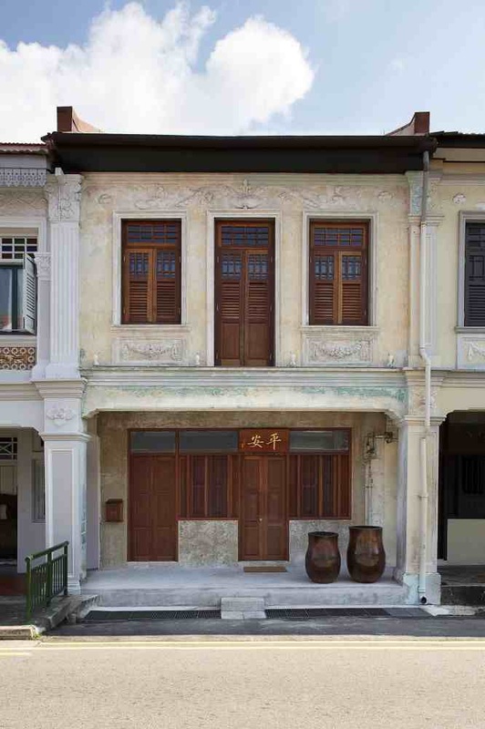
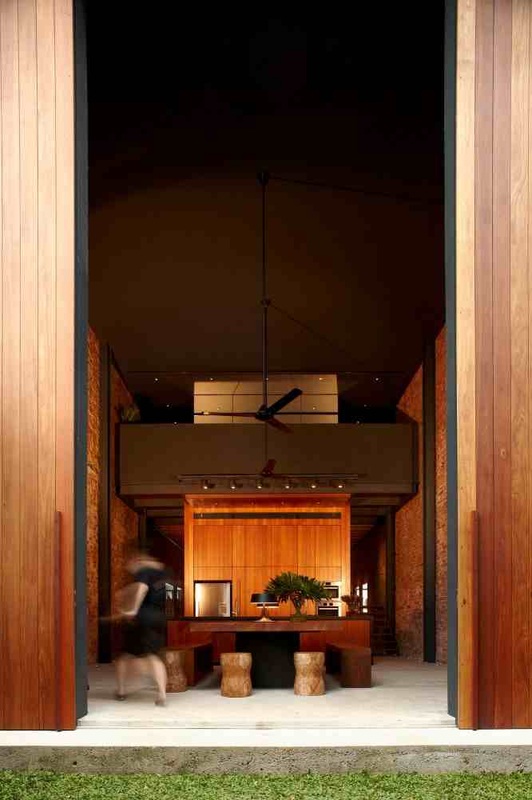
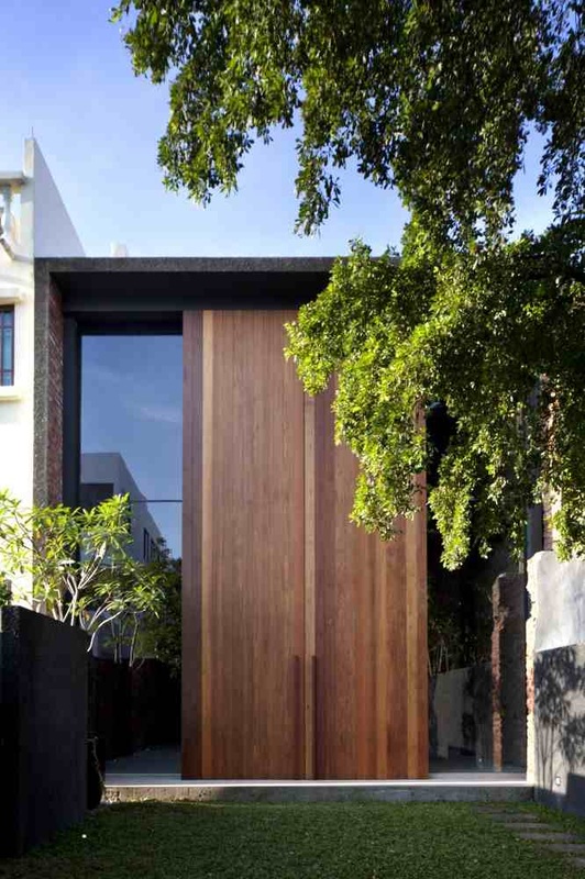
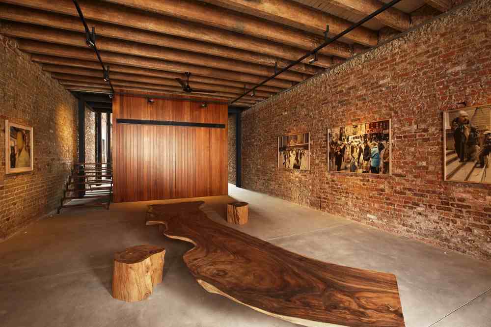
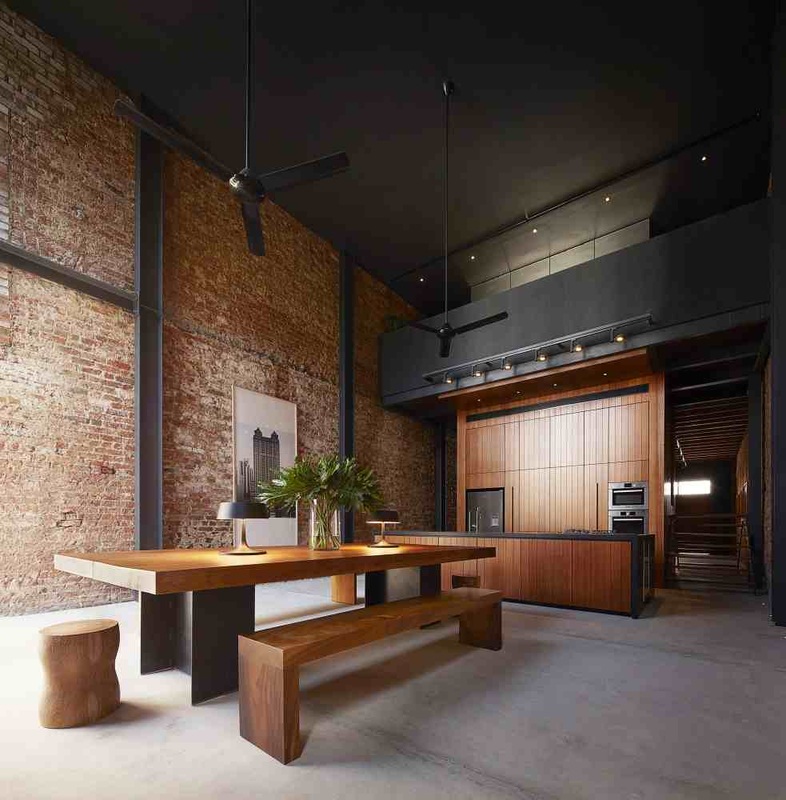
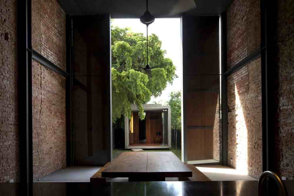
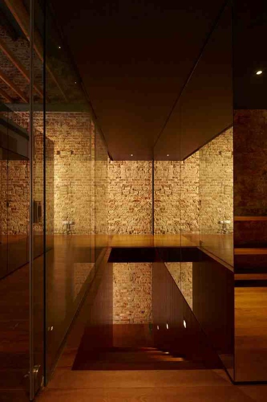
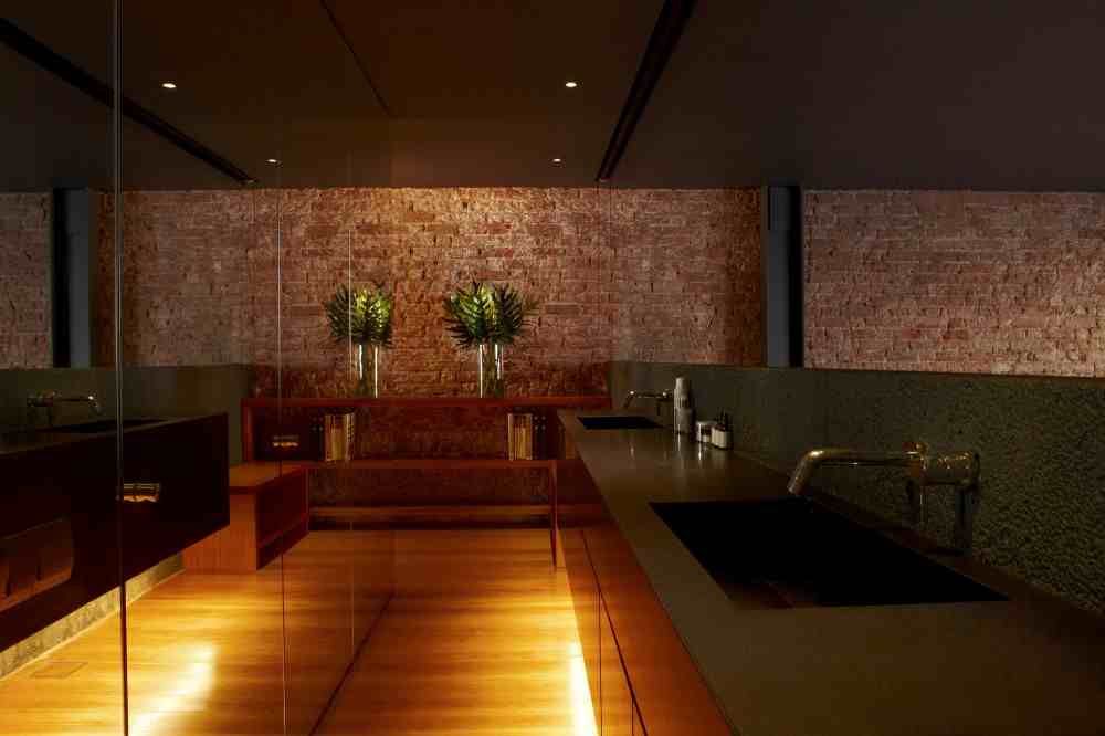
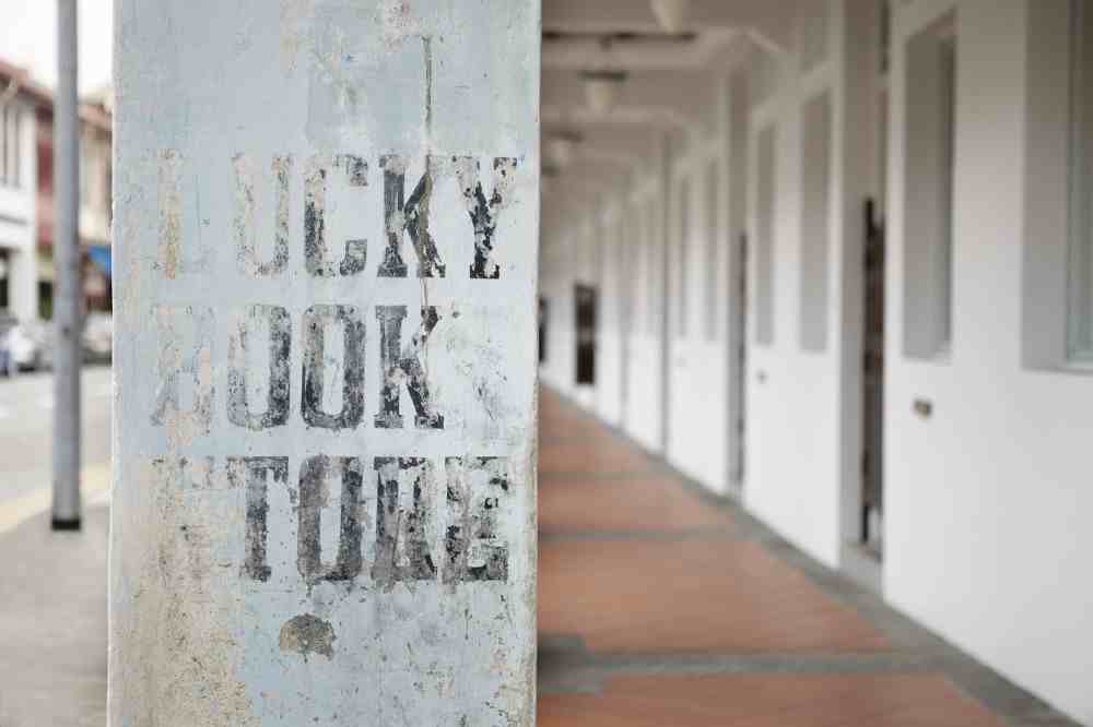
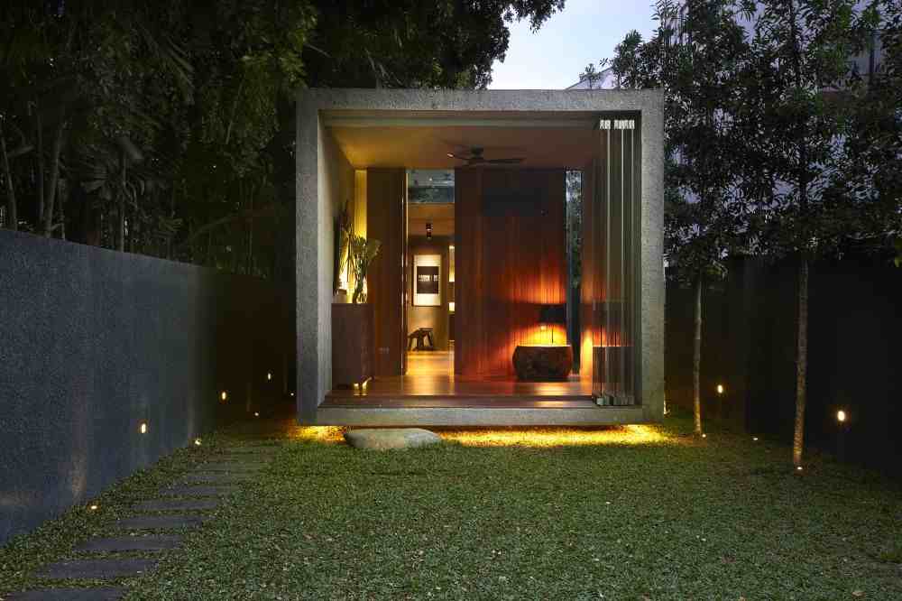
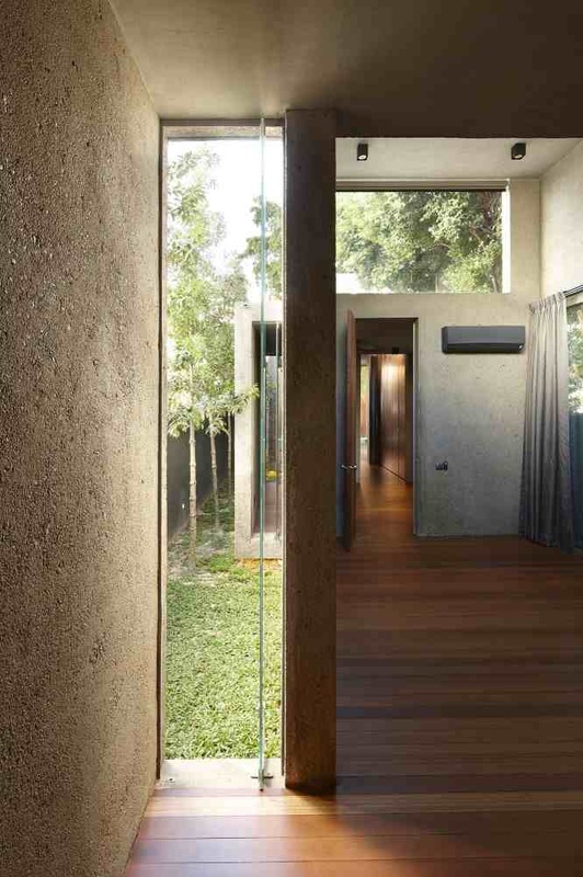
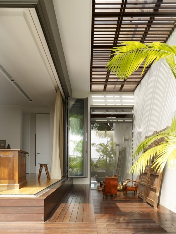
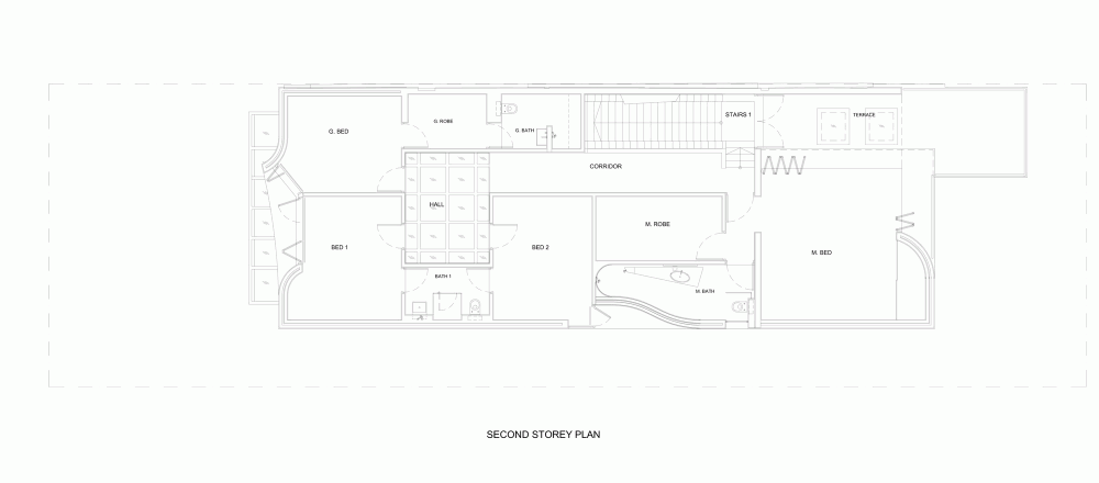
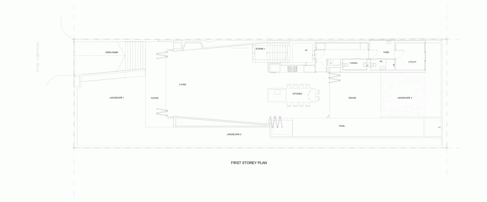
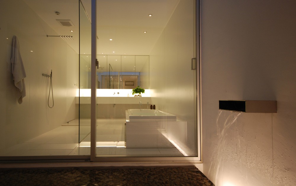
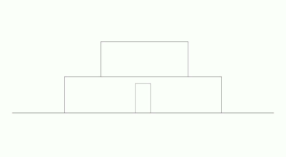
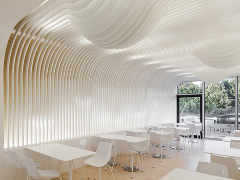
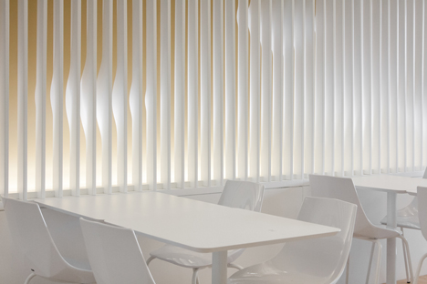
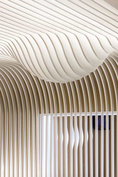
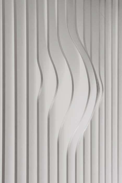
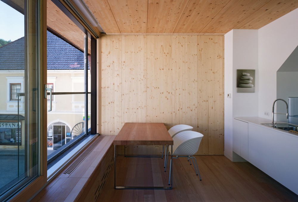
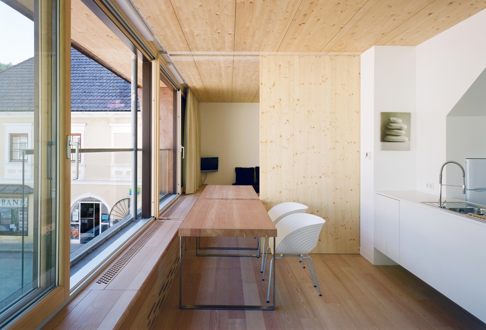
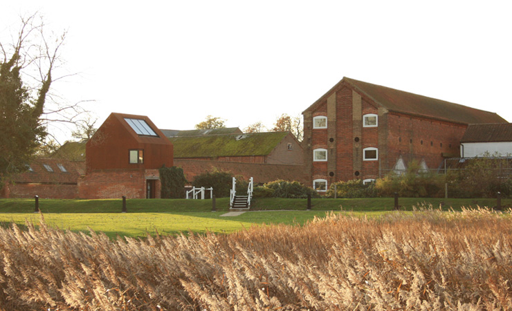
Lucky Shophouse, CHANG Architects
Looking at the Lucky Shophouse building as a design precedent was for several reasons. Looking at how the front of the building maintains a traditional facade and then the back elevation is a sliding glass facade adding a modern and open aspect to the building. The back elevation uses the glass sliding panel to frame views into the garden of the house. This is a feature that would be able to be replicated within the project at Short Hill. Using a facade of this style would add a modern aspect to the exterior the building and bring in natural light into the space which in some areas of the building would be limited due to the requirement of a grade II listing to maintain the appearance of the building.
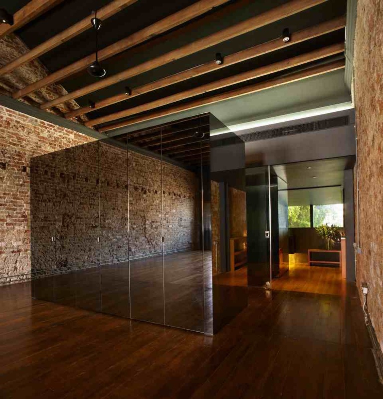
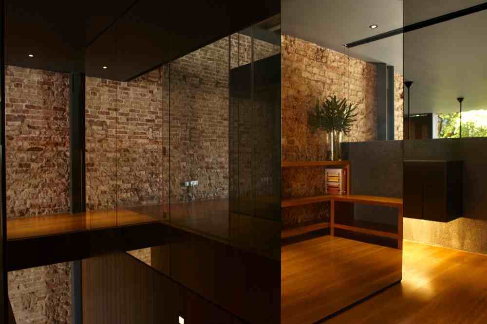
CHANG Architects have also used a variety of interactive materials within the the interior of the building. The use of glass, wood, brick and concrete create different textures within the building that when touched will explore the sense of touch. These different textures create different feelings when in these spaces - concrete creates a clean space with clean lines. It appears to be a material that creates a cooling effect. Applying materials like this through out the development of the restaurant that use different textures and finishes from the norm will aid the creation of different emotions when within a space.
CHANG Architects have also used a variety of interactive materials within the the interior of the building. The use of glass, wood, brick and concrete create different textures within the building that when touched will explore the sense of touch. These different textures create different feelings when in these spaces - concrete creates a clean space with clean lines. It appears to be a material that creates a cooling effect. Applying materials like this through out the development of the restaurant that use different textures and finishes from the norm will aid the creation of different emotions when within a space.
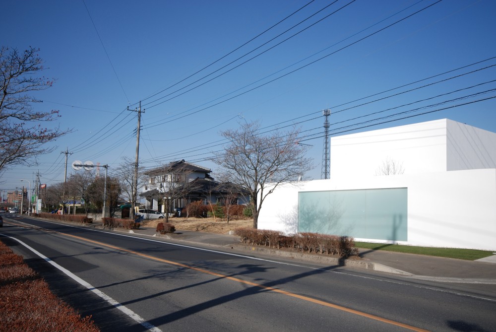
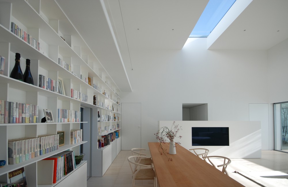
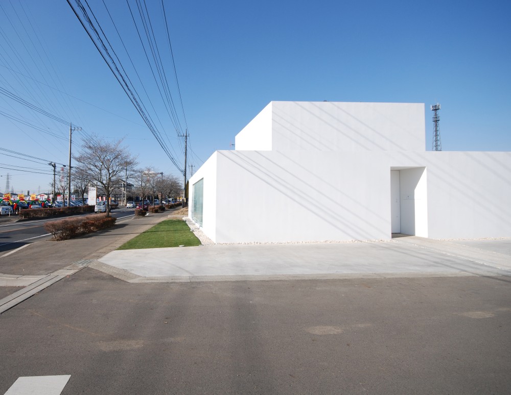
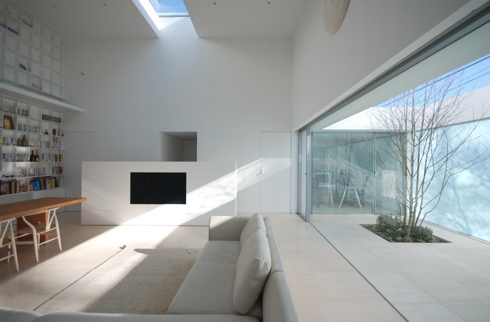
Acoustic Alchemy, Hyla Architects
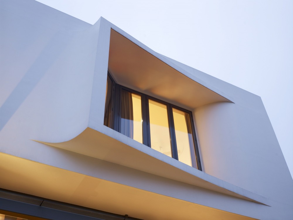
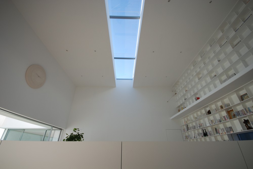
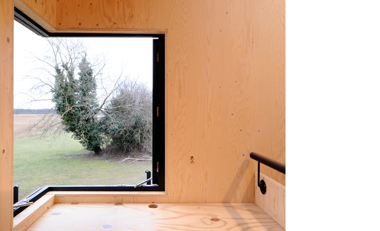
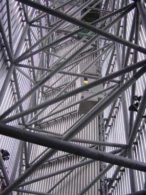
The angular window frame on the front facade of the house is the main aspect for using this building within design research. The angular frame allows for light to be filtered into the building at different points within the day creating different light within the space. Using this style angling the facade will allow for the light to come through the space at different angles and also channel to views out of the site using the design to do so.
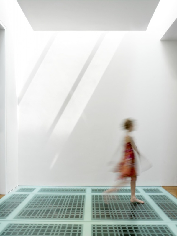
The building also uses frosted glass on the floors creating an interesting affect both looking up and down. Looking through the glass only movement and light will be seen with no definition of shape or purpose. This is concept that had been discussed for use within the development of the restaurant spaces. Creating an element of mystery about spaces. Not knowing what is in certain areas of the building would make the user curious causing them to perhaps visit again to use a different space creating a different experience with each visit.
The building also uses frosted glass on the floors creating an interesting affect both looking up and down. Looking through the glass only movement and light will be seen with no definition of shape or purpose. This is concept that had been discussed for use within the development of the restaurant spaces. Creating an element of mystery about spaces. Not knowing what is in certain areas of the building would make the user curious causing them to perhaps visit again to use a different space creating a different experience with each visit.
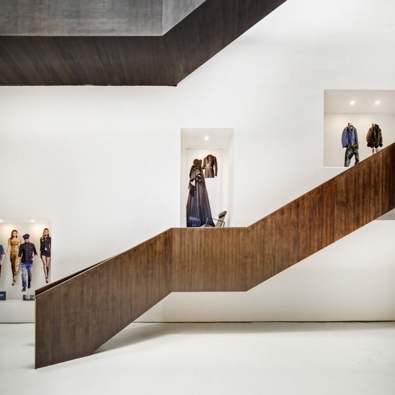
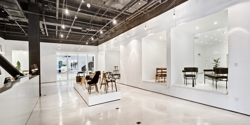
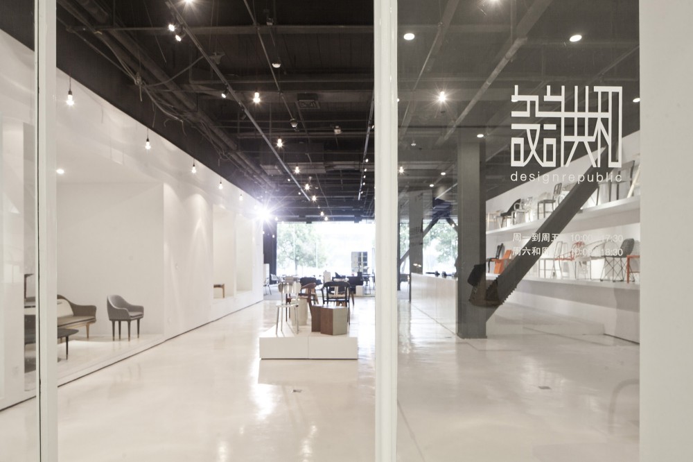
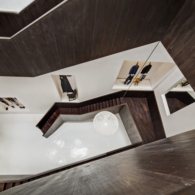
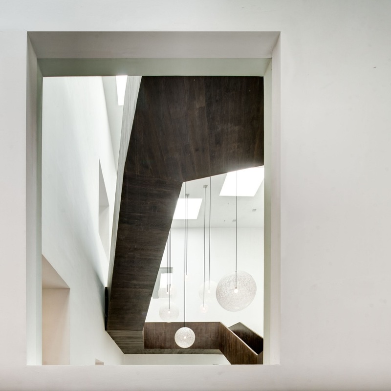
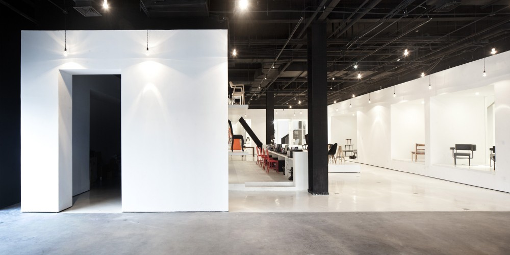
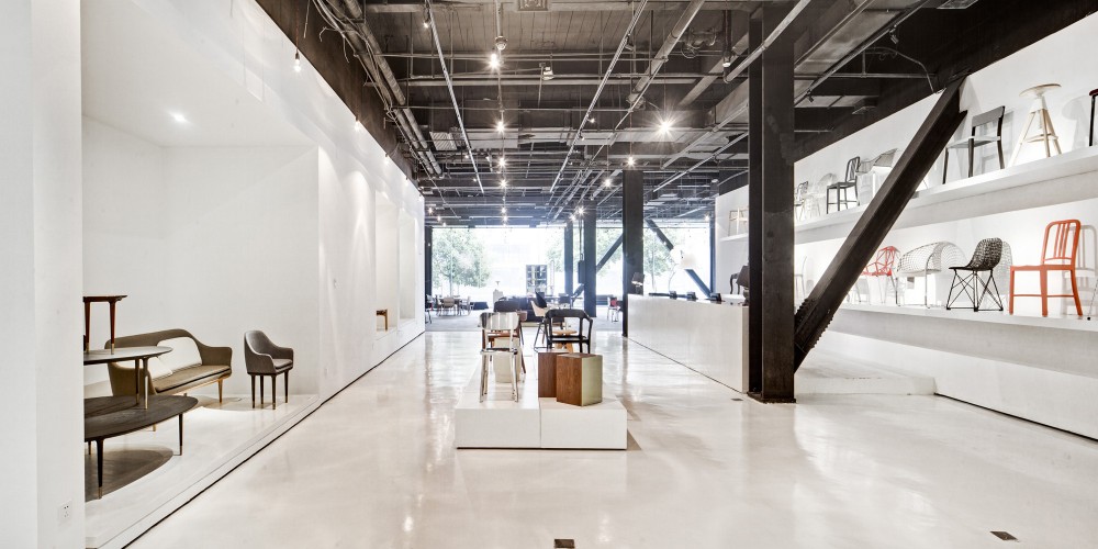
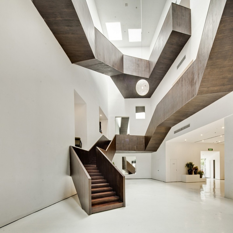
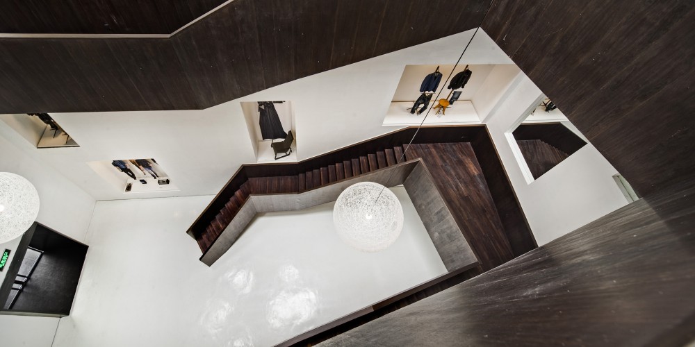
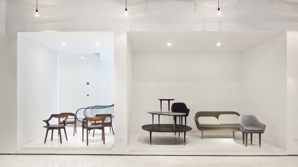
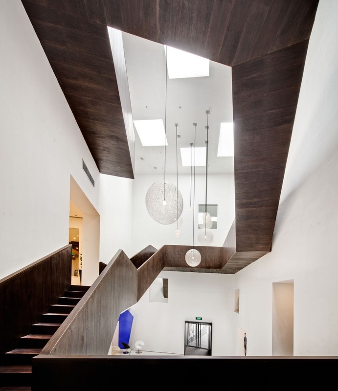
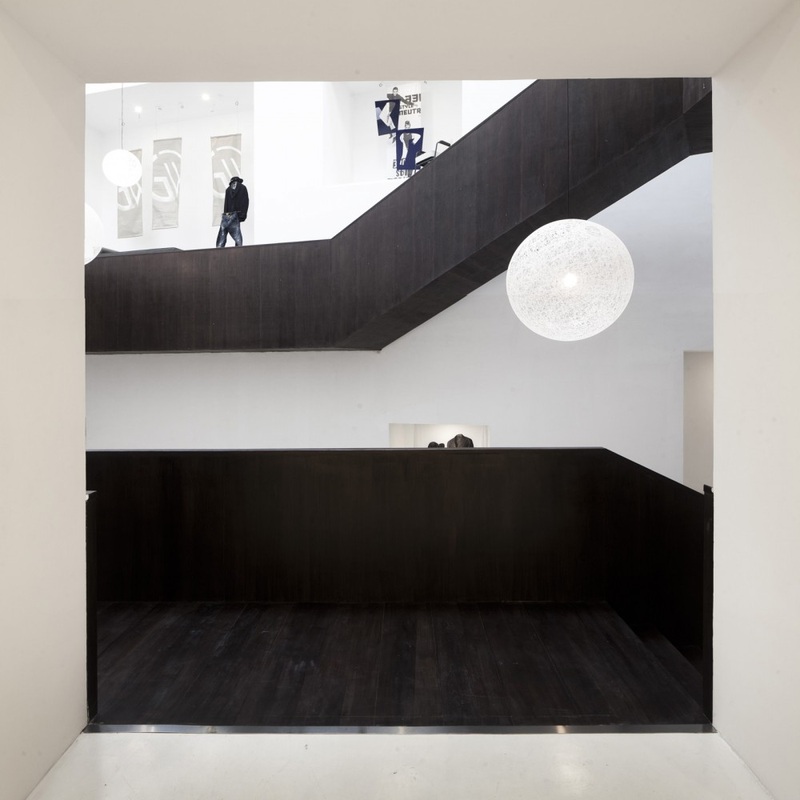
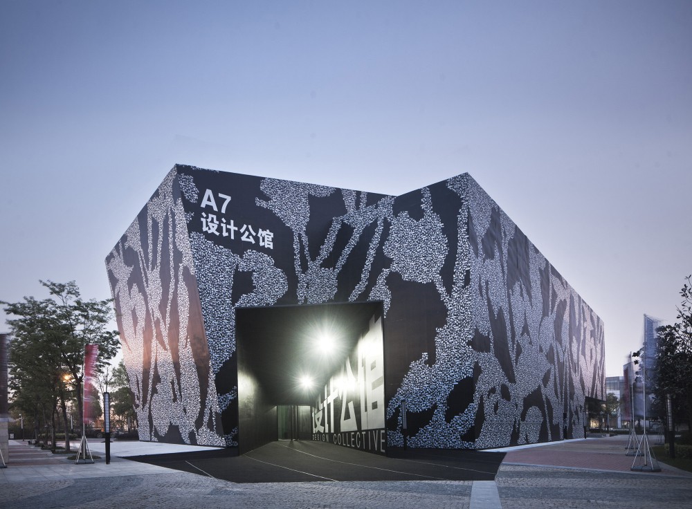
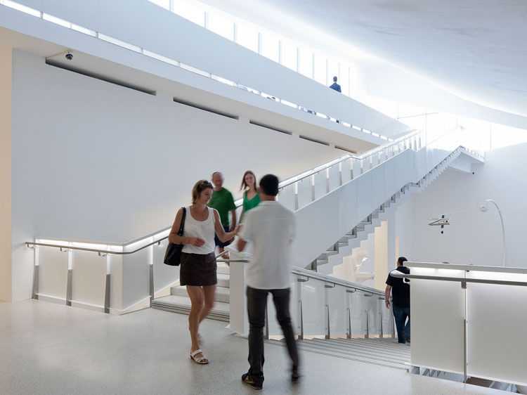
Design Collective, Neri & Hu
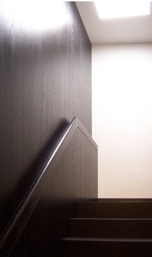
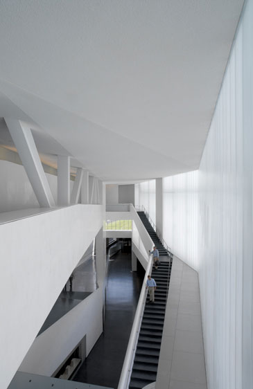
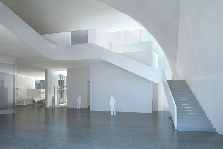
The reason for selecting the Design Collective as a design precedent is the staircase. Within the building the staircase wraps around the building interior and of the main exhibition space which is apparent when entering the building. The staircase takes the user around the space and up and down through many different levels where different displays of furniture can be experienced. The staircase creates varying spacial levels and allows for aspects of the building to be viewed from varying vantage points within the building allowing for different spaces to be seen from the stairs giving hints of displays and space functions.
The staircase acts as the focal point within this design allowing the visitor to view the building in different ways from different angles. This is a technique that would like to replicated within the design of the restaurant building. Due to the nature of the design concept containing several different spaces this will allow the visitor to see all around the building. The staircase in the Design Collective works around the building using angles and levels to create the structure. This also works creating light and shadows a method that due to the nature of the existing structure at Short Hill would allow for.
The staircase acts as the focal point within this design allowing the visitor to view the building in different ways from different angles. This is a technique that would like to replicated within the design of the restaurant building. Due to the nature of the design concept containing several different spaces this will allow the visitor to see all around the building. The staircase in the Design Collective works around the building using angles and levels to create the structure. This also works creating light and shadows a method that due to the nature of the existing structure at Short Hill would allow for.
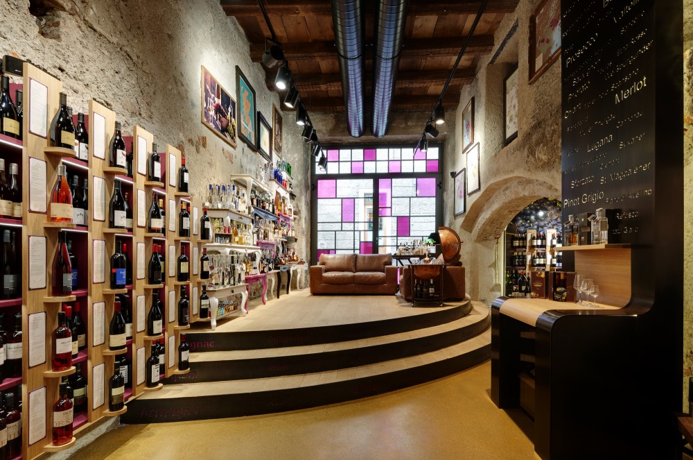
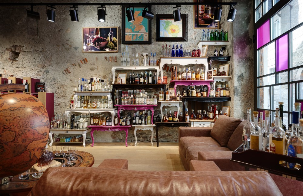
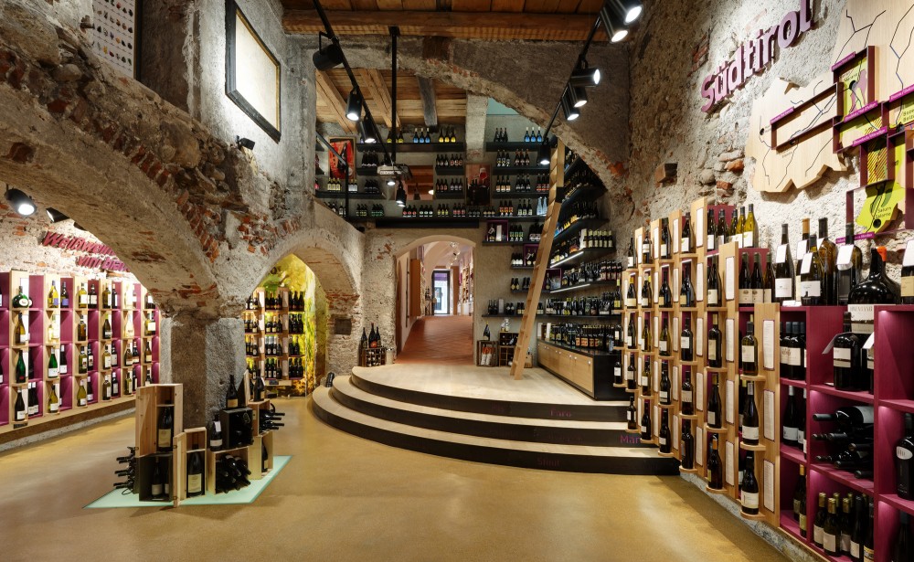
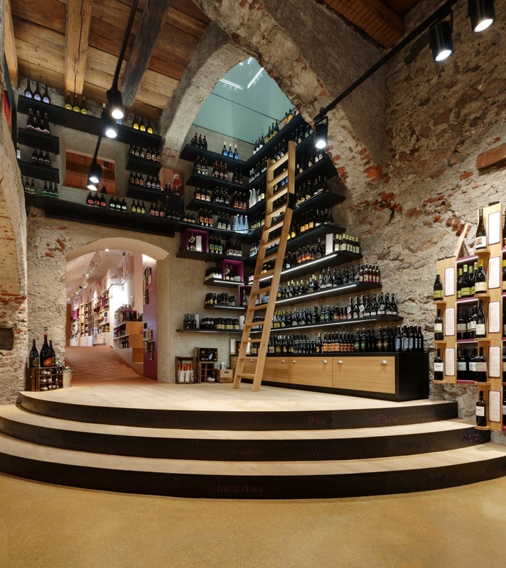
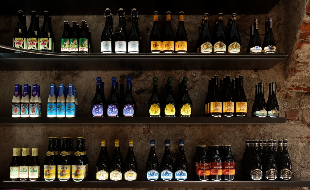
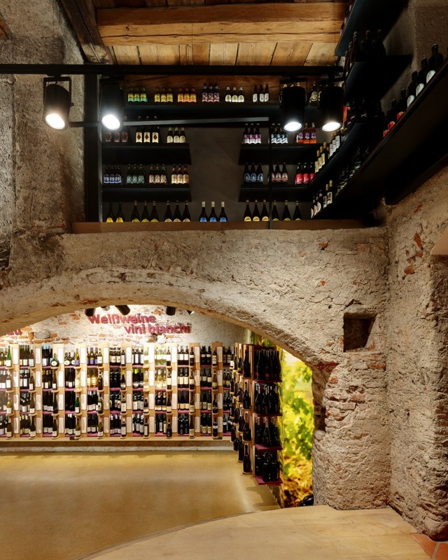
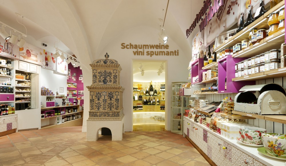
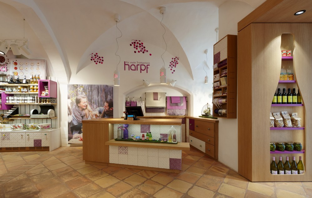
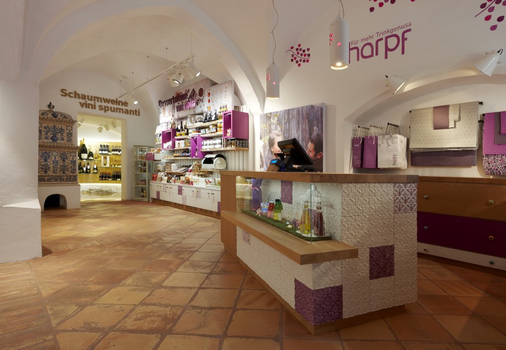
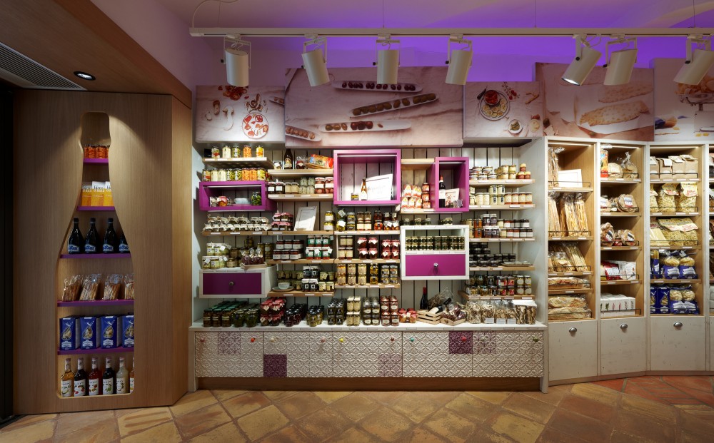
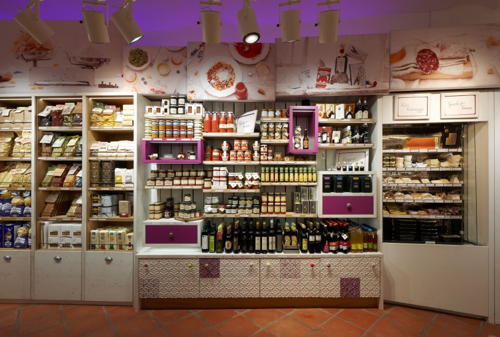
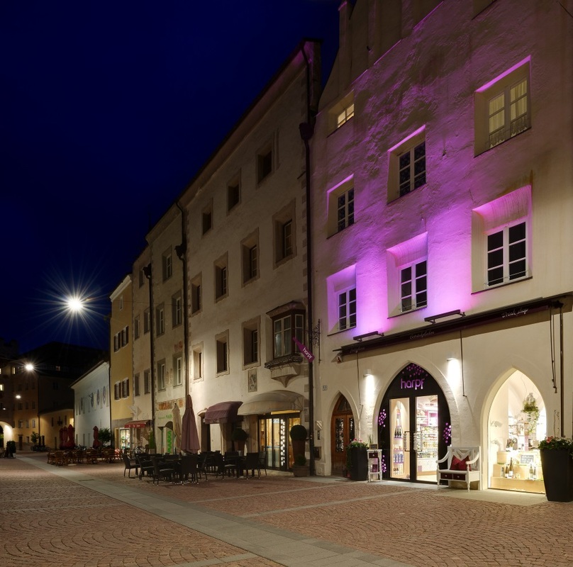
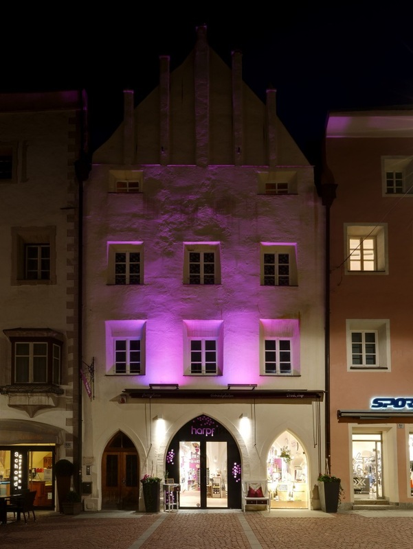
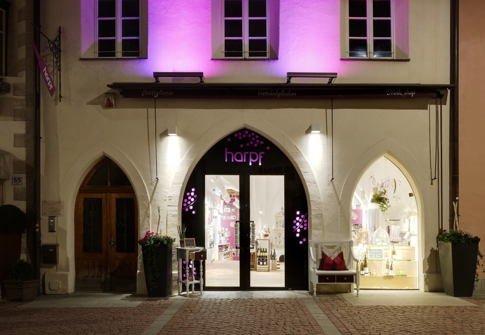
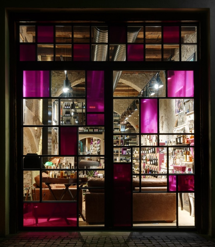
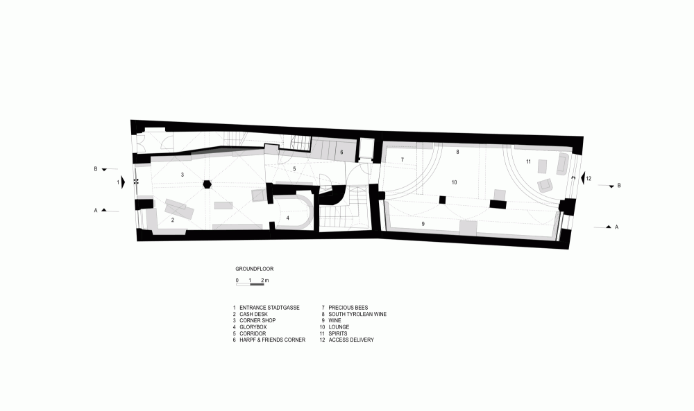
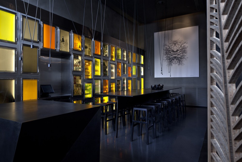
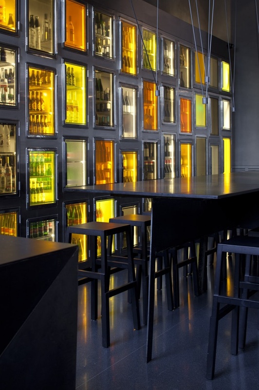
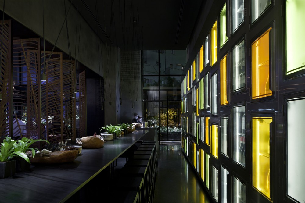
Drink Shop Harpf, Monovolume Architecture and Design
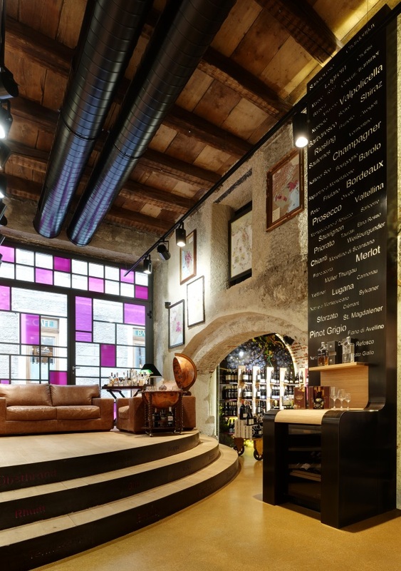
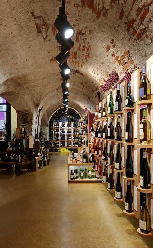
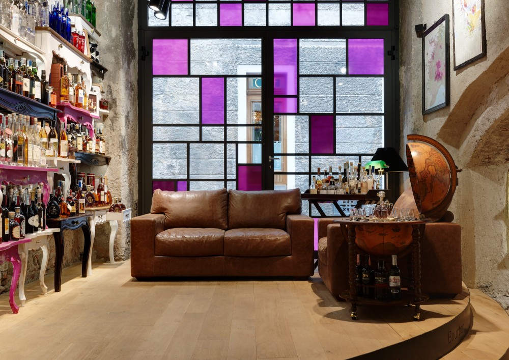
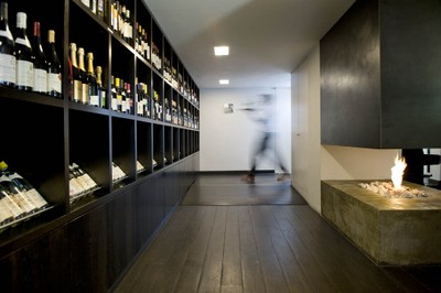
Although more of an interior design precedent it was felt looking at this example would provide interesting ways of storage within a food retail space. This drink shop in Harpf uses many different interesting methods and techniques to display and sell products. Within what appears to be a old building with a redeveloped interior. The use of wall space to display bottles allows for the maximum amount of space within the building to be used and therefore allowing more stock to be displayed. The organisation of the shelf filled with products gives the customer so much to look at and take in creating an experience in which they fill their baskets full of goods. The use of colour only within the products on sale and the coloured windows also create a visual impact causing these elements to stand out.
Due to the angular nature of the building on Short Hill and the available space in which the deli shop will be created looking at techniques like this which have worked to get the most from the space allows for the development to occur and also to gain idea on how best to layout the space.
Due to the angular nature of the building on Short Hill and the available space in which the deli shop will be created looking at techniques like this which have worked to get the most from the space allows for the development to occur and also to gain idea on how best to layout the space.
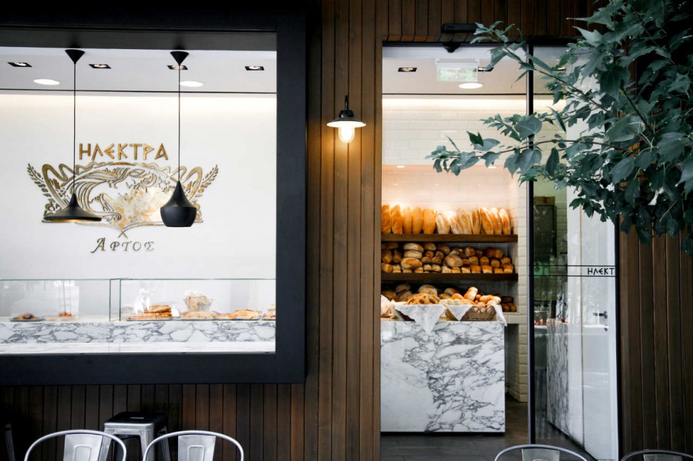
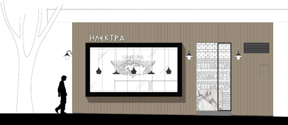
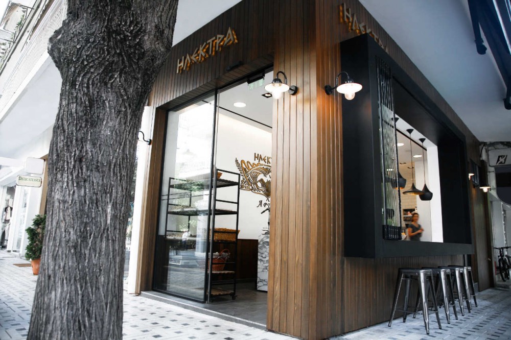
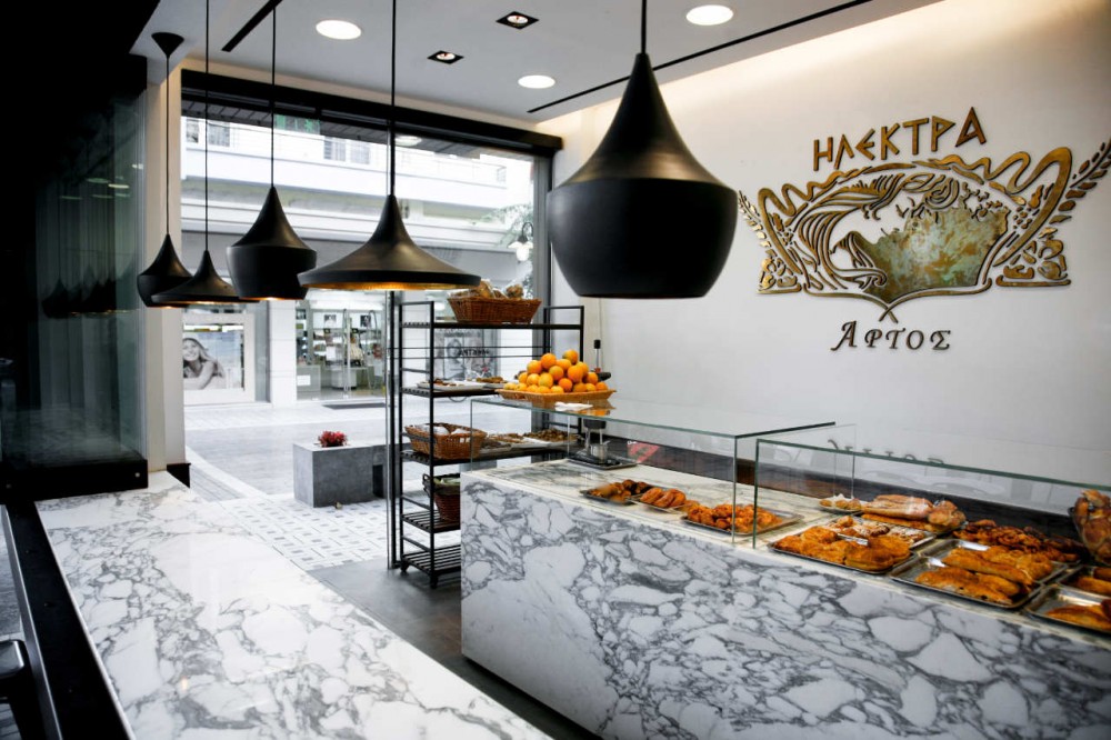
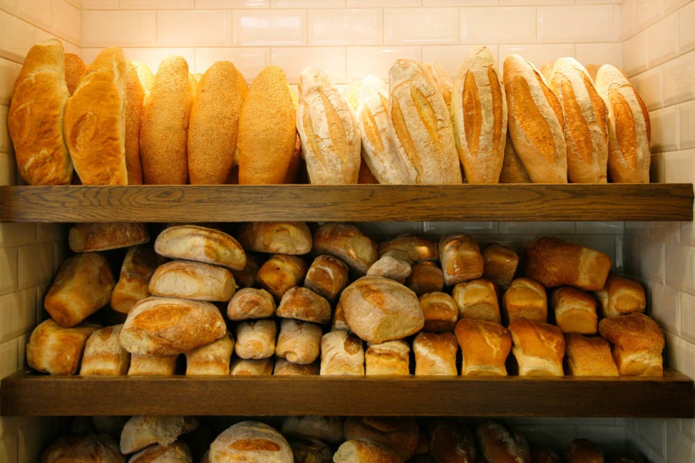
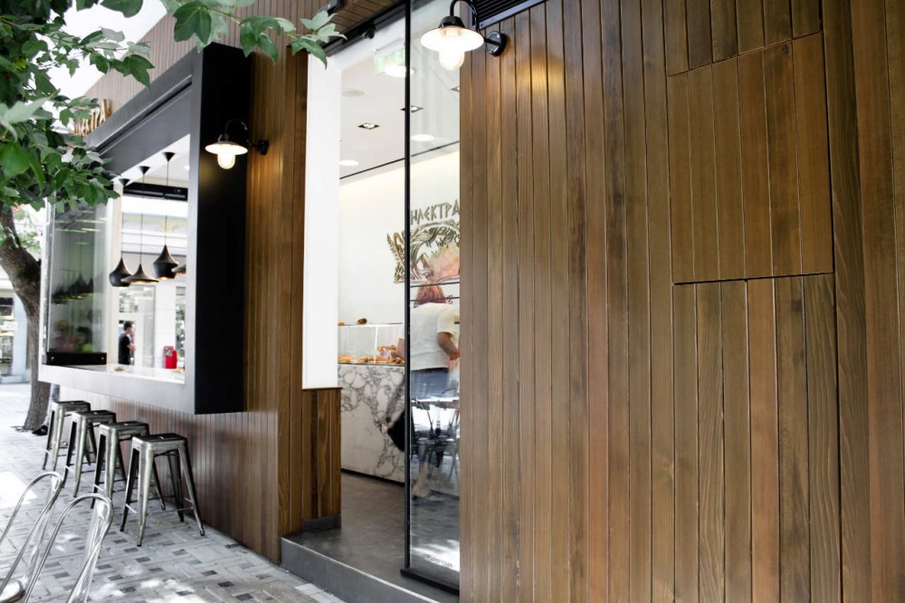
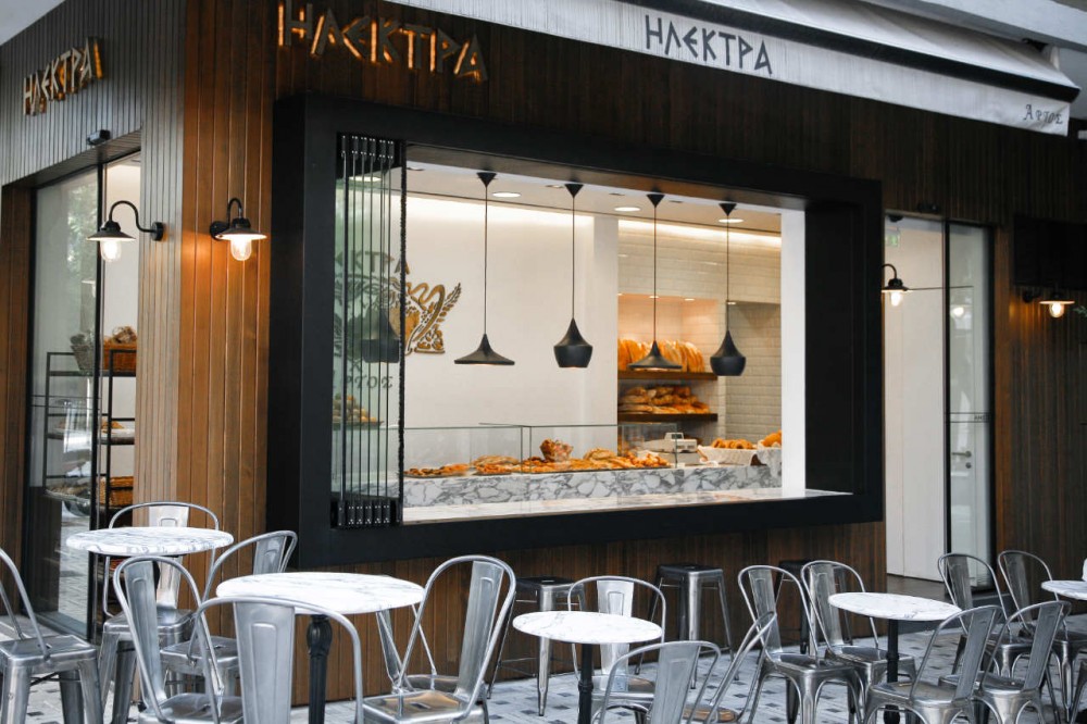
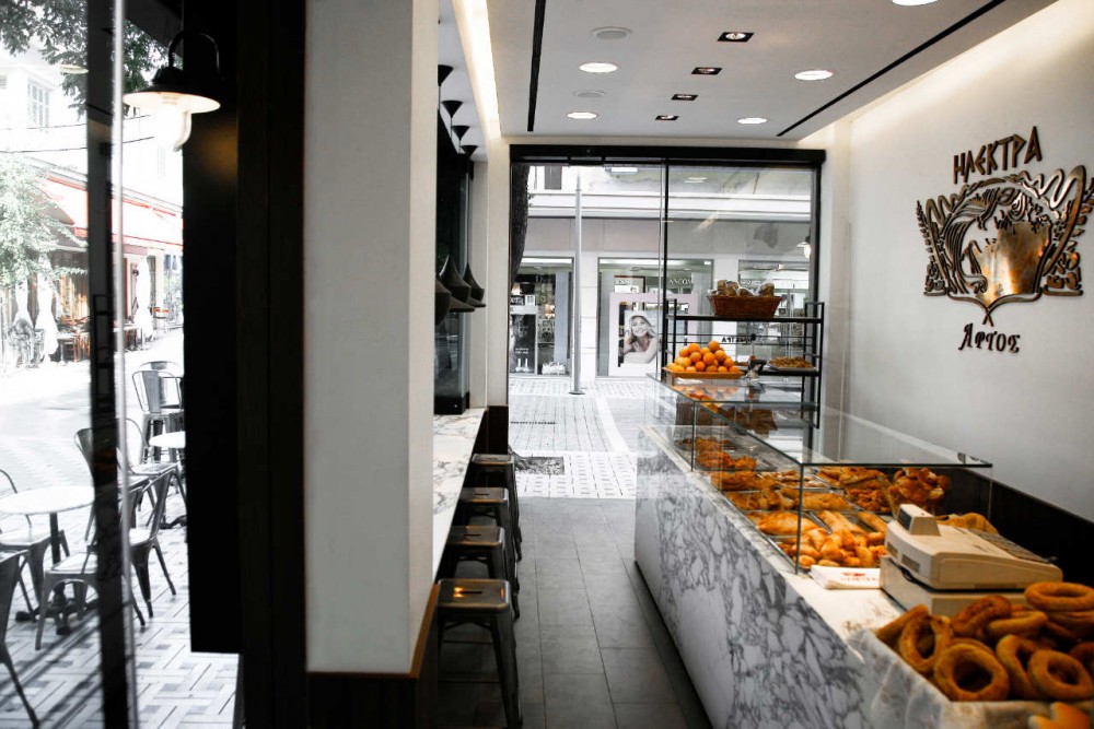
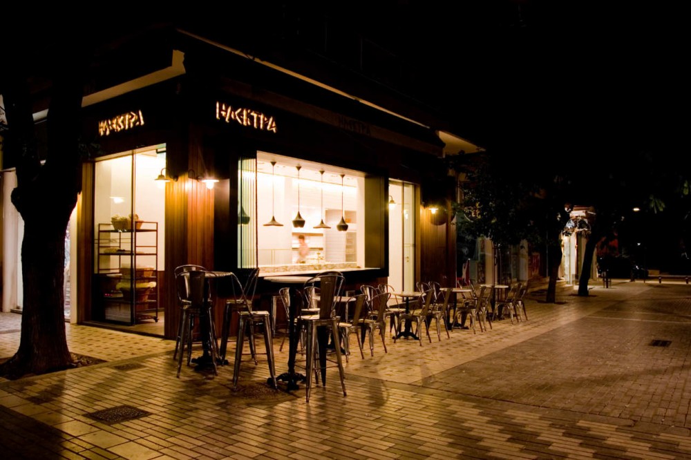
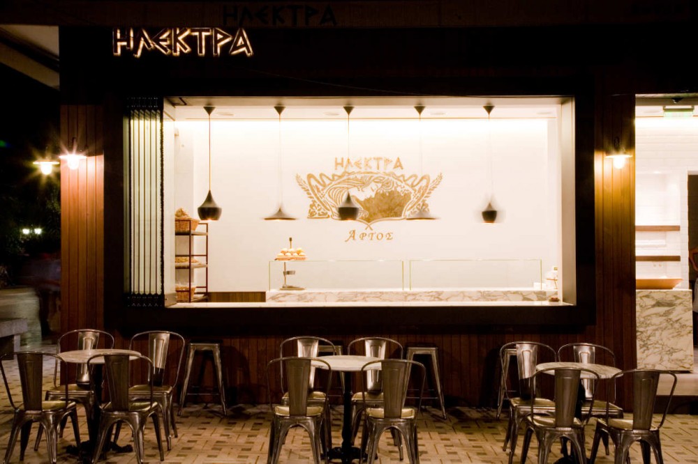
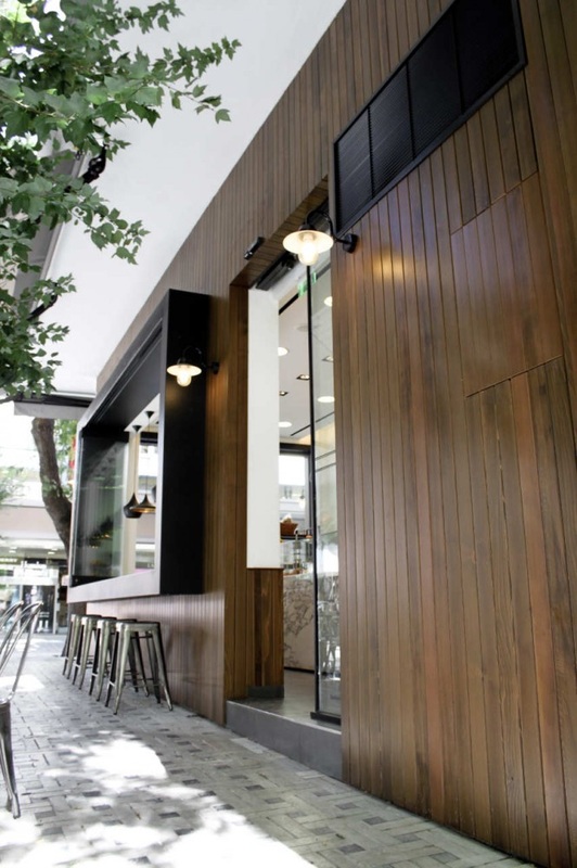
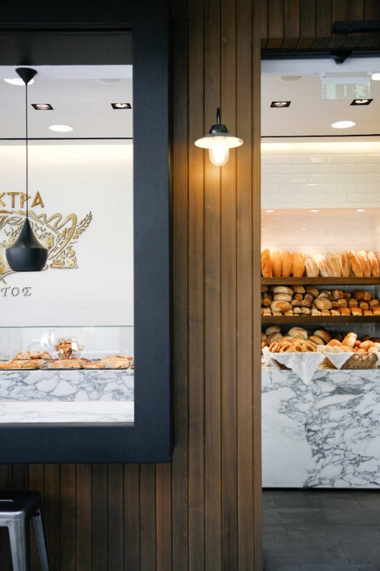
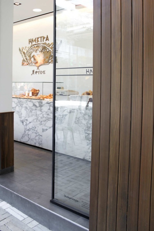
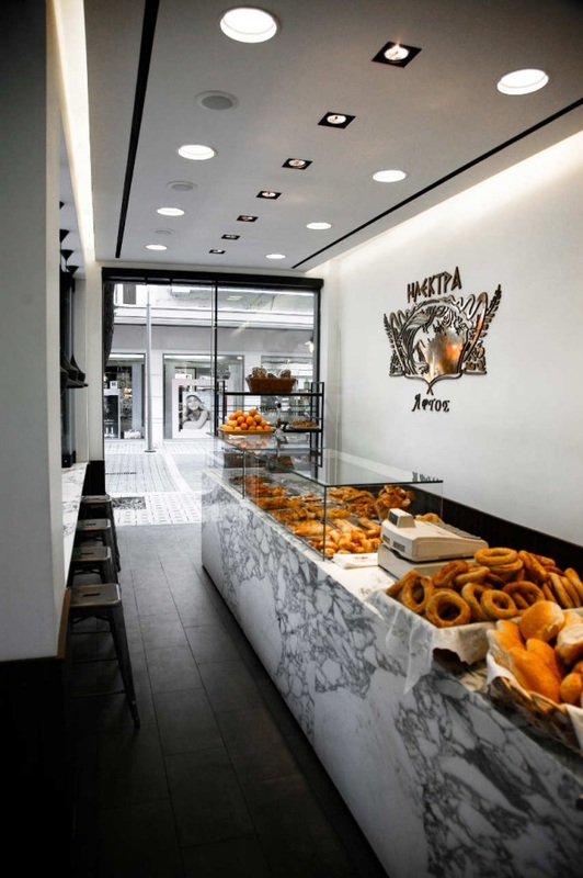
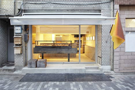
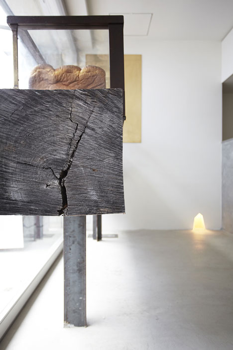
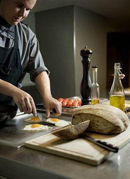
Elektra Bakery, Studioprototype Architects
The concept that I am creating will include a bakery/deli shop style space within the building. The idea behind this being that is that people would be able to come and purchase fresh produce from the shop as well as enjoy the space as a cafe and a restaurant. Selling the food also aims to give a food education and also provide fresh produce for those with allergies as highlighted within initial research. The Elektra bakery is a small bakery space providing fresh produce daily. This project was particularly eye-catching for the way in which the window element is transformable into a bar for people to sit and eat and have a drink. The simple use of materials and colours within the building interior that really allow the product they are selling to stand alone and be appealing and most importantly fresh. It is also attractive how they have shown how the products are made and baked by leaving a viewing point into the kitchen.
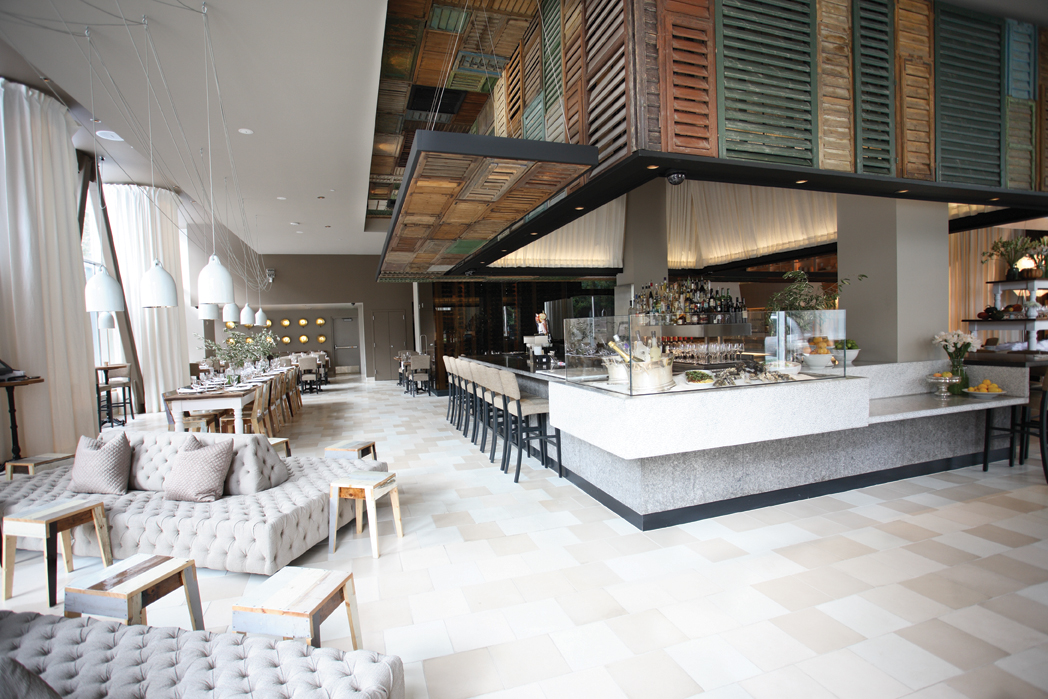
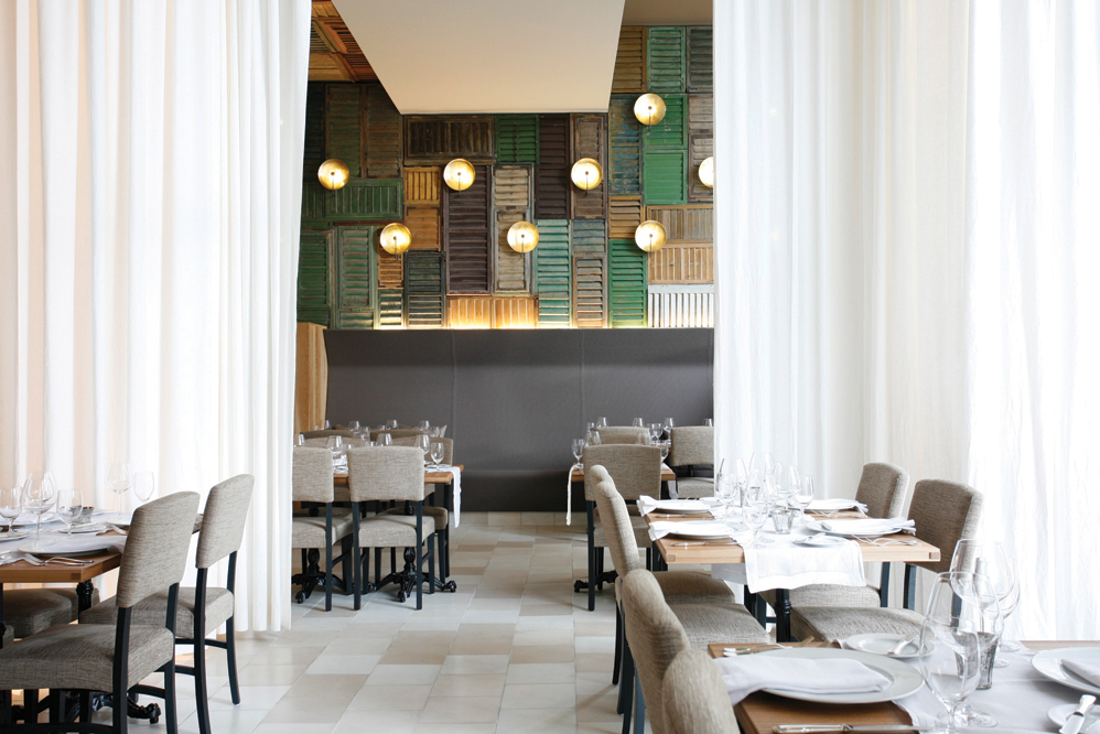
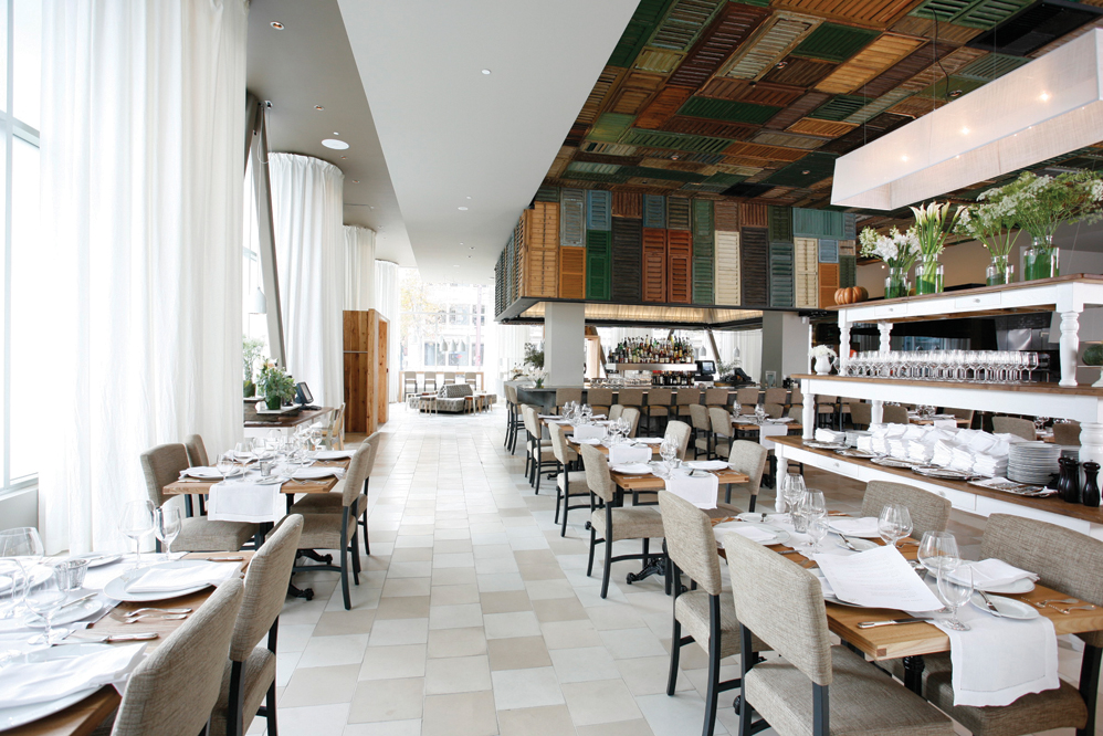
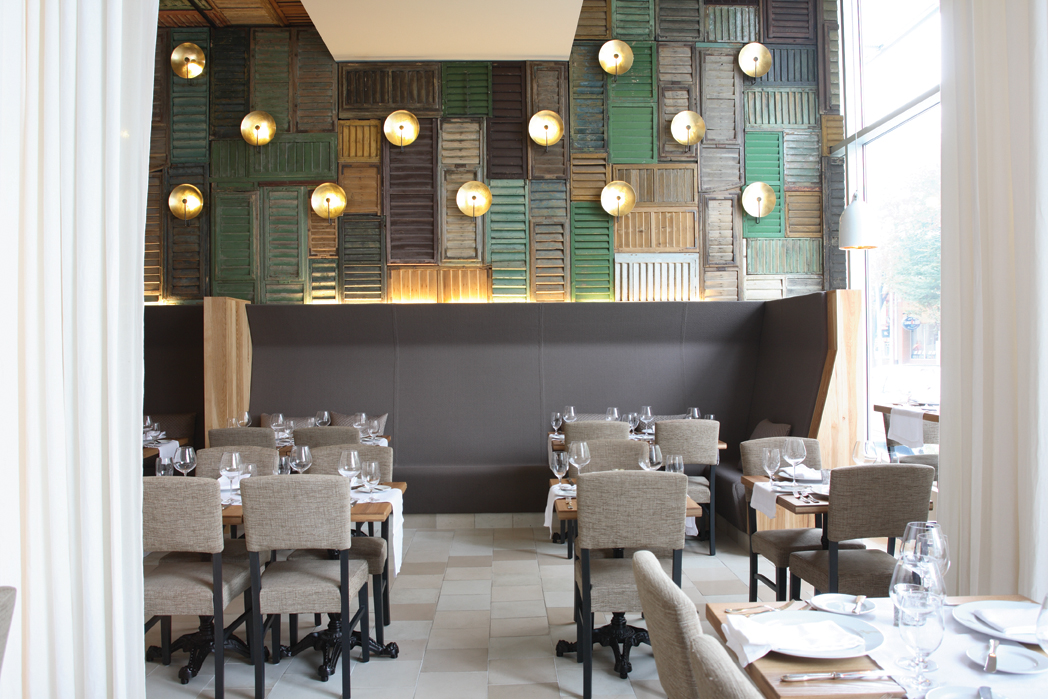
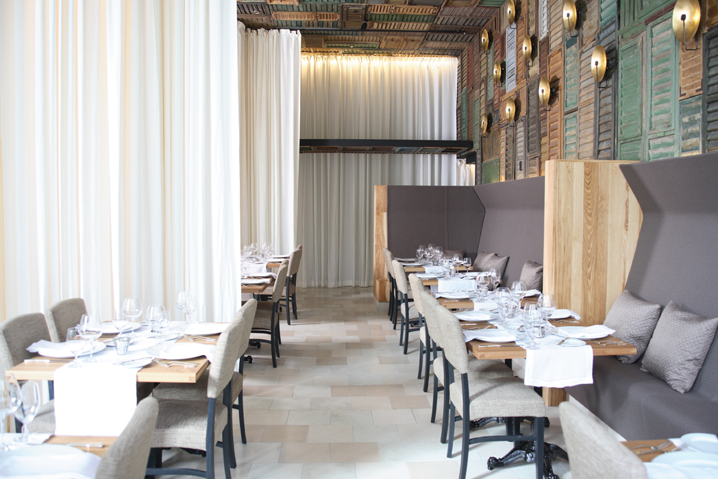
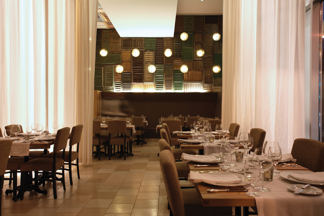
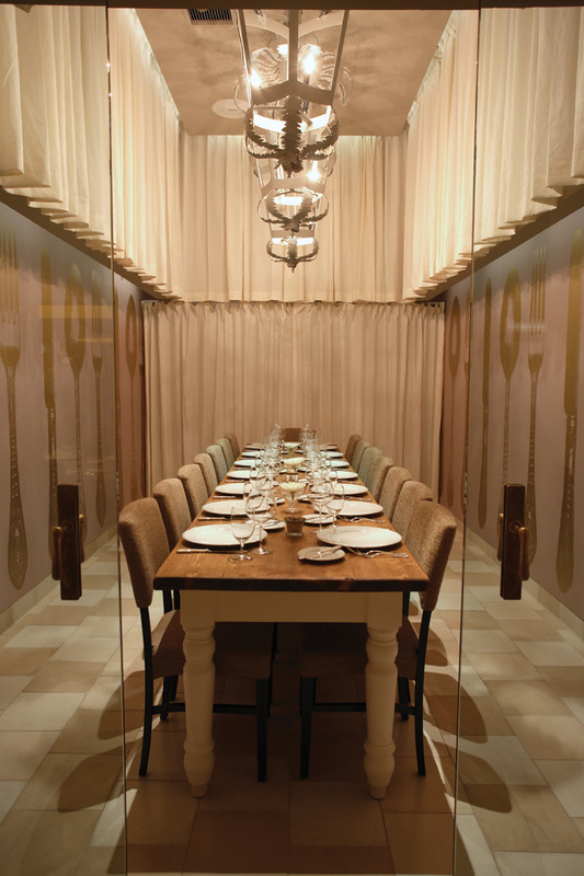
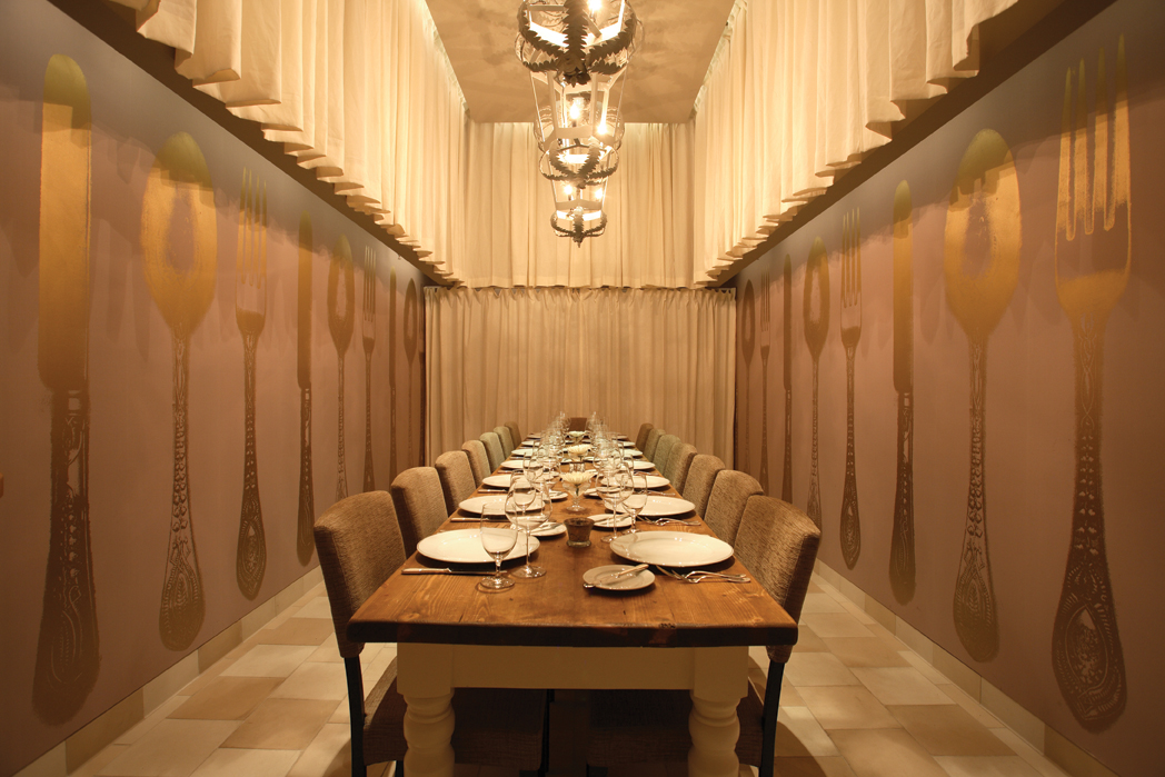
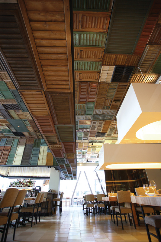
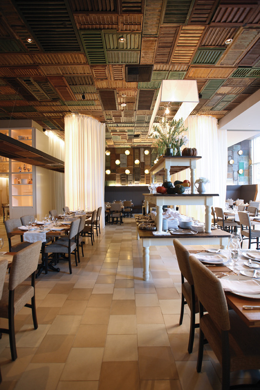
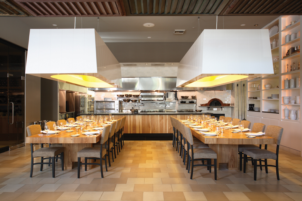
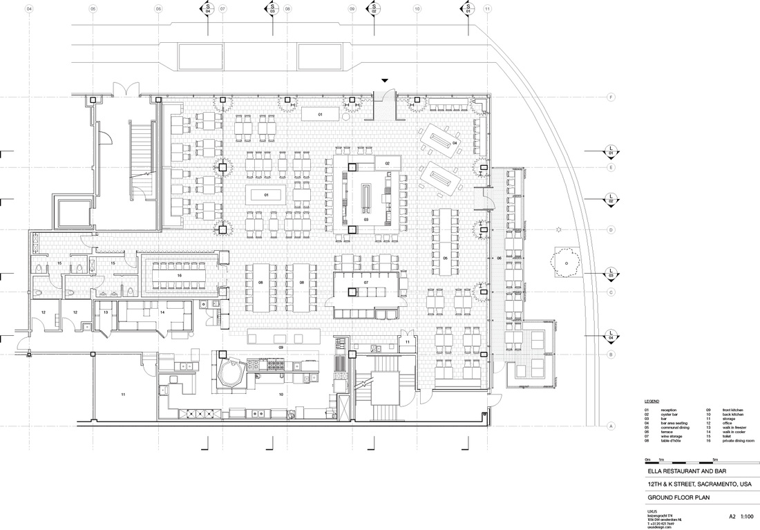
Ella Dining Room, USUX
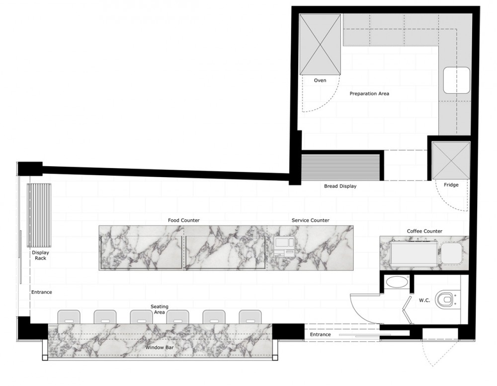
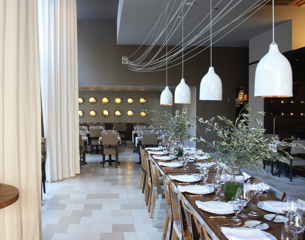
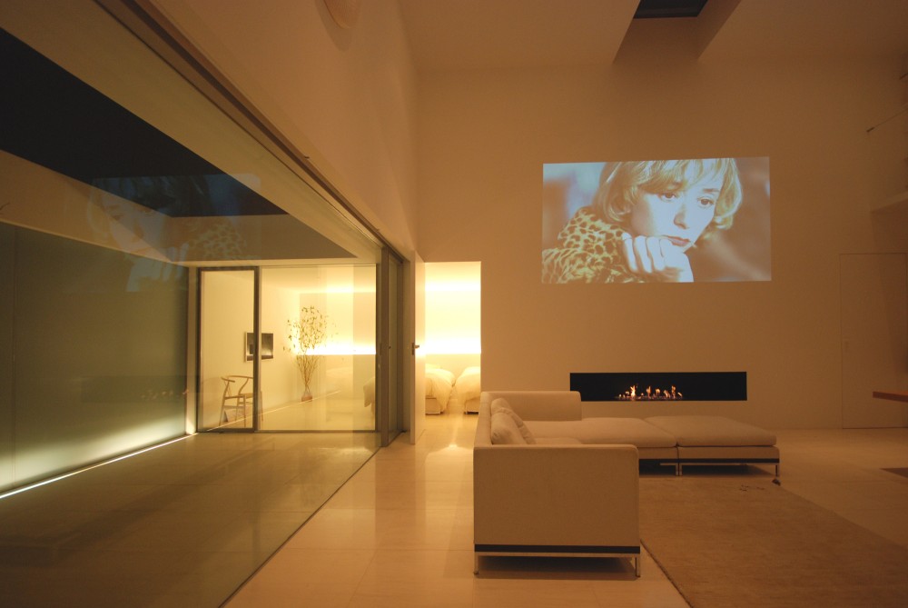
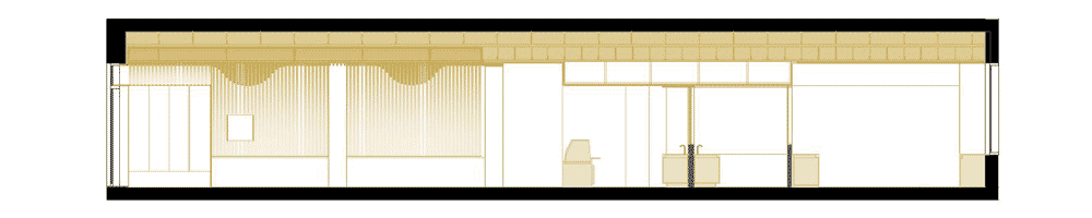
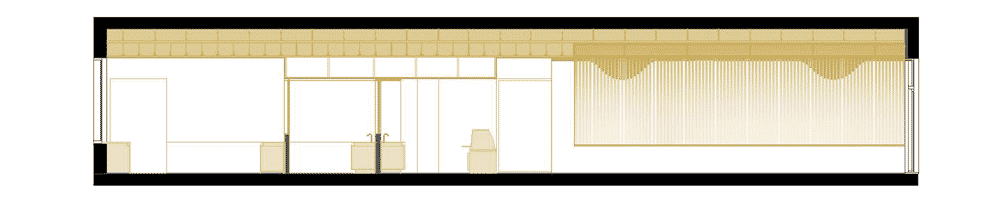
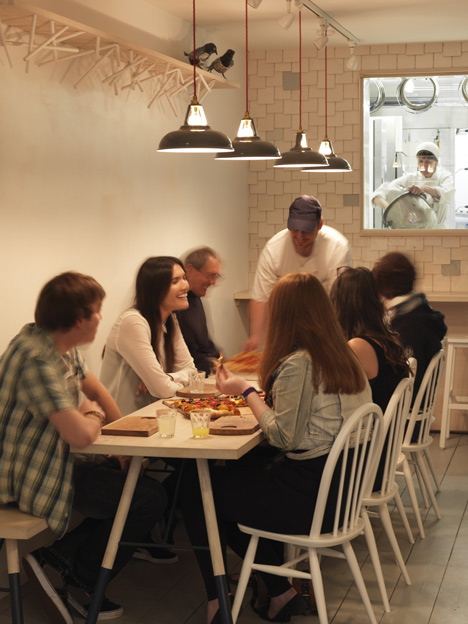
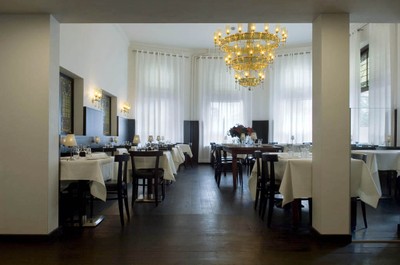
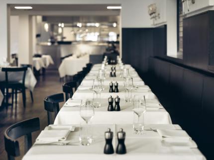
Keeping with the restaurant theme, Ella Restaurant and Bar in the USA was a design precedent that instantly stood out due to its organisation of space as well as how the interior has been developed. Although my individual project is to look at the interior architecture of the building the decor is also key to consider due to this being a selling point to the customer. Being able to look at the plans drawn up for this project allowed me to gain a real view on the space required for each element of the building and be able to allocate this as required. I found this precedent interesting as it used many elements that I would also like to include within my concept such as the use of small private dining spaces as well as an open kitchen with seating around or within this space. The combination of materials within the building is also interesting adding both depth and structure to the space. This restaurant uses light drapes to allow spaces to be separated off from one another creating unique spaces. The building is light and airy taking light from where possible. Although creating a light space within the Short Hill building is possible in some areas of the building in some spaces in this building it will be difficult to and therefore other ways of lighting these spaces need to be considered.
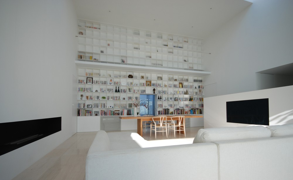
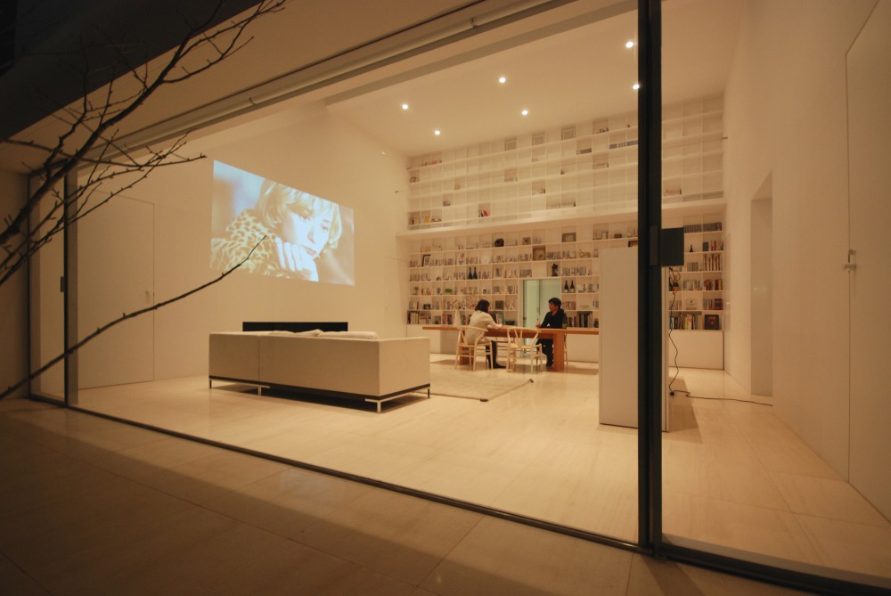
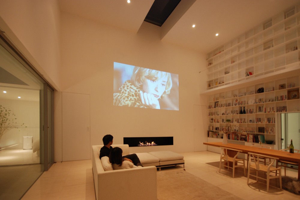
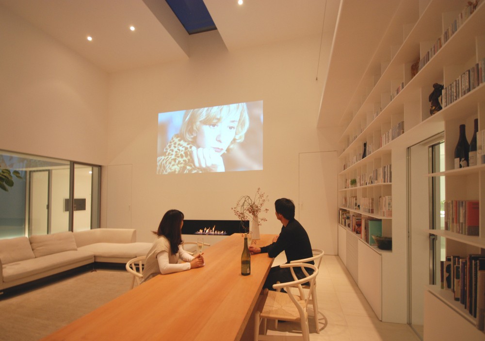
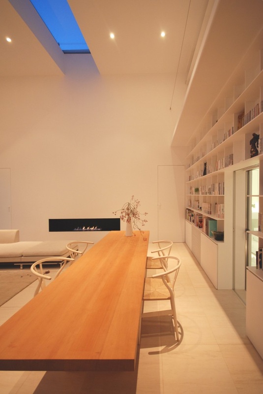
Library House, Shinichi Ogawa & Associates
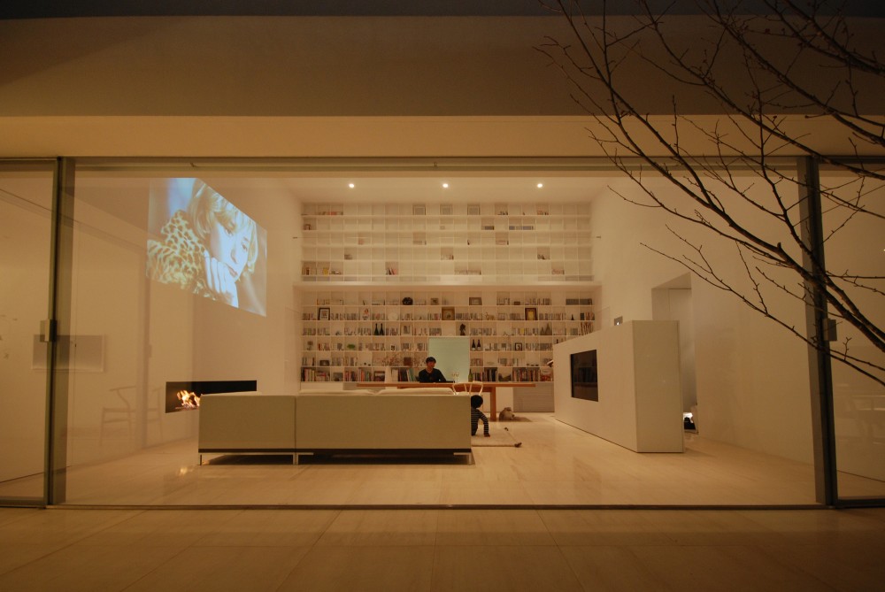
Although this example is a house this example was selected due to the use of a large bookshelf feature within the design. It was interesting to see how the bookshelf has been incorporated and how light has been used around the wall. The idea of using a bookshelf within the restaurant is to look at the idea of providing an education about food and healthy living. This would be within the cafe area to allow people to come a sit enjoy the space and read the books and note down recipes. Like the Library House example the bookshelf would take the entire wall to create a space that the user can interact with. This home uses the wall to create a family space that acts as a focal point within the space and also allows users to interact with the space. The use of a light material has worked well and allowed the books to stand out from the wall due to their colourful nature.
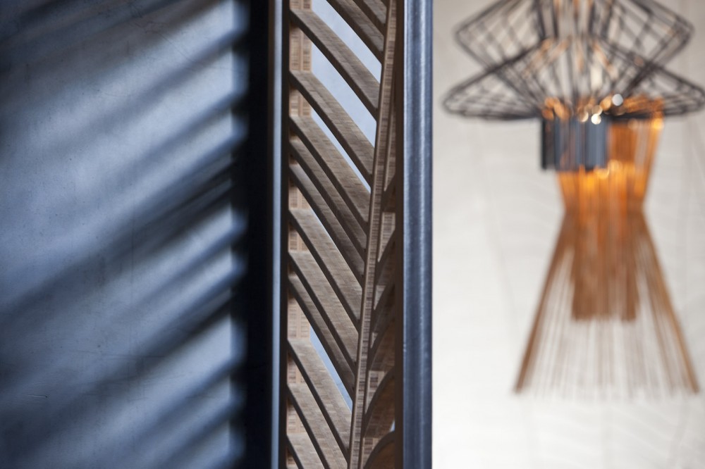
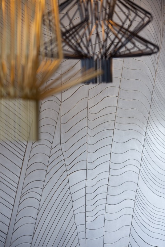
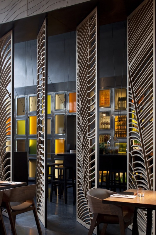
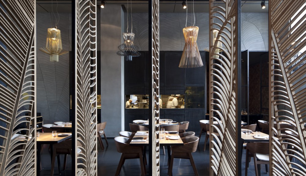
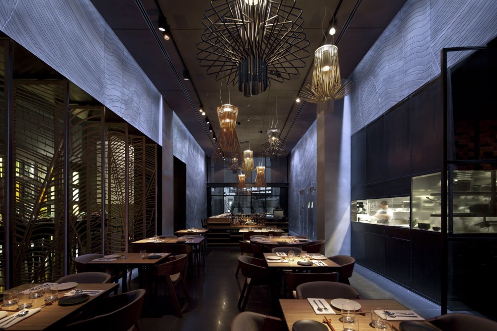
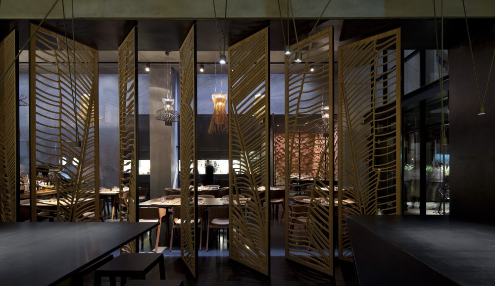
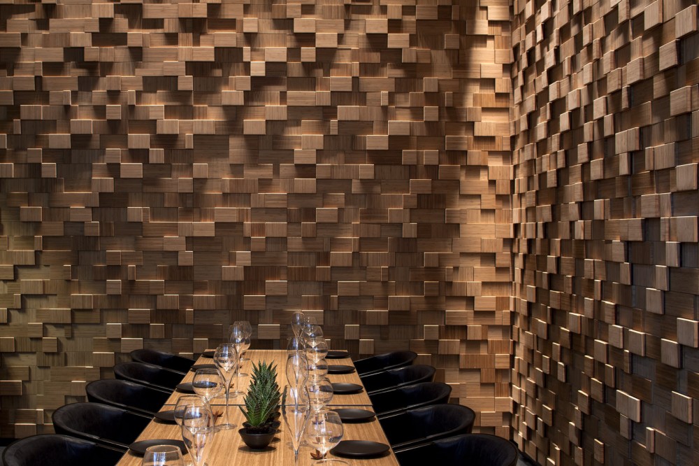
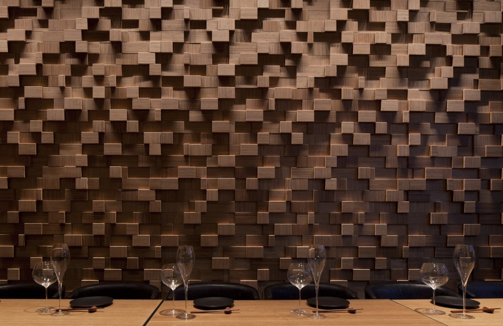
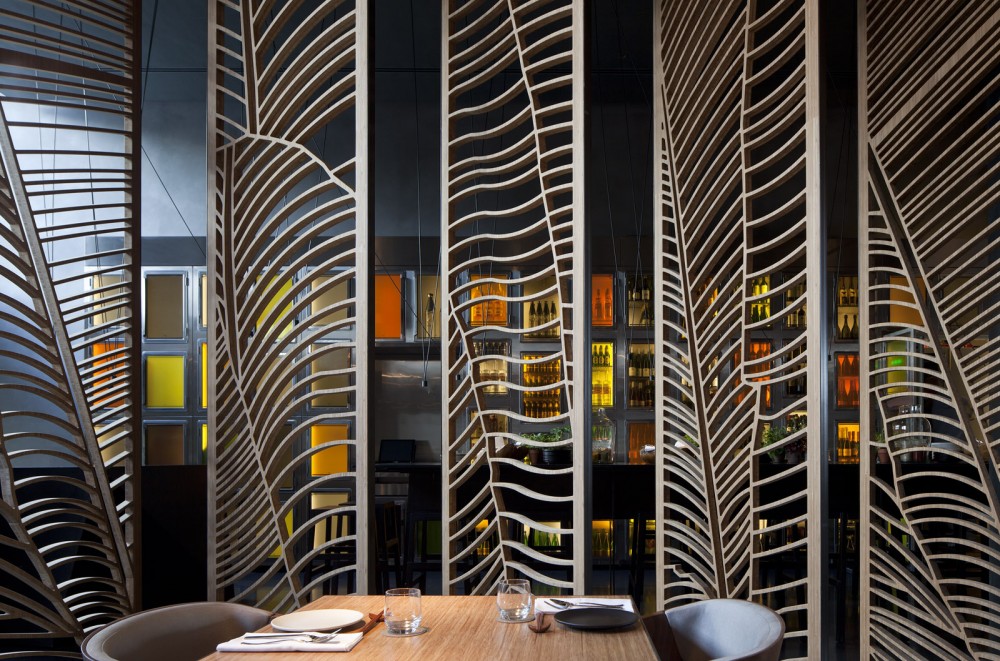
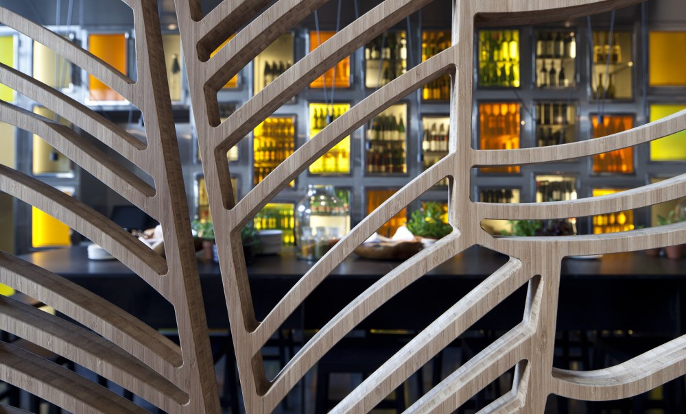
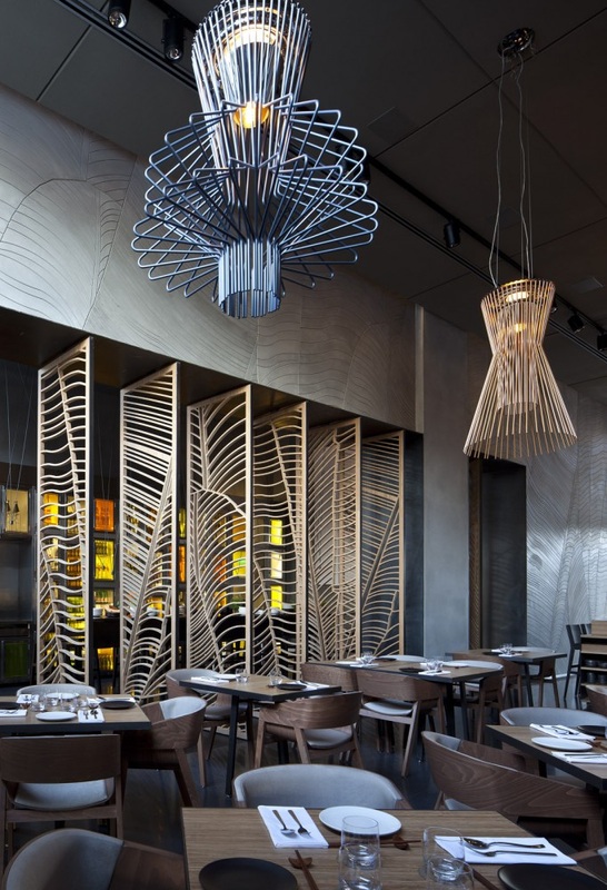
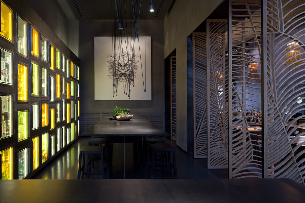
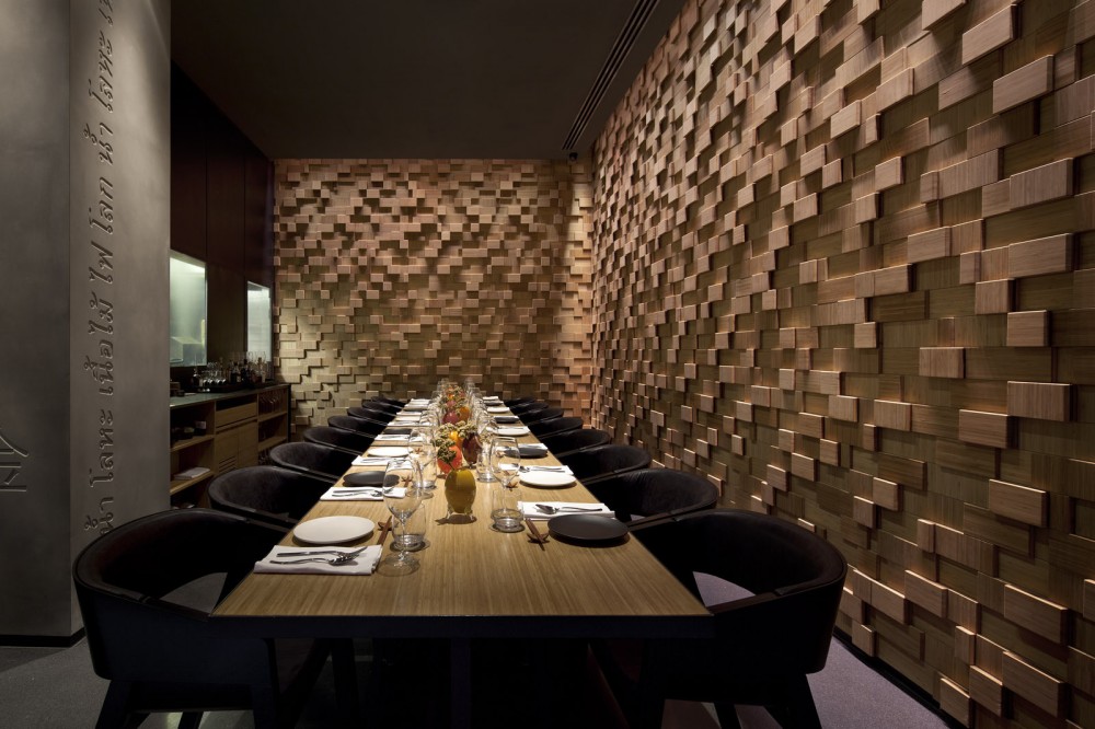
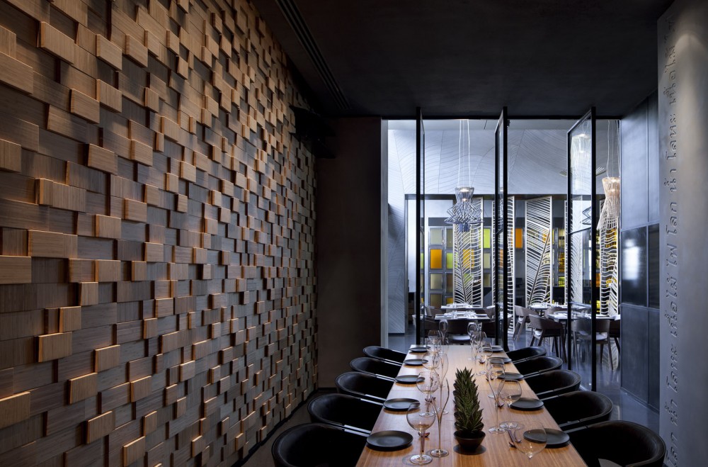
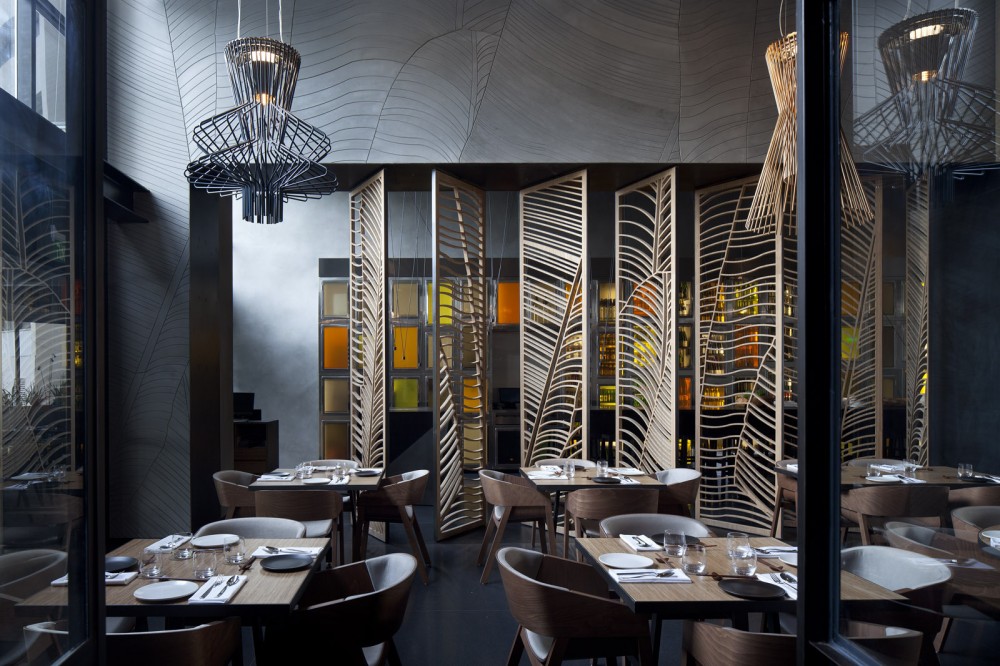
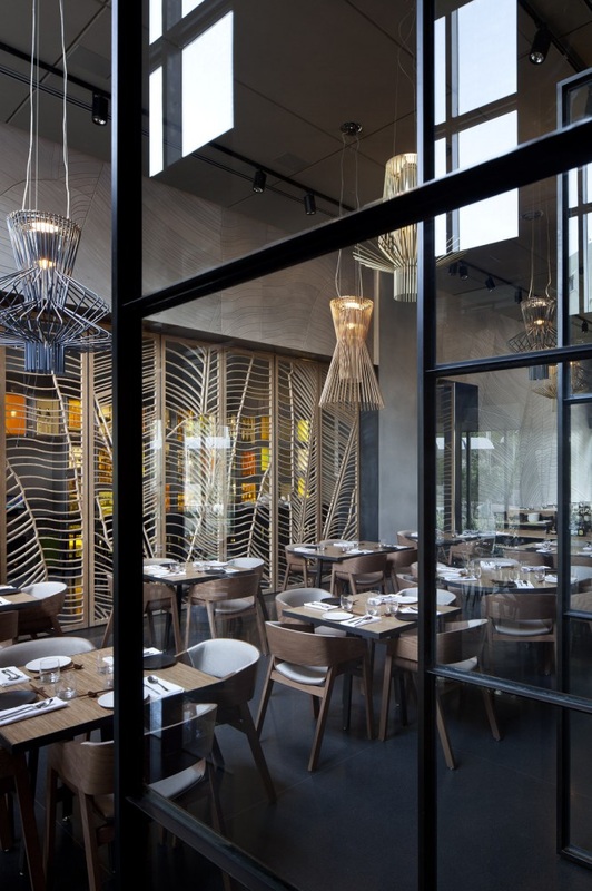
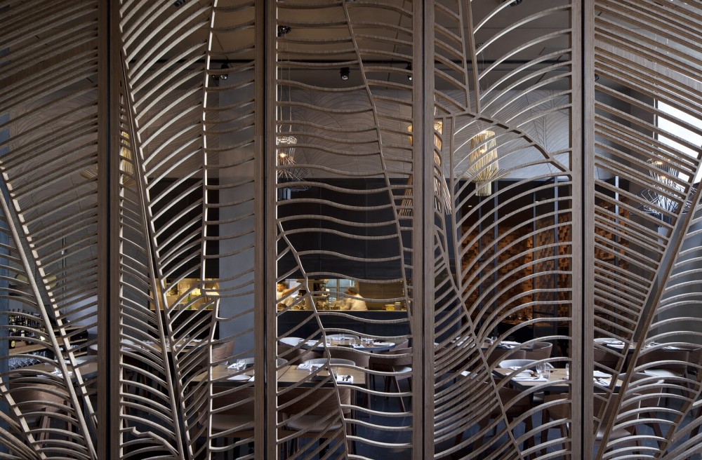
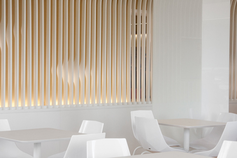
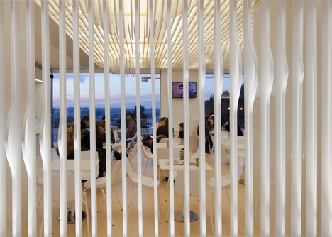
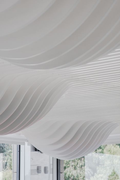
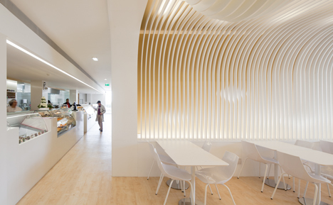
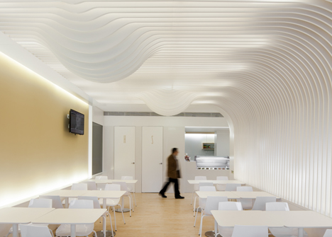
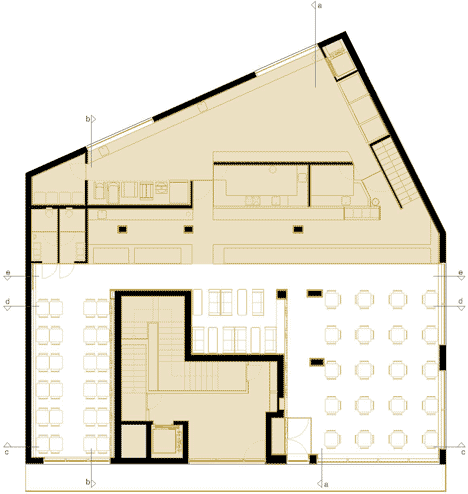
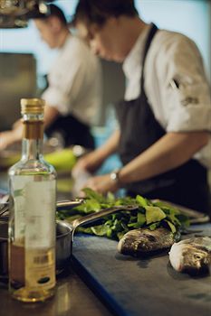
Taizu Restaurant, Pitsou Kedem Architects & Baranowitz Design Studio
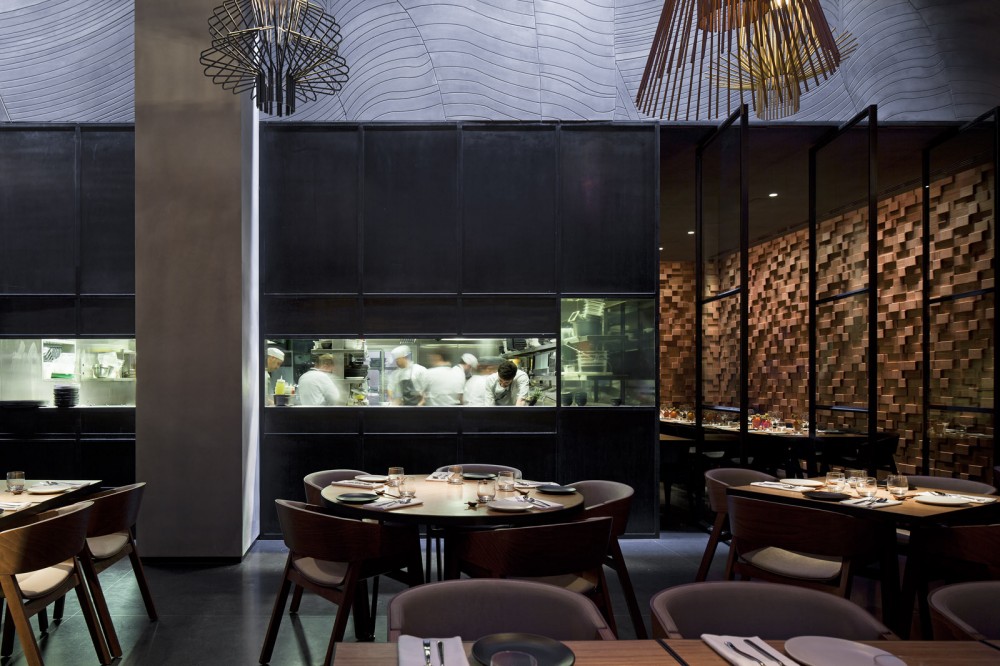
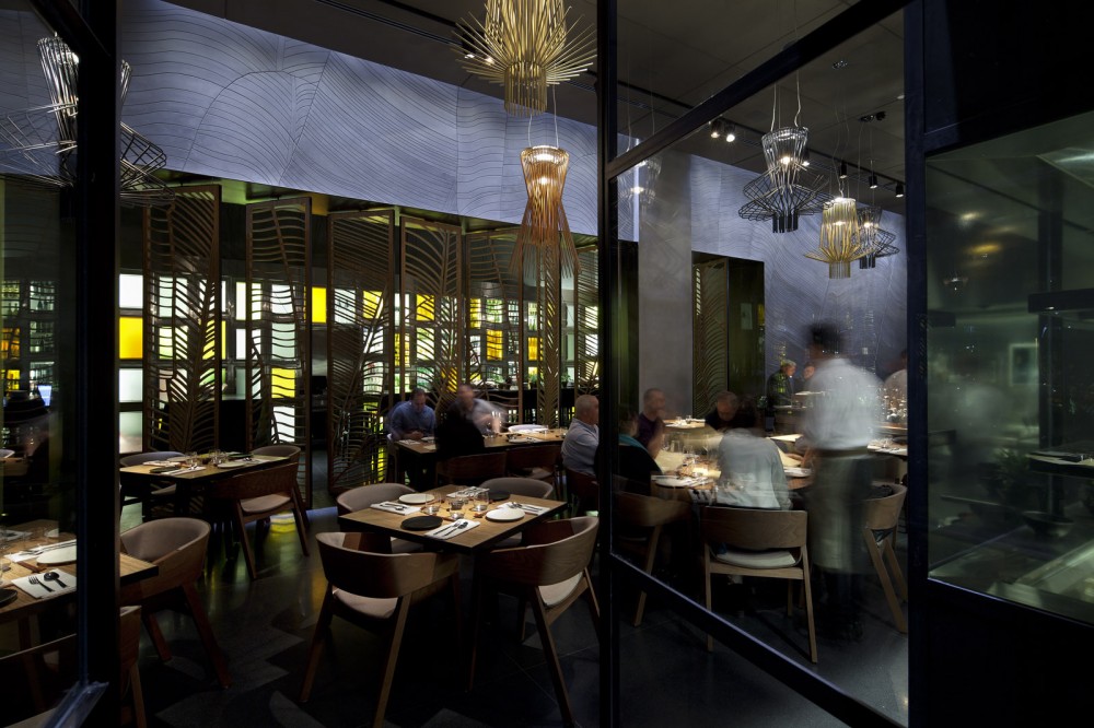
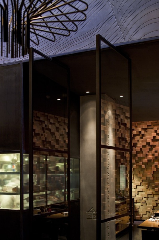
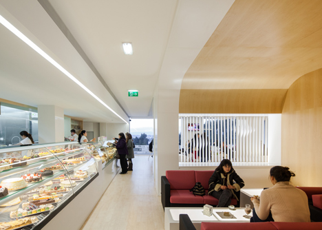
The Taizu Restaurant uses texture, colour and light within the dark space to create this restaurant environment. The Taizu restaurant is a dark space that uses artificial light and texture to create the space. The screens used to separate the spaces off are effective in separating the spaces but also allowing light to flood through the gaps creating shadows and interesting spaces. Like the Short Hill space this design example is relatively dark and contains many private dining spaces. The combination of materials creates a tactile approach to the design allowing the customer to interact with the space. The use of bottles within the wall behind coloured glass also adds light to the building. The use of a open front kitchen also allows customers to see into this space to allow them to see how the food is prepared.
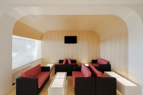
The restaurant uses a combination of concrete, wood, metal and glass. There are also a combination of light and dark space with a larger open plan restaurant is a light space which appears to be lit from above creating a light atmosphere. The private spaces are darker creating a small intimate environment for groups of people to socialise and talk whilst enjoying their meal. This idea would be able to work well within the Short Hill building that I am using. The 2nd (top) floor that will be used for the private dining space. This is a dark space which would be suitable for creating these small and intimate environments.
The restaurant uses a combination of concrete, wood, metal and glass. There are also a combination of light and dark space with a larger open plan restaurant is a light space which appears to be lit from above creating a light atmosphere. The private spaces are darker creating a small intimate environment for groups of people to socialise and talk whilst enjoying their meal. This idea would be able to work well within the Short Hill building that I am using. The 2nd (top) floor that will be used for the private dining space. This is a dark space which would be suitable for creating these small and intimate environments.
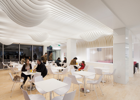
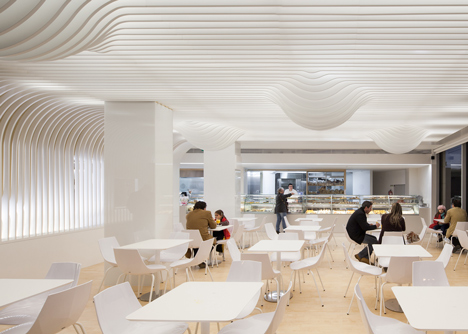
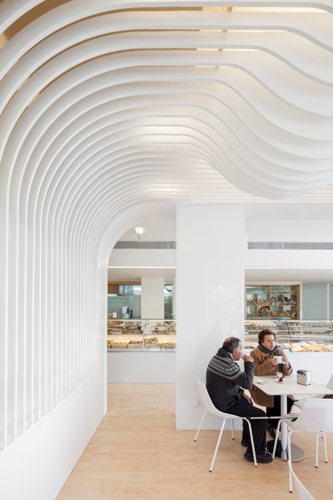
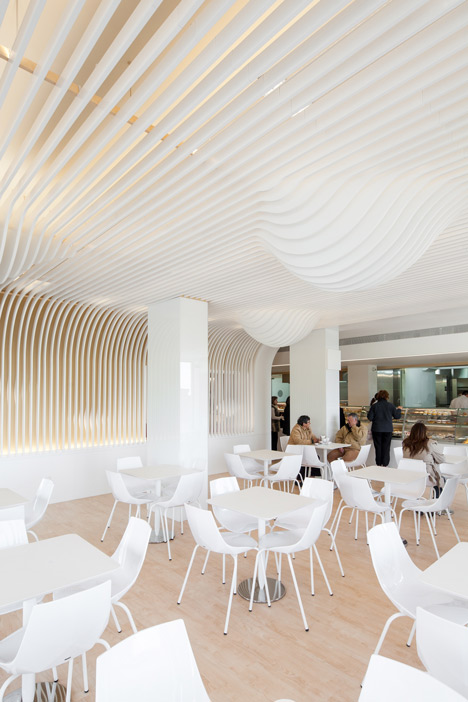
Bakery In Porto, Paulo Merlini
This bakery in Porto is a bakery space with a cafe designed by Paulo Merlini. It is a light space with a curved effect ceiling. This precedent was selected due to its function. This a light and clean space which has the added detail in the curvature of the roof. A combination of table space for dining and sofas to allow people to site and relax and enjoy the space. The plans for the bakery allow you to see the space required for the building for the kitchen, storage and dining space.
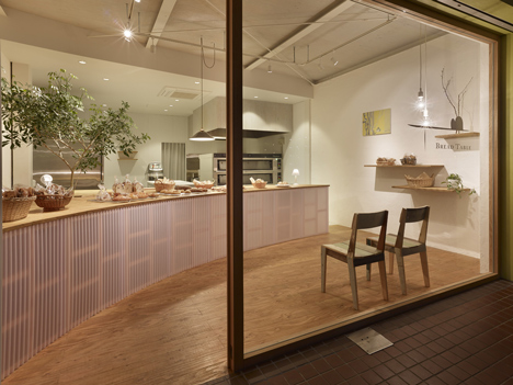
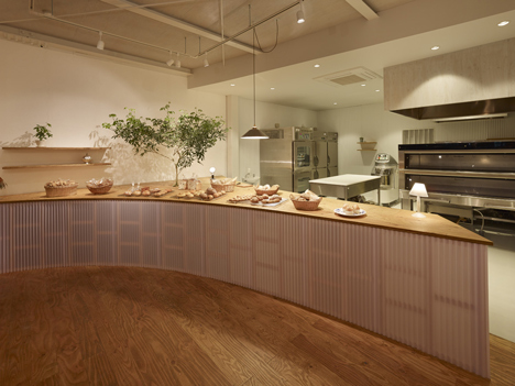
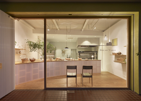
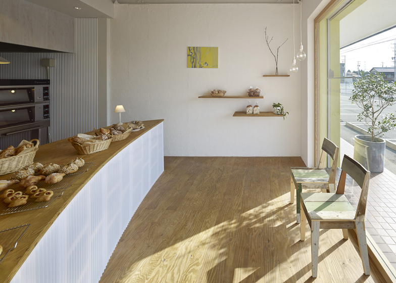
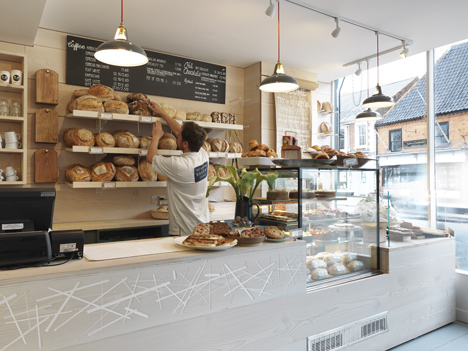
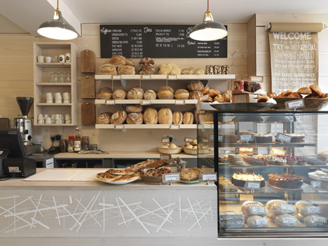
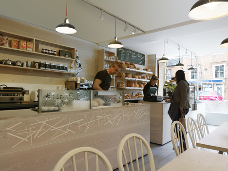
Bread Table, Airhouse Design Office
The Bread Table is a small bakery that has been developed by the Air House Design Office. Looking at the example showed what could be done in a small space to create a deli shop experience within the concept that is being developed. This example shows how the space can be developed to display the products as required. The space is completely open with the counter acting as the definition between the customer and staff spaces. The front glass facade brings in the necessary light into the building to create a light and natural environment. The colours used are pale and natural with the addition of the green from the tree within the interior design. The use of the curved counter is in contrast to the square a straight lines within the rest of the design of the space.
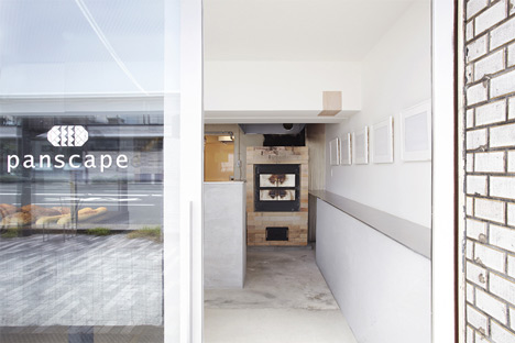
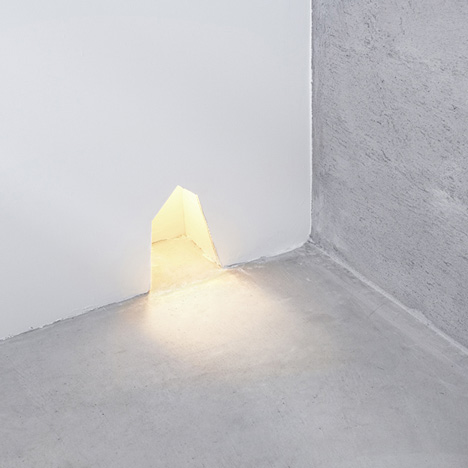
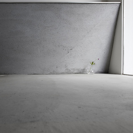
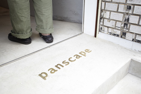
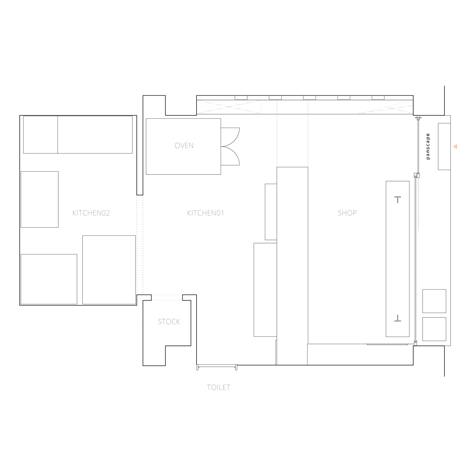
Panscape, Ninkipen!
Panscape is a again a small space due to the nature of the space within the Short Hill building that is to be developed into the deli shop space. The Panscape bakery uses natural materials - such as the oak beam in the window displaying the products. This creates a rustic interior within a clean, white and light space - due to the front glass facade. The design is simple and clean and allows the customer to view the products within the bakery.
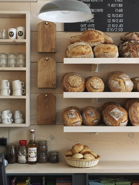
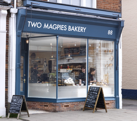
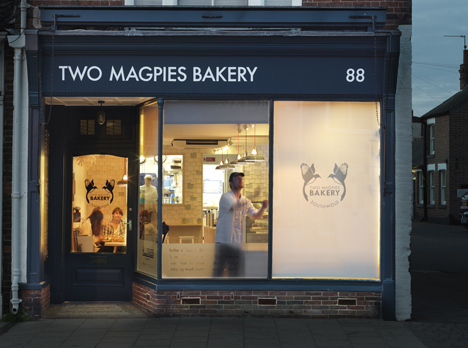
Two Magpies Bakery, Paul Crofts Studio
Looking at examples of how products can be displayed for sale within a deli shop environment. The vintage style of this bakery uses a combination of the counter, shelfs and boards that inform the customer what is on sale. The example of the Two Magpies Bakery is an interior design example which was looked at simply for the organisation the space within the building. This allowed for the use of colour and materials to be looked at and how they work within the space.
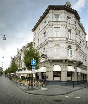
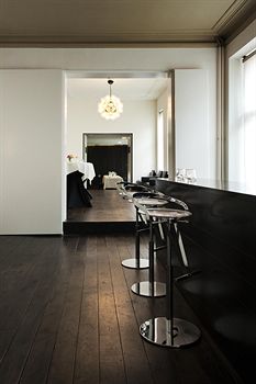
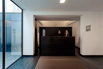
Hotel Beaumount, David Chipperfield
Looking at the work by David Chipperfield the Hotel Beaumont was discovered. Based in The Netherlands, the hotel interior has been redeveloped by Chipperfield's office to give a modern update to the space. The project took place between 2002 and 2005. The hotel originally found in 1912 is a 4 storey building which was built in 1885 - the Hotel Beaumont has since developed into a 121 bedroom modern 4 star hotel. The monochrome interior uses simple lines to separate the spaces. The hotel interior designed by Chipperfield has a modern approach which aims to maintain the history of the building and the typical features to ensure that the building maintains its long history but with a modern twist.
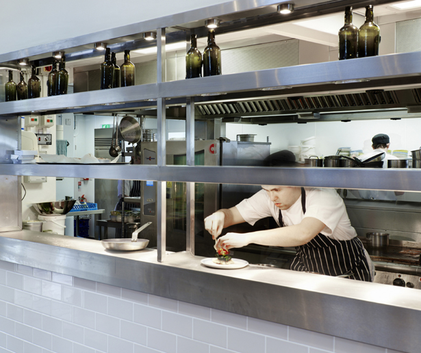
The kitchen again is open front space that is open for all to see into the space where the food is being prepared. This openness of the kitchen allows for the smell of cooking to drift out of the space as well as the hustle and bustle of the kitchen being visible to those dinning within the restaurant. This idea within this design is a concept that can re worked as used within the development of the kitchen space within the restaurant concept that is being developed. This would allow the views into the kitchen to be framed. The idea of framing the plating up area of the kitchen to display the food like art could create a space that is appealing to all customers to allow them to see the food they are receiving being cooked fresh.
The kitchen again is open front space that is open for all to see into the space where the food is being prepared. This openness of the kitchen allows for the smell of cooking to drift out of the space as well as the hustle and bustle of the kitchen being visible to those dinning within the restaurant. This idea within this design is a concept that can re worked as used within the development of the kitchen space within the restaurant concept that is being developed. This would allow the views into the kitchen to be framed. The idea of framing the plating up area of the kitchen to display the food like art could create a space that is appealing to all customers to allow them to see the food they are receiving being cooked fresh.
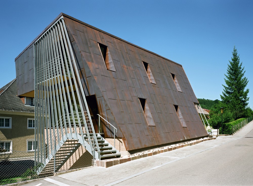
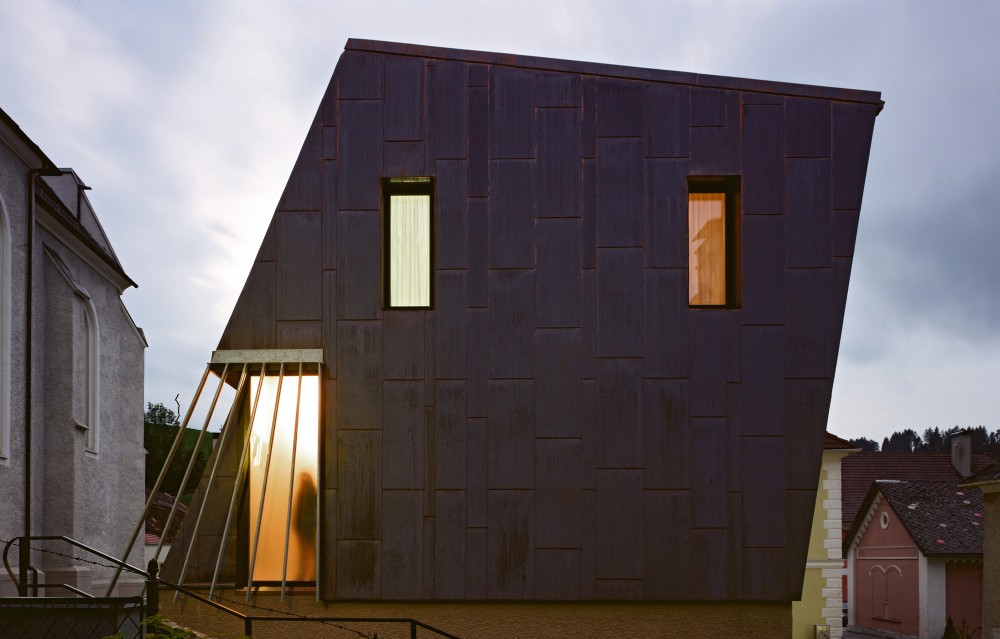
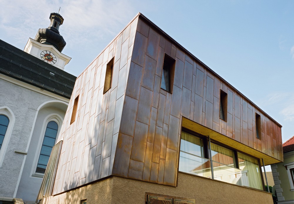
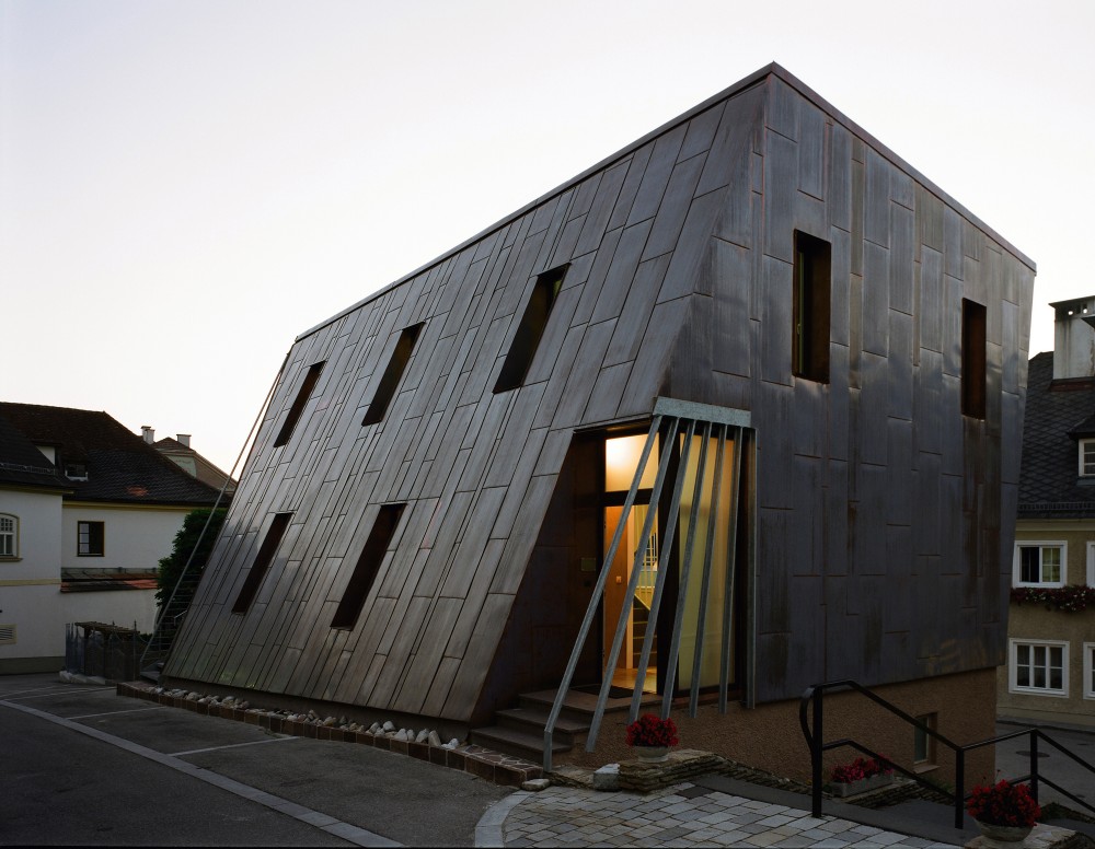
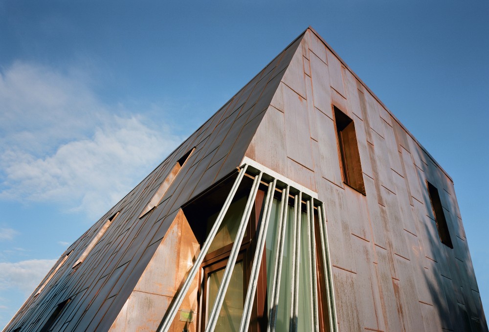
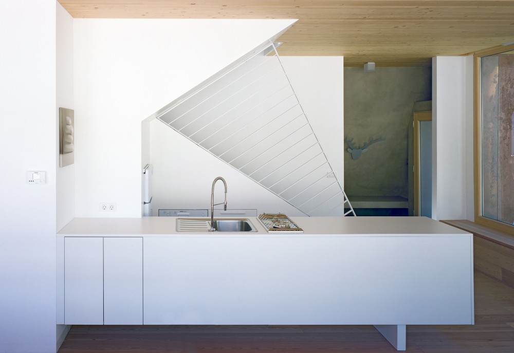
Das Aigner, Kleboth Lindinger Dollnig
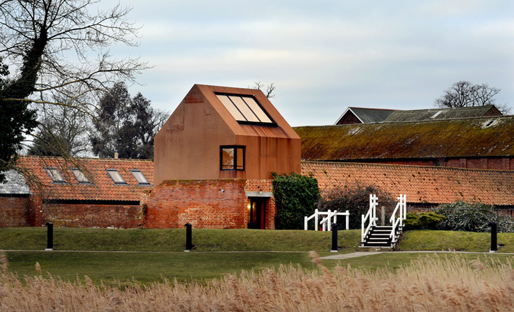
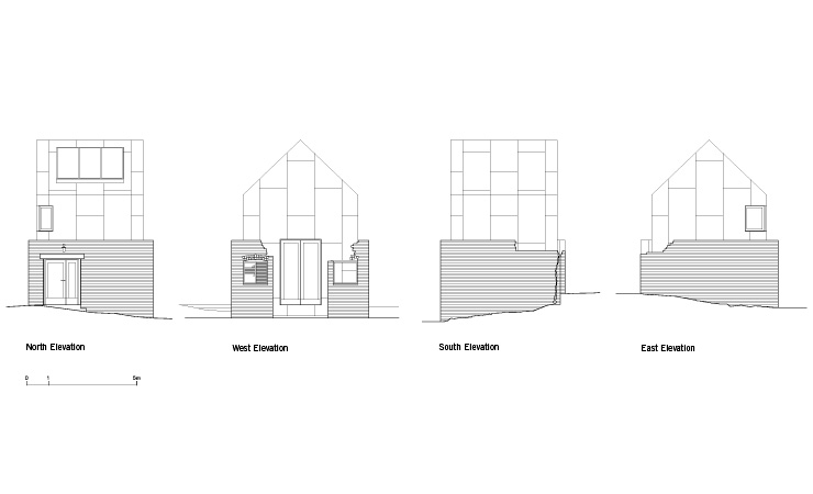
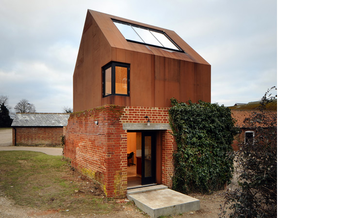
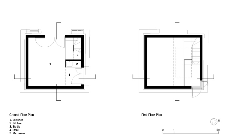
Das Aigner is a design precedent was looked at due to the slanting walls within the design. The building shows how the spaces are affected by the slanting and how this would impact the space. The idea of playing with the walls and the floor levels would also create and interesting environment. Although externally the slant is noticeable inside the space is subtly adjusted to make the user question the space that the person is within. This idea of questioning the space that you are within will create an experience for the user and to look at their surroundings to question what is around them.
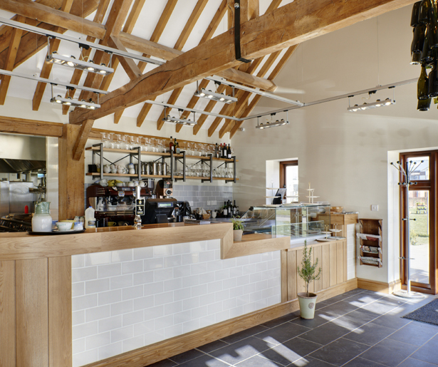
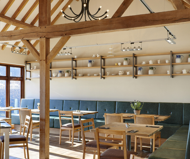
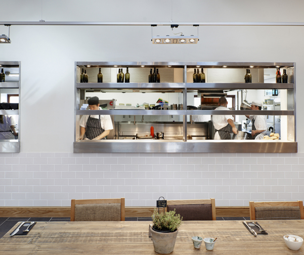
The Ludlow Kitchen, Catering Design Group
I came across the Catering Design Group over a year ago in a magazine and have continued to follow their work ever since. I selected several precedents from their list of projects on their websites. The first is the Ludlow Kitchen, the design uses a combination of interior decor fitting the building along with architectural details such as seeing into the new modern kitchen. The space allows the customer to sit within several different spaces to get a different experience depending on the space. Looking at this example also showed different way in which products could be displayed within the deli store. Using a rustic approach to suit the fresh and and homemade approach to the deli shop. Using the methods within the Ludlow Kitchen with the moveable shelving would allow the shop to be changed around to create different spaces.

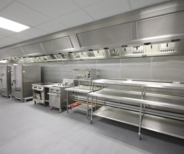
The Sliverstone Wing, Catering Design Group
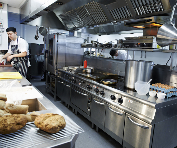
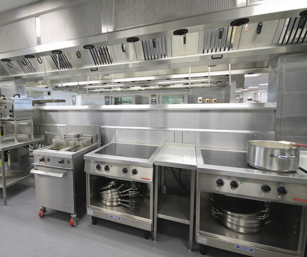
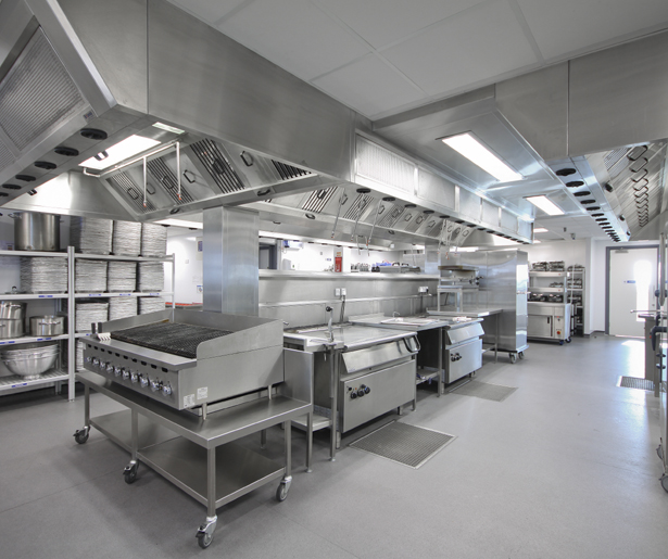
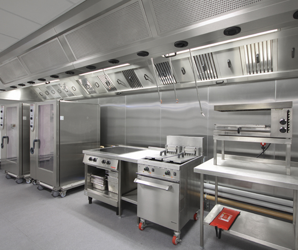
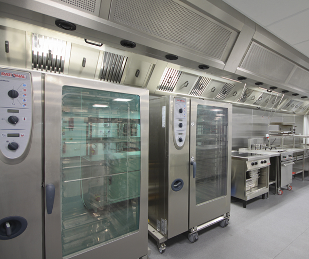
The Silverstone Wing is a design example that has not been selected due to its architectural qualities but more for the example of the professional kitchen to look at the layout, space between worktops, the how the kitchen space has been used. This is a larger kitchen space then what is available with the concept developed for Short Hill but this is also due to the number of people the space needs to be able to cater for. Looking at this example has shown how the space can be filled with the required elements and that the work benches should be positioned so that the user can easily swap between space due to the work tops being close together. The space also shows how the kitchen aspect of the design also needs to be clean lined and practical. Whilst developing a suitable interior architecture project with regards to the restaurant spaces and the cooking school there also needs to be a balance to create a practical and functional space alongside the other aspects of the buildings to ensure it is a suitable and viable final concept for a restaurant. This does not mean that the design will not correlate with the other spaces as the kitchen will be on show within the building the consideration of the spaces practicality and the need to meet regulations needs to be a main factor as the kitchen space is developed.
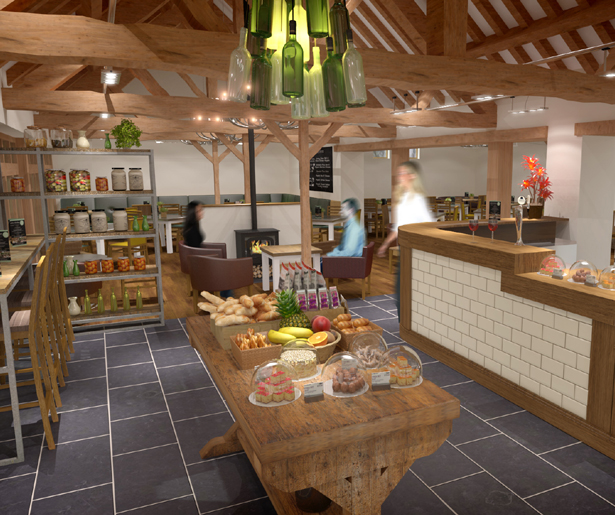
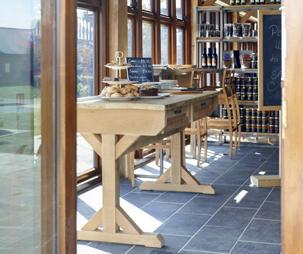
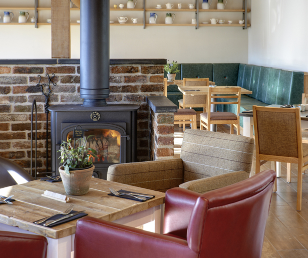
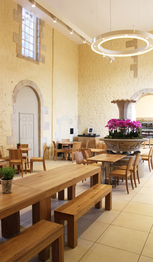
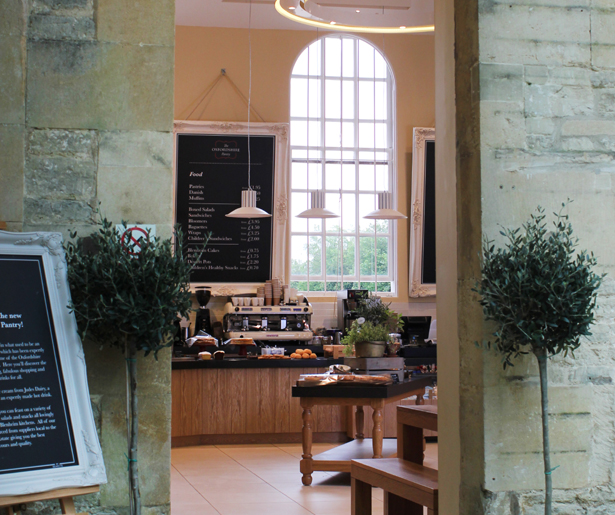
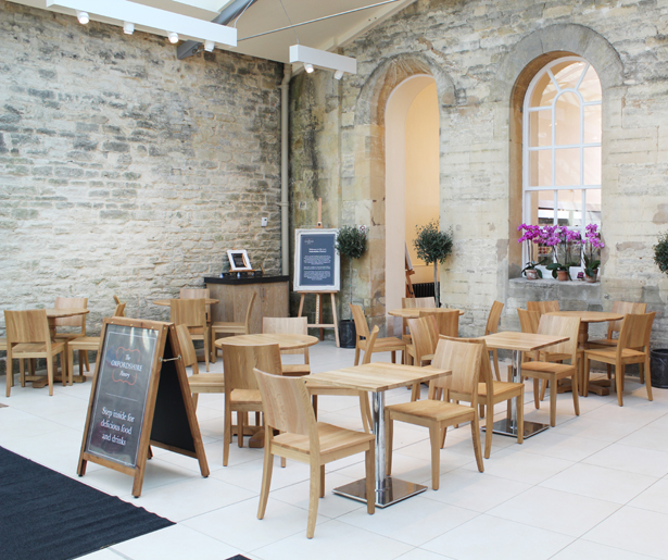
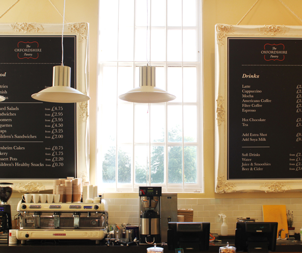
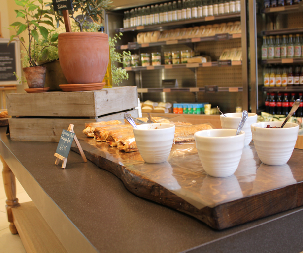
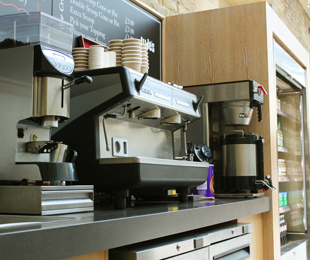
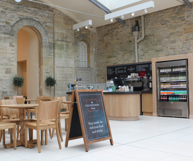
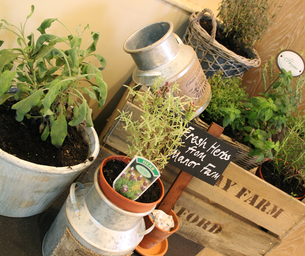
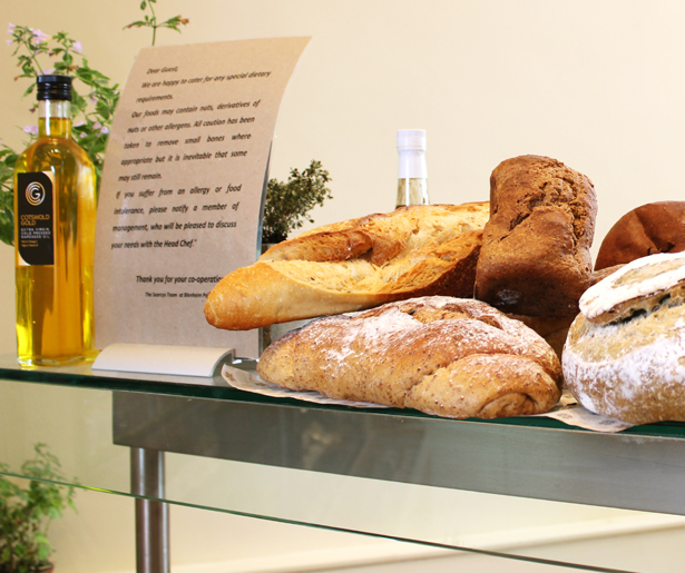
The Oxfordshire Pantry at Blenheim Palace, Catering Design Group
Again an example from the Catering Design Group this cafe space known as The Oxfordshire Pantry at Blenheim Palace is an example that looks at how a space has been organised and aspects of it displayed rather than the architectural qualities. I feel that it is necessary to get a balance between the architecture and the visual appearance of the space as it is both of these aspects working together that will attract and enhance the customers experience within the space. This project was selected as an example as it uses a combination of the old and the new - a design features that personally appeals to me and I feel that in the case of this project and the concept that I am creating for Short Hill this allows for an element of the buildings history to be retained. Looking at this example also showed the relationship between the furniture, how the space has been organised and how aspects can be displayed within spaces. As the deli shop and the cafe are both prominent within the concept for Short Hill being on the basement level where the entrance to the building is the spaces need to be innovative and appealing to the customer to grab and maintain their attention.
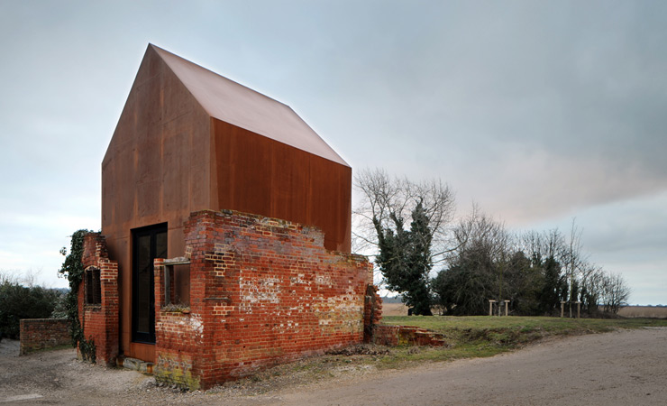
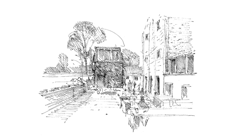
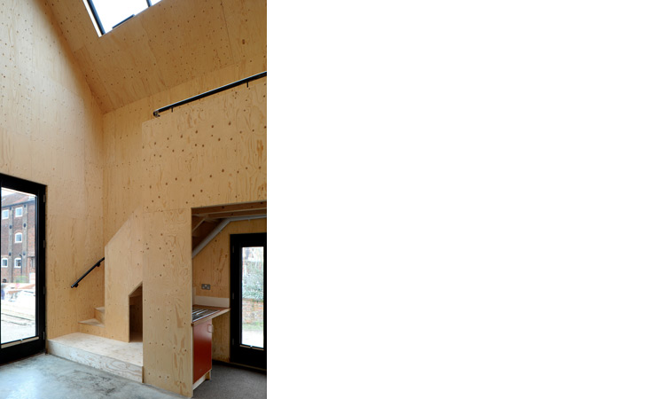
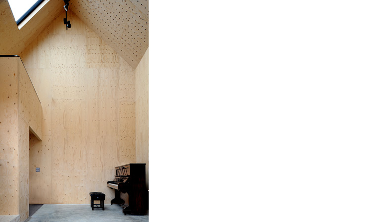
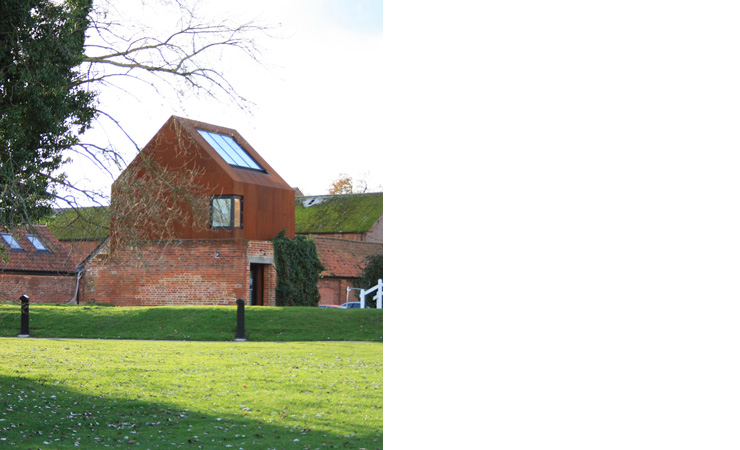
Dovecote Studio, Haworth Tompkins
The Dovecote Studio is a project by Haworth Tompkins that I have looked at before and personally find very appealing and interesting. The building to be used as a single space studio uses the brickwork from an existing building to create the foundations for this design. Apart from selecting this piece as a design precedent due to its appeal to myself but also as I feel some of design language could be used within development of the new space on the 2nd floor balcony which is currently and external balcony. The space is currently unused and separate from the rest of the building. Within the concept that is being developed I want to join this external space to the 2nd floor which is dedicated to restaurant space and private dining to create a large area. To do this an external structure will be created. The wall around the balcony reminded me of the Dovecote Studio and how the modern intervention comes up out of the old creating the new space. I feel that creating something like this space created by Haworth Tompkins would work well in this space, allow for a generous and beautiful space to be created and also from an elevation point of view create an interesting an unique visual on the Nottingham skyline.
The Dovecote Studio uses a steel material and a pitched roof element. Where as I feel that for this project it works well and that it what makes it such an interesting space for the building on Short Hill I want to create more of a contrast between the new and the old structures. This is an example that I will refer back to during the design development to look at how this one piece structure has been developed.
The Dovecote Studio uses a steel material and a pitched roof element. Where as I feel that for this project it works well and that it what makes it such an interesting space for the building on Short Hill I want to create more of a contrast between the new and the old structures. This is an example that I will refer back to during the design development to look at how this one piece structure has been developed.

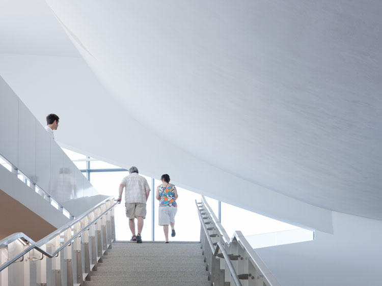
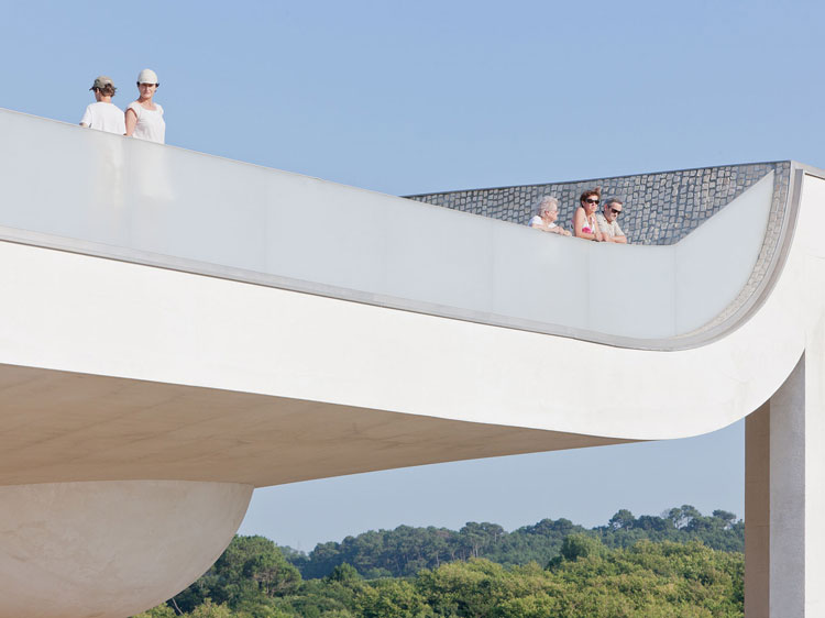
Cite De L'Ocean Et Du Surf, Steven Holl
Looking to create a contrast between the old and the new structures at the site on Short Hill I began to look again at Steven Holl's work. I say look again as because this project aims to accumulate all the work and skills developed over the past year Holl is an example I have looked at within another project during the year with the same goal of creating a contrast between old and new. This example of Holl's is the Cite De L'Ocean Et Du Surf - a museum in France. What I like about Holl's work is how the building does not appear to be overcomplicated. Although the consideration and thought behind the project would be the same as any fancy skyscraper the simplicity of this building is beautiful to look at. The building itself is a museum that works to raise awareness of oceanic issues and allow people to look at the influence of the surf and the sea upon leisure, science and ecology. The buildings seamless design fits perfectly within the landscape surrounding the site.
It is Steven Holls reoccurring use of plastic within the schemes he develops that is what has drawn me to his work. With the goal of creating a contrast between the old grade II listed structure of the Short Hill building which dates back to 1860 the use of a structure like this alongside the brickwork would create an interesting juxtaposition within the design. Having explored plastic as a building material previously I feel that the benefits of using it and the visual output are fantastic. Using Steven Holl's technique of creating simple yet affective exteriors through the use of plastic is a design technique I hope I will be able to transfer into my design concept.
It is Steven Holls reoccurring use of plastic within the schemes he develops that is what has drawn me to his work. With the goal of creating a contrast between the old grade II listed structure of the Short Hill building which dates back to 1860 the use of a structure like this alongside the brickwork would create an interesting juxtaposition within the design. Having explored plastic as a building material previously I feel that the benefits of using it and the visual output are fantastic. Using Steven Holl's technique of creating simple yet affective exteriors through the use of plastic is a design technique I hope I will be able to transfer into my design concept.
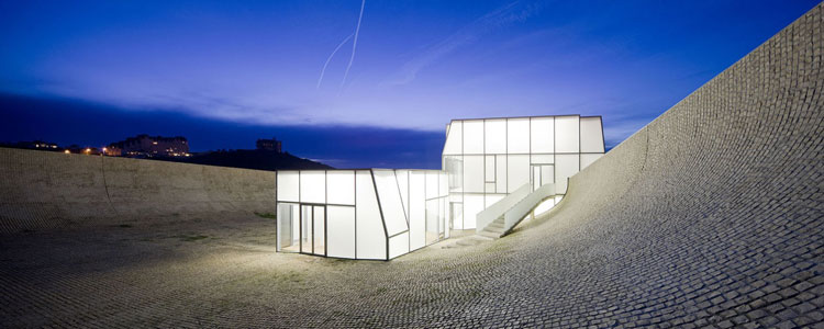
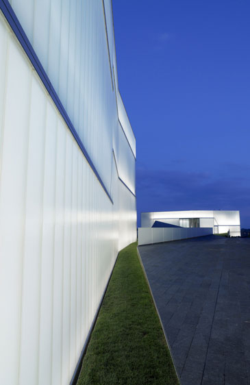
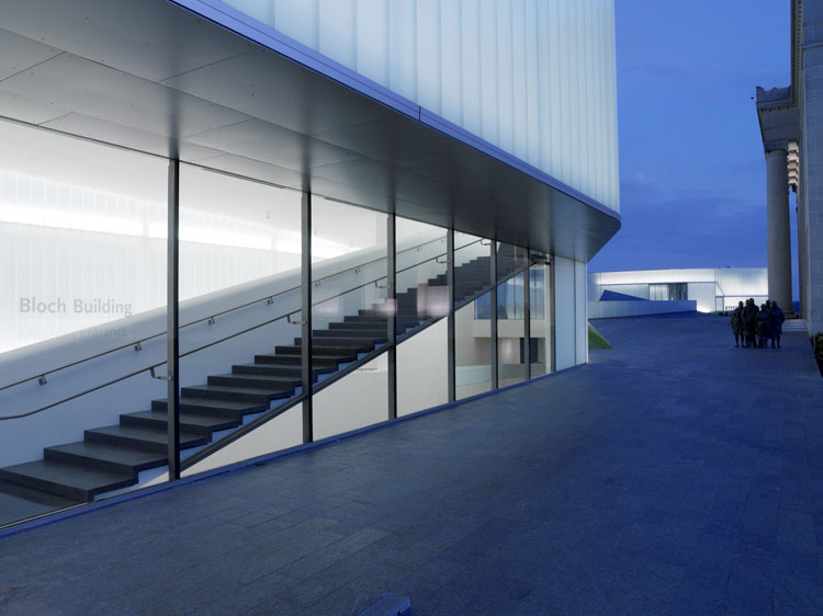
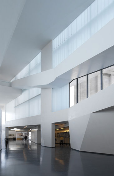
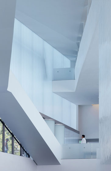
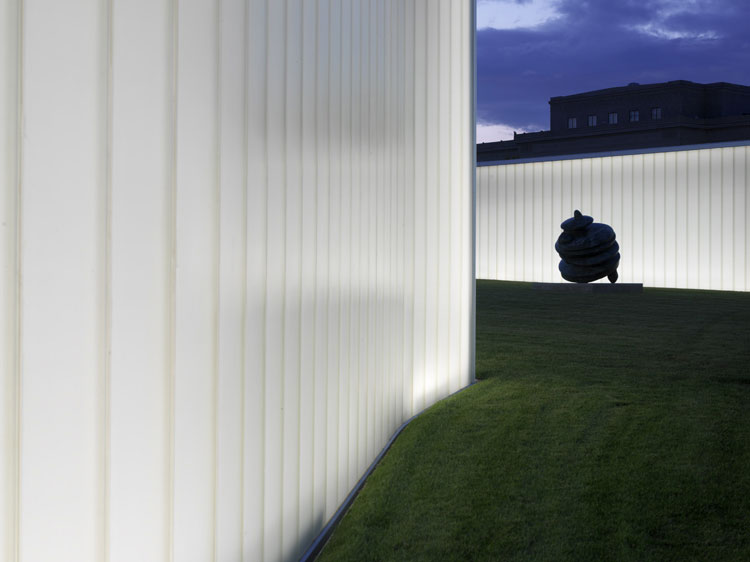
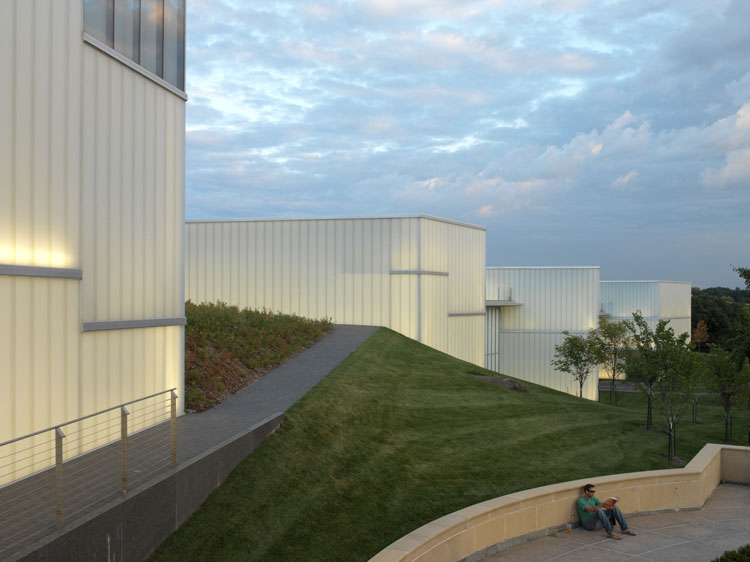
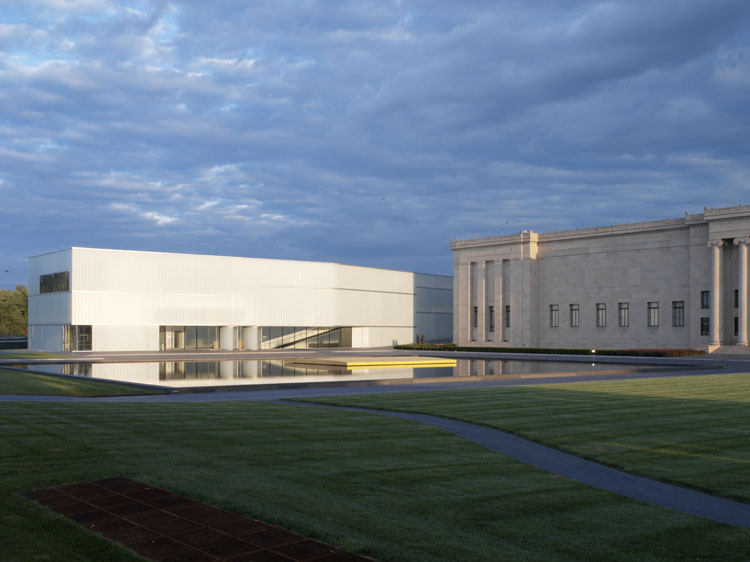
The Nelson-Atkins Museum Of Art, Steven Holl
The Nelson-Atkins Museum Of Art in Kansas City, USA is another piece of Steven Holl's work that used plastic as the main building material within the design of the space. The building itself was a competition entry that won, the scheme has been created from five linking structures that work together as spaces rather than one large structure. Working with the existing buildings on the site these five spaces which have been called - lenses create new spaces and angles of vision within the site. This idea of creating five interlocking spaces which all work together around an existing structure is an interesting concept for creating space. Holl has once again used the juxtaposition of the existing structures on the site with the new plastic spaces which are clean lined, white, open and light. The use of this material creates an interesting yet peaceful atmosphere on the site.
It is again the contrast between the new and old that I find intriguing about this project. The use of lighting within the project also creates and interesting and unique landscape across the site. This is an aspect that I feel would well on the Short Hill site. The existing building has a prime location within the Lace Marker which looks out across the city. Using a material and lighting techniques like Holl has used here would allow for not only interesting interior spaces to be created but also the elevations would be visible and unique within the city - an aspect which would attract customer to the building.
It is again the contrast between the new and old that I find intriguing about this project. The use of lighting within the project also creates and interesting and unique landscape across the site. This is an aspect that I feel would well on the Short Hill site. The existing building has a prime location within the Lace Marker which looks out across the city. Using a material and lighting techniques like Holl has used here would allow for not only interesting interior spaces to be created but also the elevations would be visible and unique within the city - an aspect which would attract customer to the building.
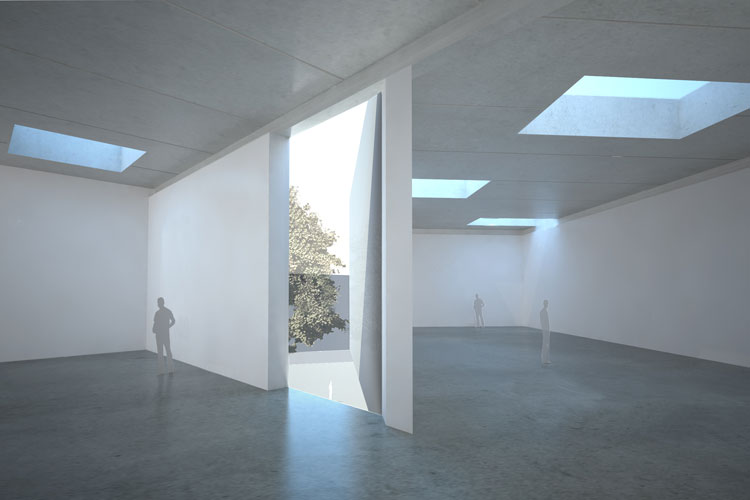
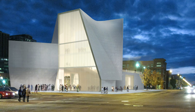
Institute For Contemporary Art Virginia Commonwealth University, Steven Holl
The Institute For Contemporary Art Virginia Commonwealth University due for completion in 2015 has been designed to be built on the edge of the University campus in Richmond Virginia. This new Institute for Art has been designed to created a link between both the university and the surround community around the campus. The building aims to "form a gateway to the University with an inviting sense of openness".
The design along with the combination of materials used within this project is what made me select this work as a design precedent for my project. The use of the light alongside the plastic structure with the use of concrete to form some of the buildings walls is a combination that visually works well together and internally would create a series of light and dark spaces working alongside each other. This design precedent was selected with an element of the design concept in mind. To create an entrance to the building and the the site on Short Hill a tunnel is to be created using a plastic material to create the structure - this will then be developed into a 4 storey high extension to the space. Using the plastic to create space is suitable for some of the building aspects within this area but to create a more intimate space in others the use of concrete would allow for a darker yet warmer space to be created compared to the use of plastic which would give a continual light space.
The use of plastic of varying transparencies would also allow for light and movement to be seen without defining a specific shape or object. This would allow for interesting spaces to be created. Using a plastic to create some of the internal walls within the building would create the required privacy but at the same time allow other customers to question what the purpose of the space is and who is using it as this questions could not be answered without entering the space creating an aspect of mystery and questioning - a action that the building wants the customer to do.
The Imperial War Museum, Daniel Libeskind
The Imperial War Museum can be found in Manchester on the bank of the Manchester Shipping Canal. The design by Libeskind is based around the concept of a globe which has been broken into fragments - the 'shattering' effect that war has had on our world. The Imperial War Museum in Manchester by Daniel Libeskind is a design precedent that I decided to look at due to the curved floor that Libeskind has used and his use of levels. I want to use this idea of Libeskind's curved wall and use this to create a sloping floor and ceiling within one of the spaces to work to create an also illusion. The sloping space will have slight slope that will crete a varying level though out the room.
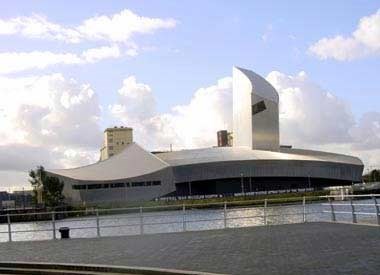
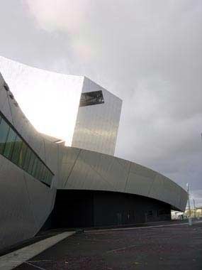
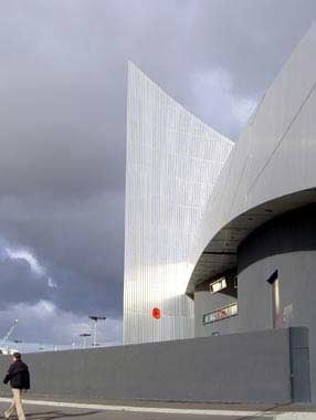
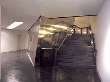
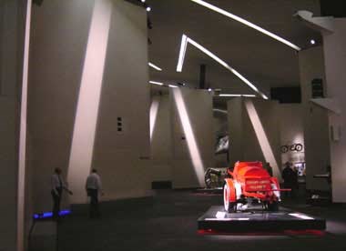
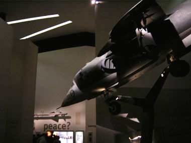
A video showing the design of the Imperial War Museum in Manchester by Daniel Libeskind
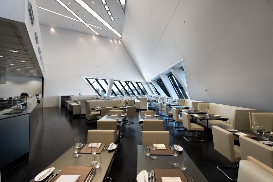
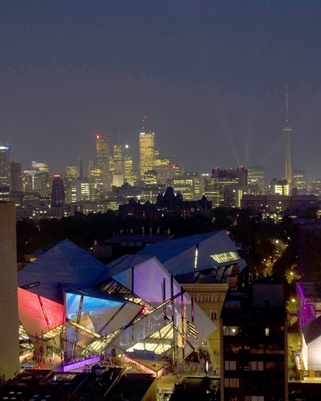
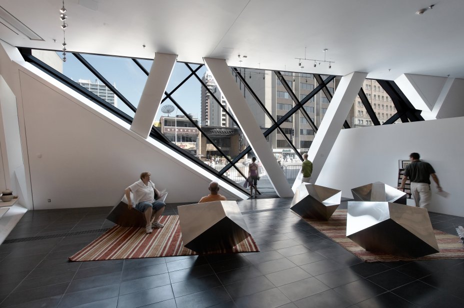
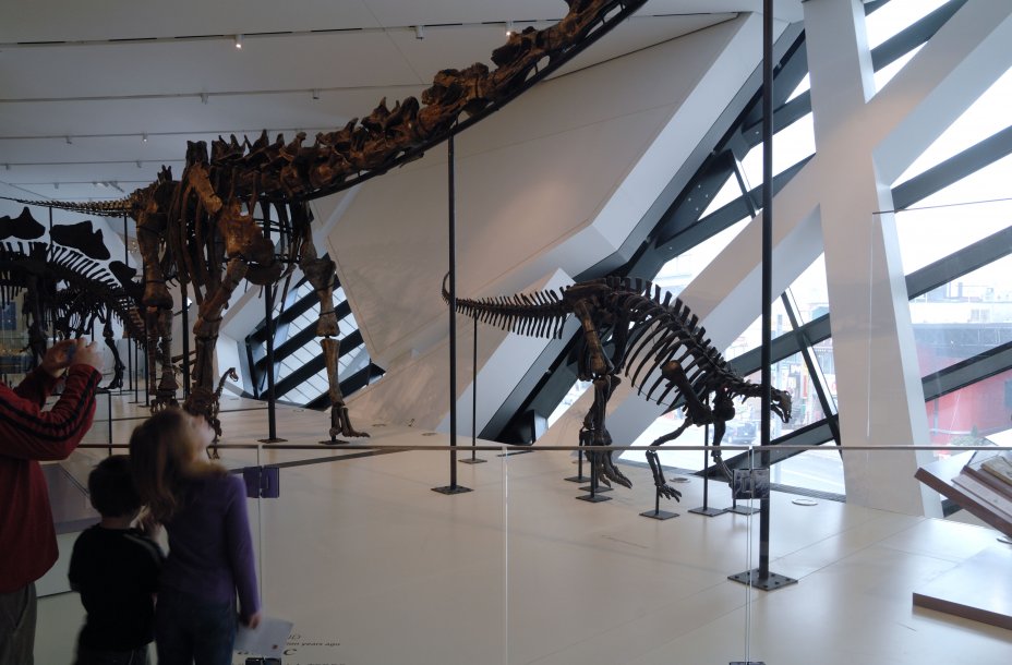
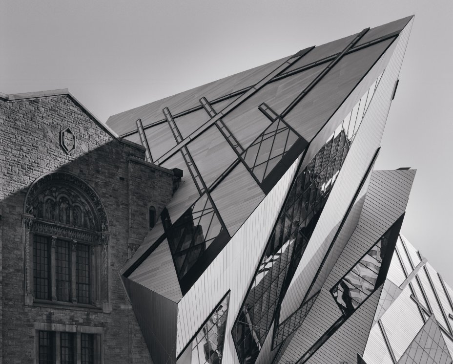
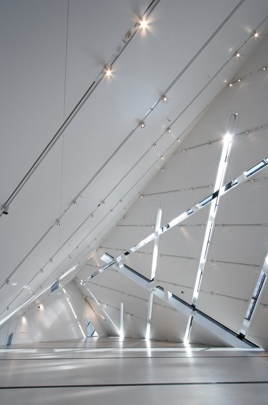
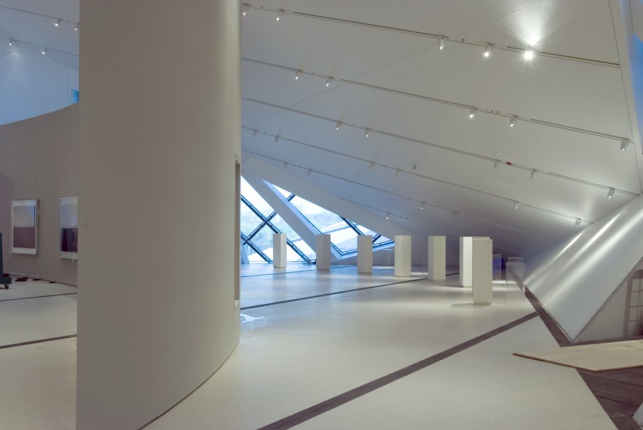
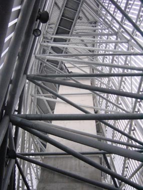
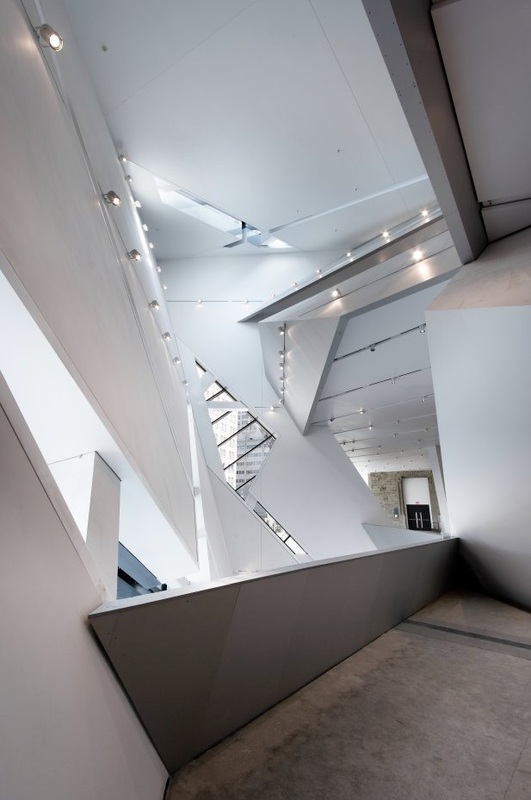
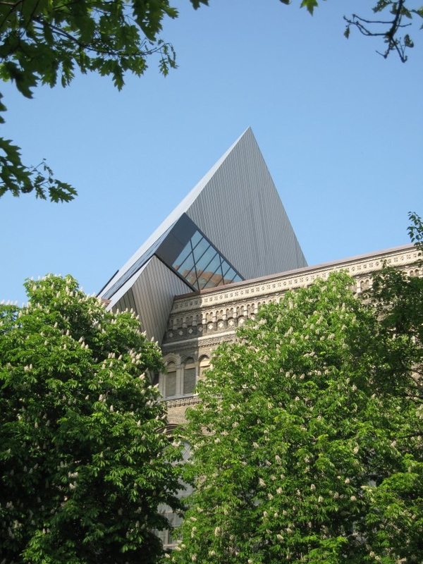
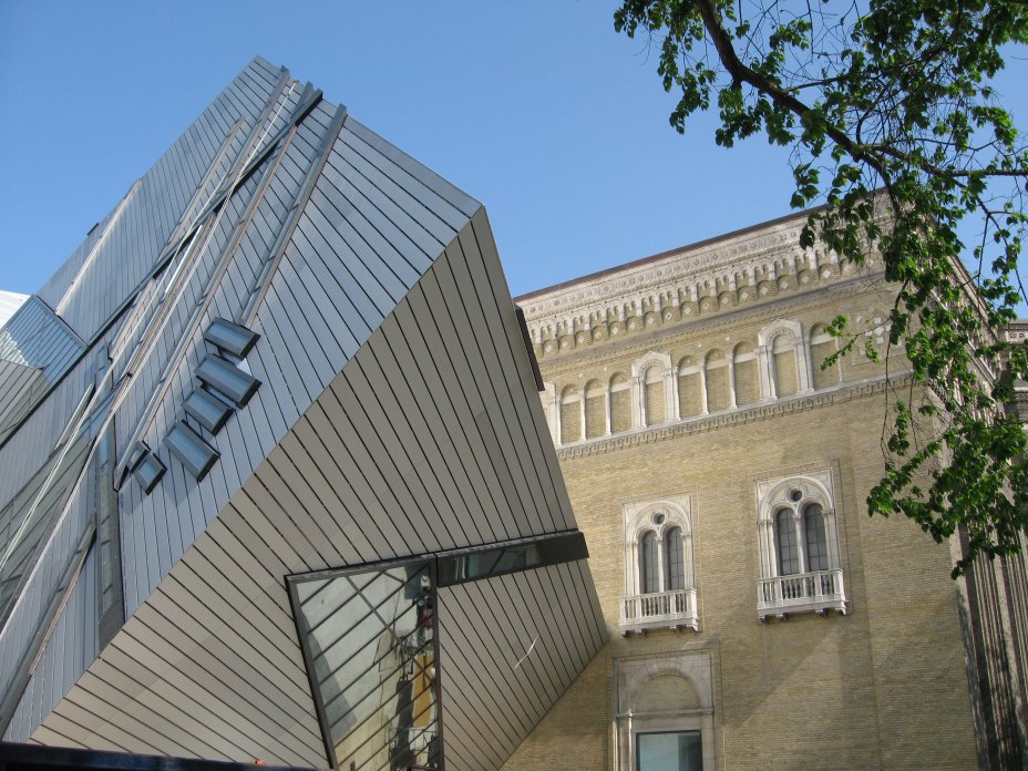
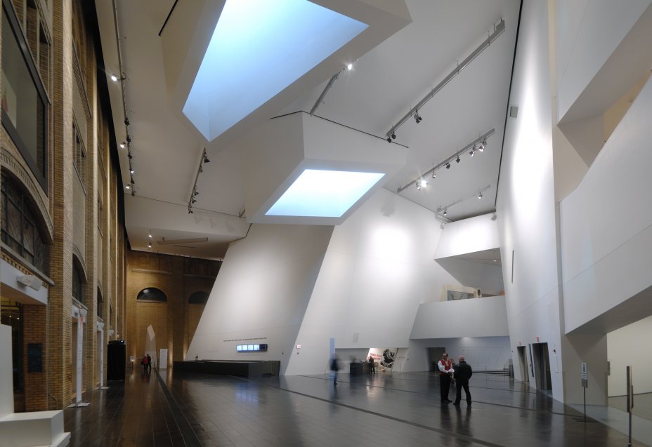
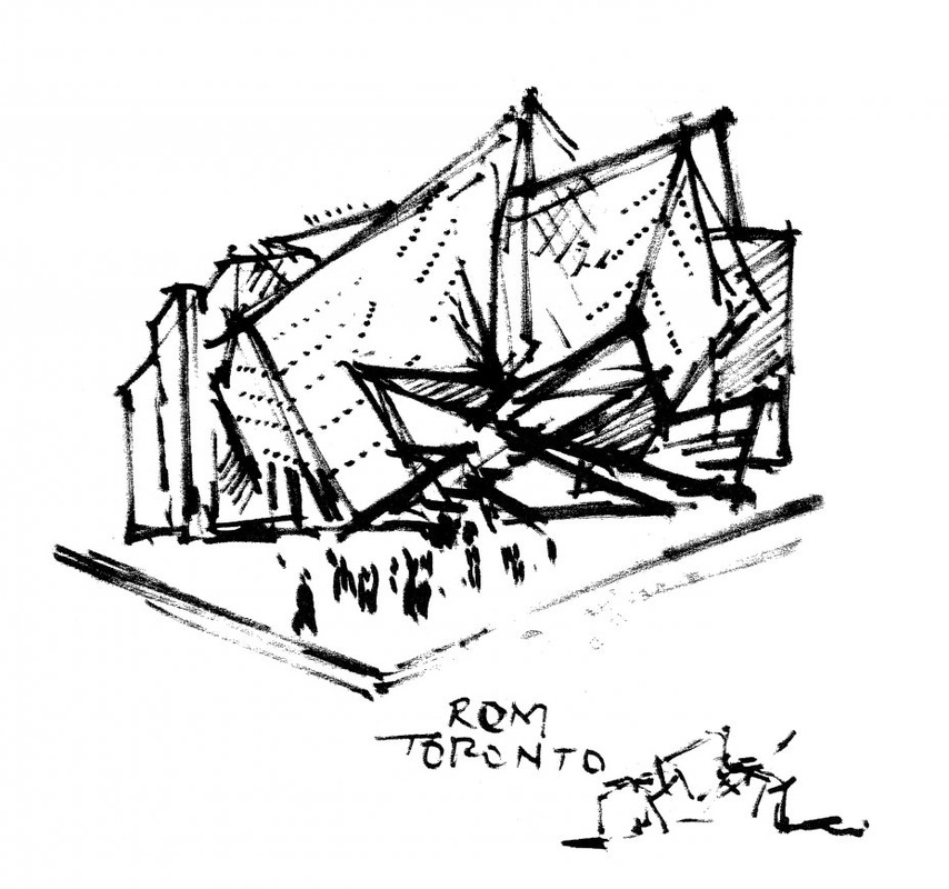
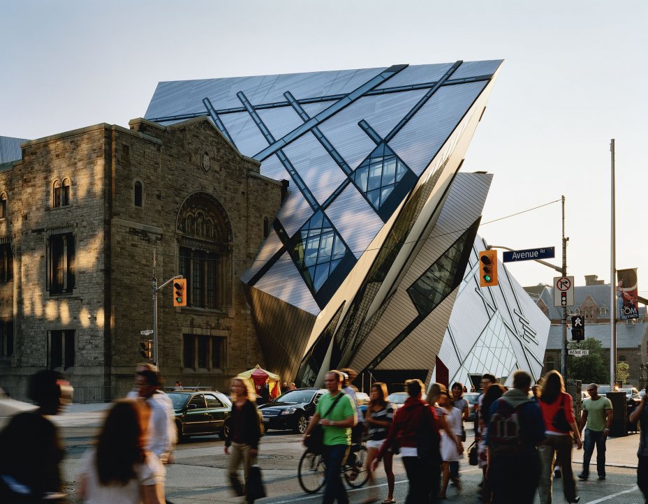
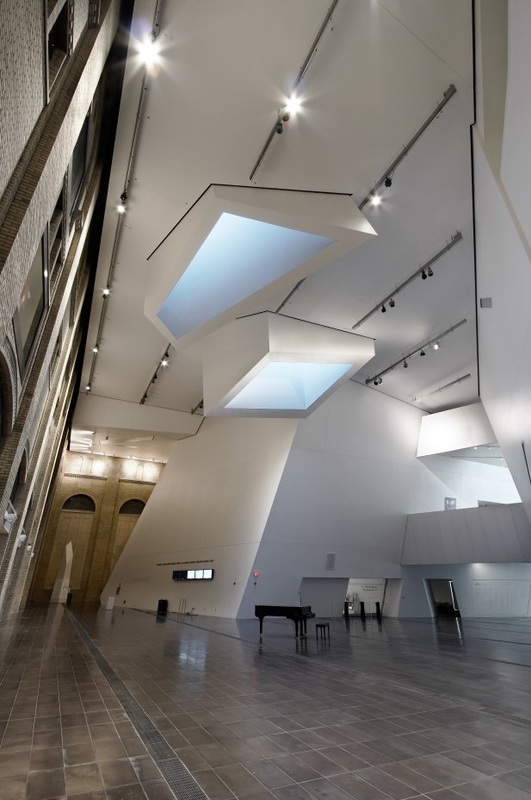
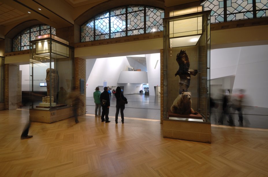
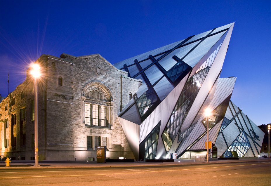
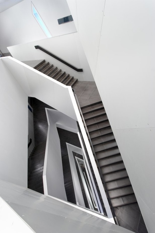
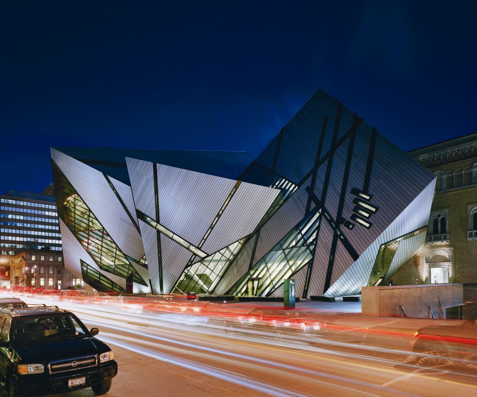
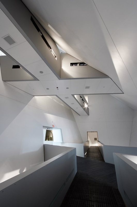
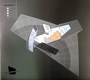
Royal Ontario Museum, Daniel Libeskind
Whilst looking at the Imperial War Museum by Libeskind I came acorss another of his projects - Th Royal Ontario Museum. The building is an extension to the existing building - the Royal Ontario Museum which has been renamed the Michael Lee-Chin Crystal is located in the downtown Toronto - the building was opened in 2007.
With the addition of an extension to the Short Hill building I want to create a contrast between the old and the new - something that we can see within the design of Libeskind's Museum. The use of the contrasting materials create the interesting juxtaposition that I am aiming to create with the design and the space that the concept is to create. This example of Libeskind Museum in Toronto also uses the idea of slating walls and angled spaces. Using the space in the Short Hill building using this affect of slanting walls would create interesting and unique spaces that would create the affect of the customers questioning the space they are within. The use of the of slanted walls will also create the use of texture through out the spaces to play on the idea of touch and the senses. The uses of slanting walls will also play with the noise within the spaces bouncing the sound within the space of at angles - again working with the idea of the senses with the idea of hearing.
With the addition of an extension to the Short Hill building I want to create a contrast between the old and the new - something that we can see within the design of Libeskind's Museum. The use of the contrasting materials create the interesting juxtaposition that I am aiming to create with the design and the space that the concept is to create. This example of Libeskind Museum in Toronto also uses the idea of slating walls and angled spaces. Using the space in the Short Hill building using this affect of slanting walls would create interesting and unique spaces that would create the affect of the customers questioning the space they are within. The use of the of slanted walls will also create the use of texture through out the spaces to play on the idea of touch and the senses. The uses of slanting walls will also play with the noise within the spaces bouncing the sound within the space of at angles - again working with the idea of the senses with the idea of hearing.