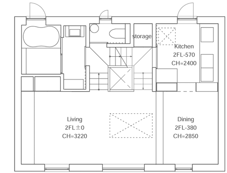
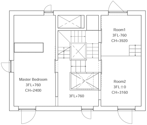
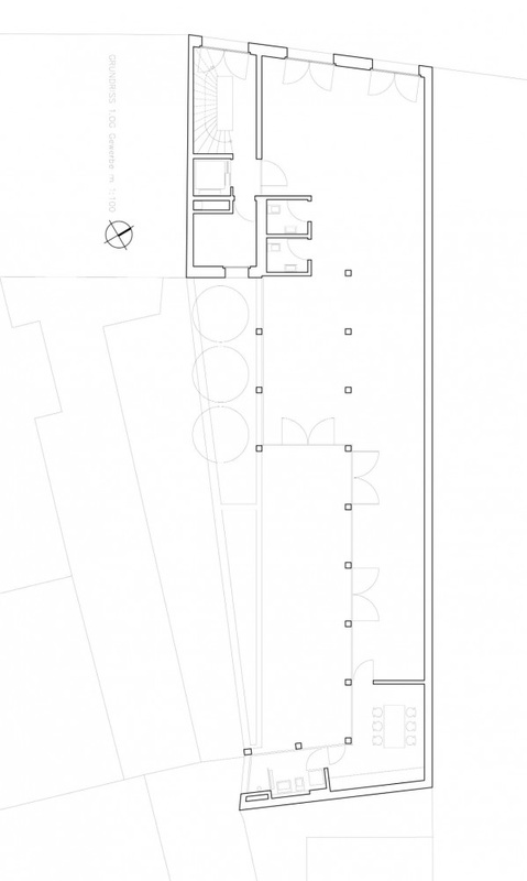
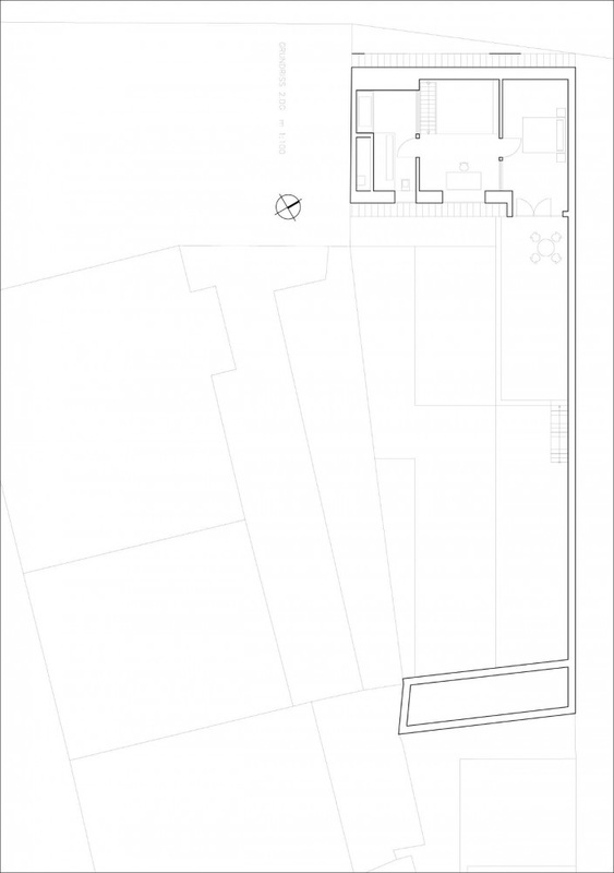
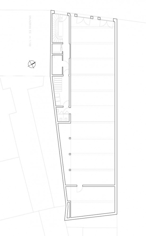
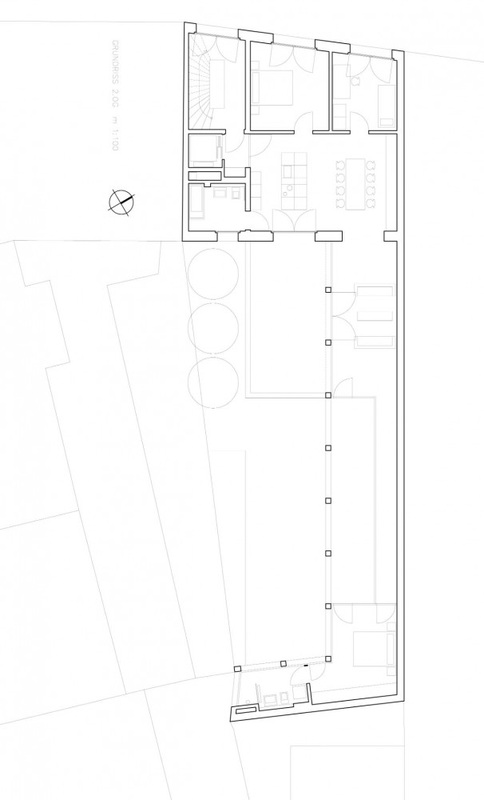
Stairs
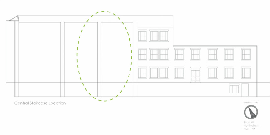
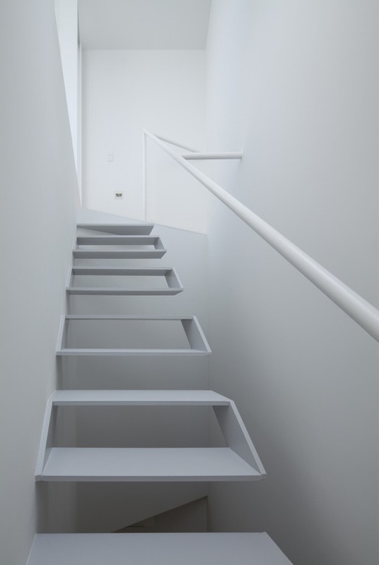
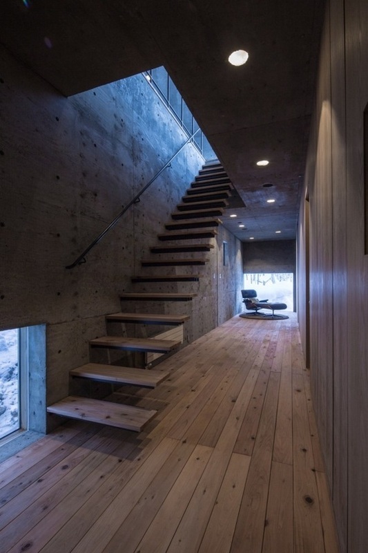
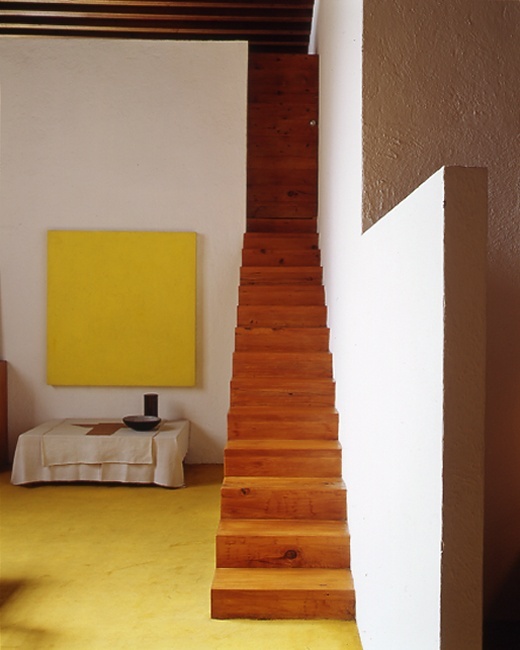
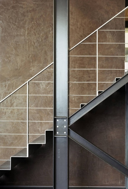
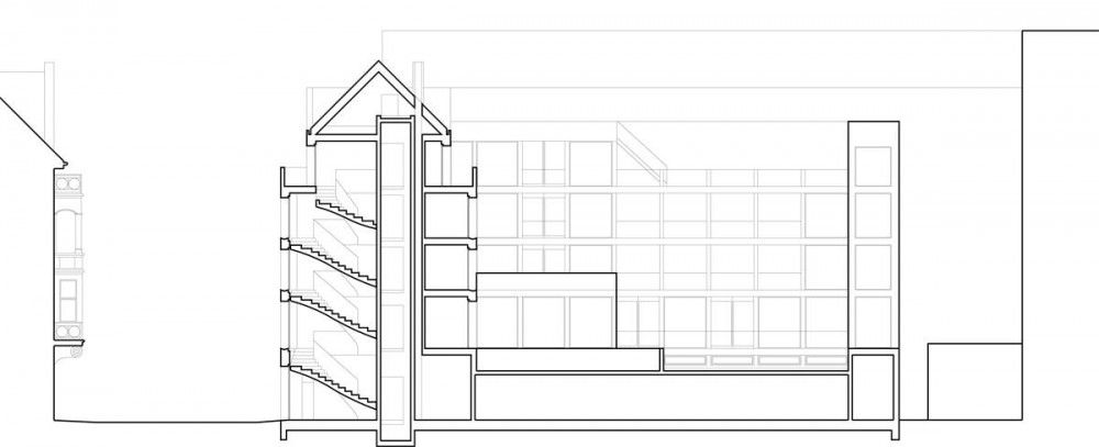
The restaurant design features a focal staircase that runs centrally through the building. Creating an interesting structure through the centre of the building is key. The staircase sit centrally in the building plans to allow of accesses to be gained to all levels through the building and also provide views around the building. The staircase also wants to create interesting light channels and shadows as well as working within open spaces and small concealed spaces towards the top floors. To gain inspiration many design precedents are to be looked at to look at form, shape and structure to see how different techniques could be used within the context of this building interior.
Looking at design precedents for the staircase came from coming across some trouble with the design of the central staircase. Due to the nature of the building which the interior is being developed for the design language of the lines used to create the individual spaces was not translating and working together when the straight lined nature of the initial staircase was put into place. Looking at precedents that used more angular and unusual shapes to create the stairs as a focal point within design helped to create a structure that would be more fluid and work with the rest of the developed interior.
What was wanted from the central staircase within the building was to allow for the user to travel up and down the stairs gaining glimpses into all the spaces that they are able to see through out the building from the staircase experiencing all of the building and all the spaces including the restaurant spaces, the kitchen, the cafe and the deli space. Through the use of materials this would also be able to be achieved. For example through the use of frosted glass panels within walls this would allow movement and light to be seen from the stairs at different points but without being able to define the space function without entering - creating this subtile sense of mystery and secrets. This will provoke interest and also play with the user senses and aims to create this sense of mystic.
Design Precedents
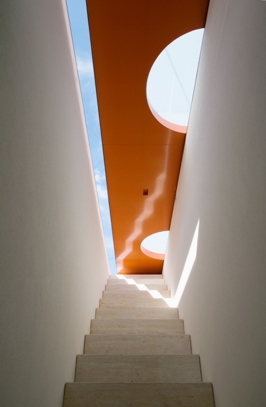
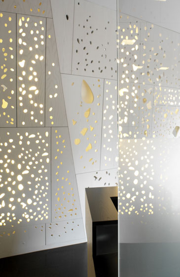
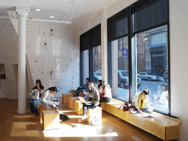
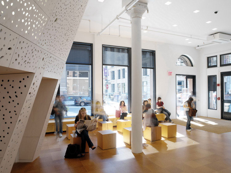
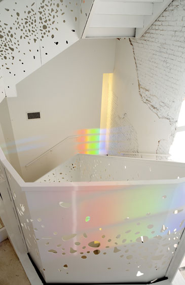
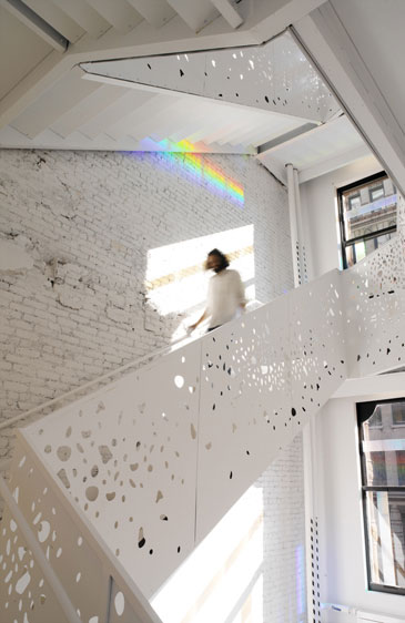
NYU Department of Philosophy, Steven Holl
Apart from being an admirer of Steven Holl's work the NYU Department of Philosophy interior, in particular the staircase creates and interesting space and structure similar to what is wanted to be achieved within the restaurant building on Short Hill. The department of philosophy based in New York City, USA was created between 2004 and 2007. The creation of the interior was apart of the refurbishment of the existing building. The school space is based around the concept to organise space around the light that can be drawn into the space and use the properties of the materials used within space. The stair shaft which has been developed within the space works to connect the six level building allowing for access to all floors with ease. The stair shaft uses the light that is coming into this space and the design uses this light and shadow which changes seasonally creating interesting shapes, space, light and shadowing throughout the year. The exterior of the building which is historic has remained untouched whilst the new interior of the building aims to create a "luminous" space for the NYU department of philosophy.
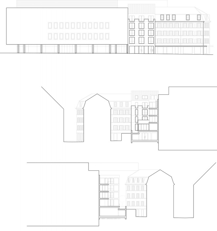
One reason for selecting this as a design precedent is for the similarities between this building and the building selected for use within this project. Again like Steven Holl the Short Hill building is the redevelopment of the interior. Whilst the staircase in Holl's design runs through one end of the building and the staircase within the concept runs centrally - they are both contained staircase spaces that use angular lines within a rectangular space. Looking also at how the material can influence the space this idea of using a light material to draw in natural light which will change seasonally creating a different space throughout the year is an interesting concept and a technique which could be used within the development of the stair shaft within Short Hill. The idea of looking down the stair shaft and seeing the movement of other users and where they are in their daily business is also an interesting concept with the idea of each user creating noise and shadow and interpreting the unique space in their own way.
One reason for selecting this as a design precedent is for the similarities between this building and the building selected for use within this project. Again like Steven Holl the Short Hill building is the redevelopment of the interior. Whilst the staircase in Holl's design runs through one end of the building and the staircase within the concept runs centrally - they are both contained staircase spaces that use angular lines within a rectangular space. Looking also at how the material can influence the space this idea of using a light material to draw in natural light which will change seasonally creating a different space throughout the year is an interesting concept and a technique which could be used within the development of the stair shaft within Short Hill. The idea of looking down the stair shaft and seeing the movement of other users and where they are in their daily business is also an interesting concept with the idea of each user creating noise and shadow and interpreting the unique space in their own way.
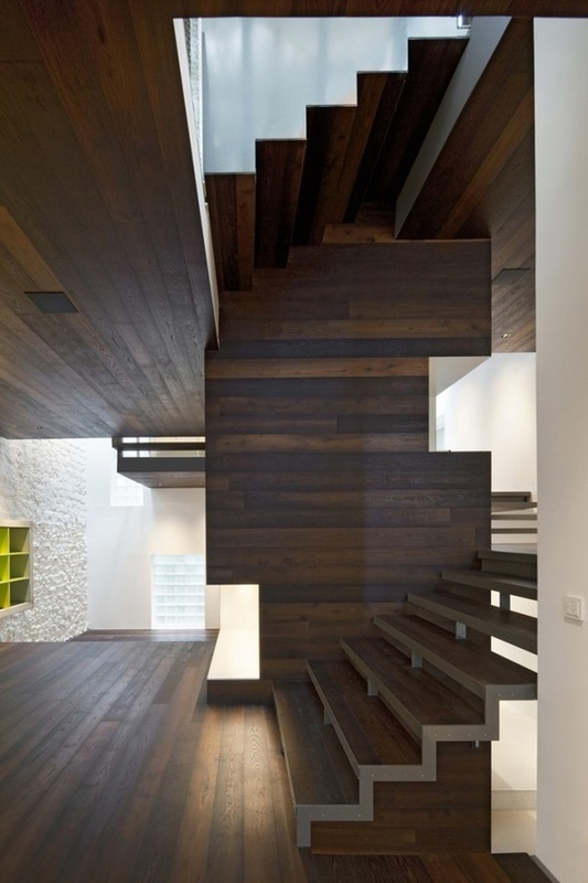
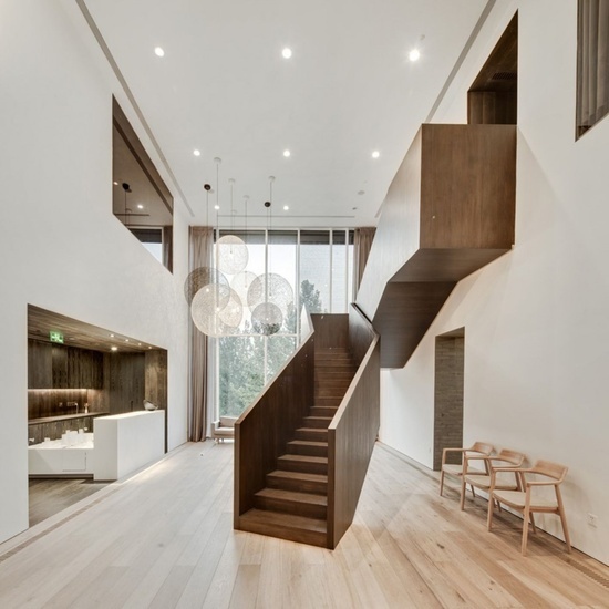
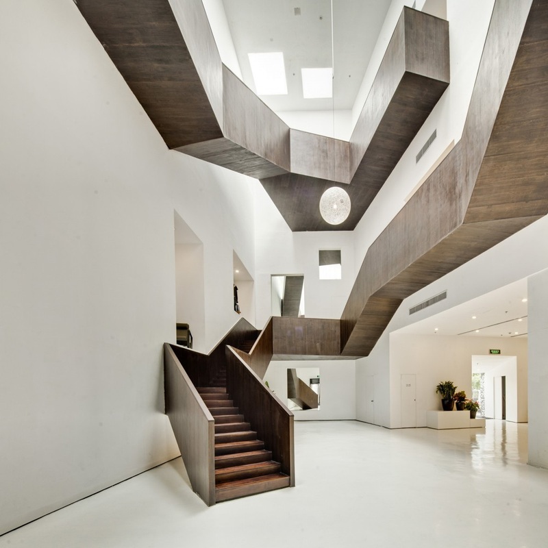
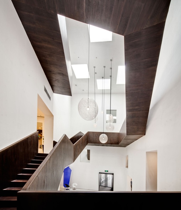
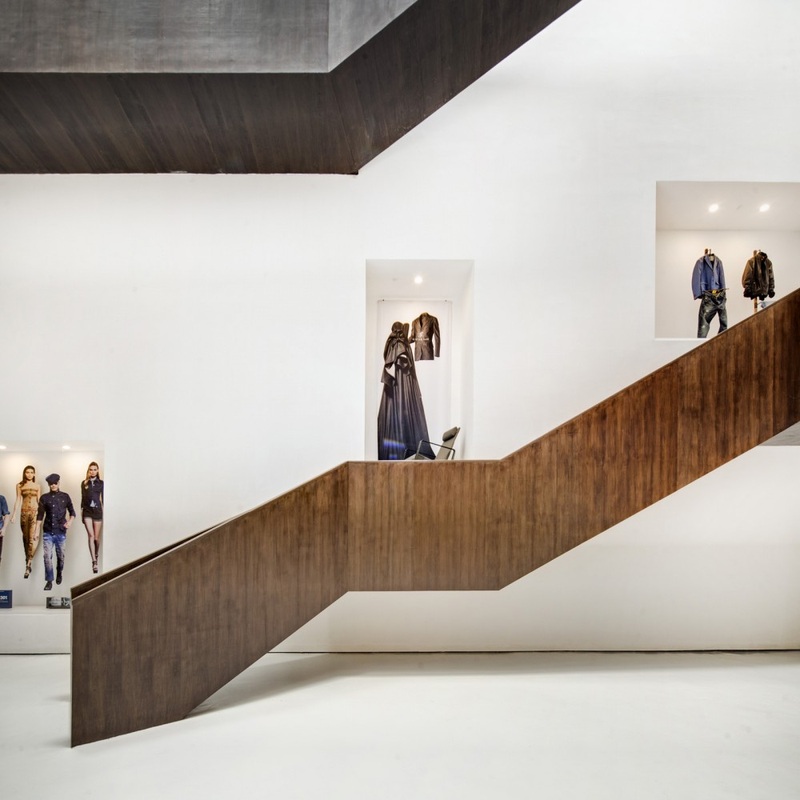
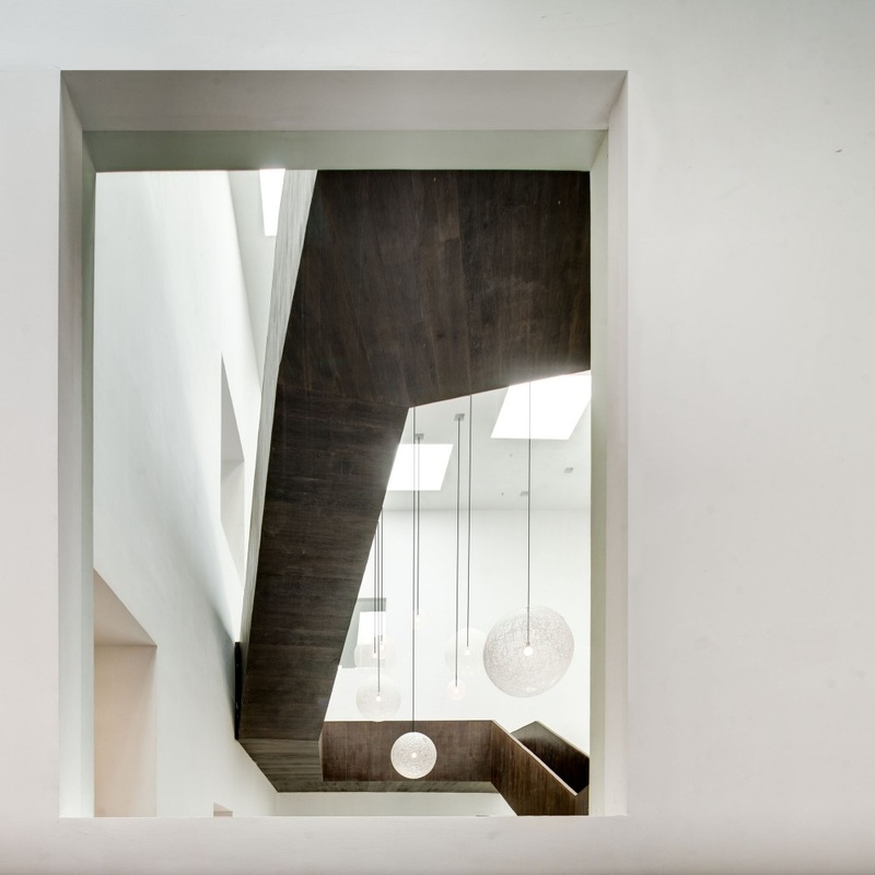
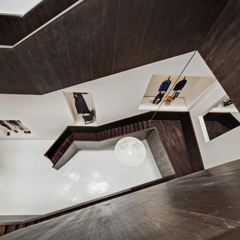
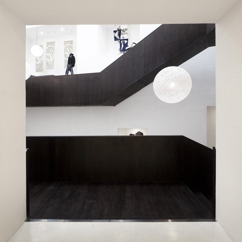
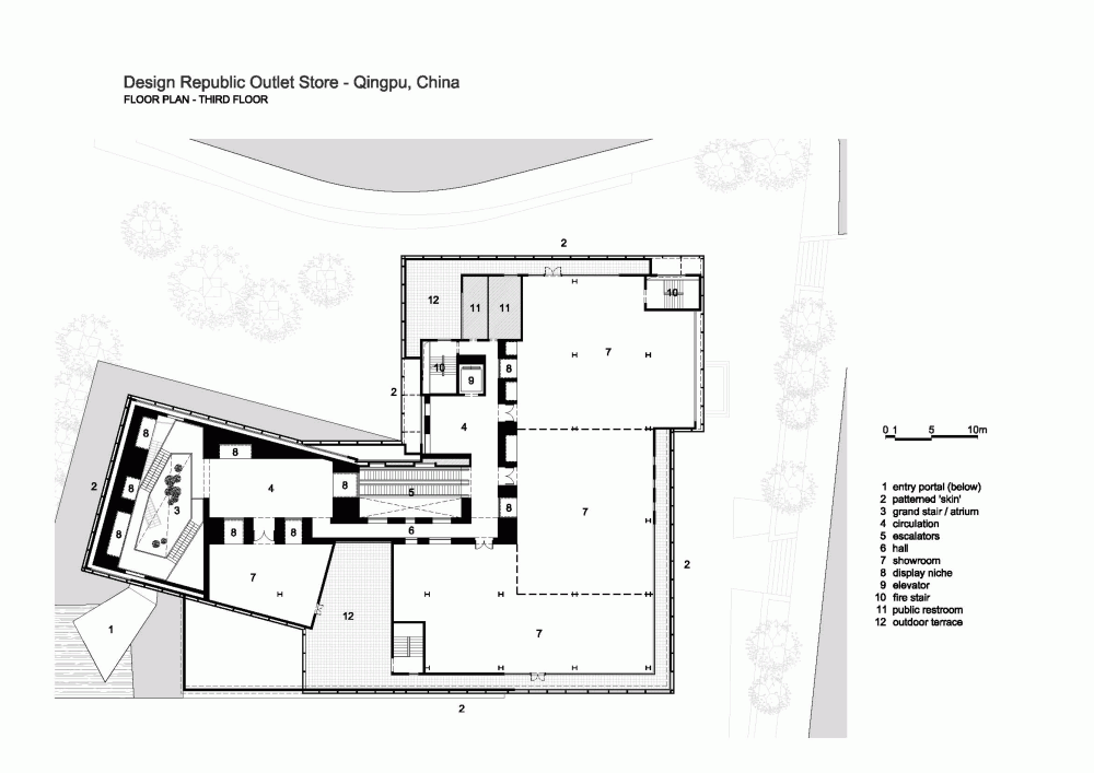
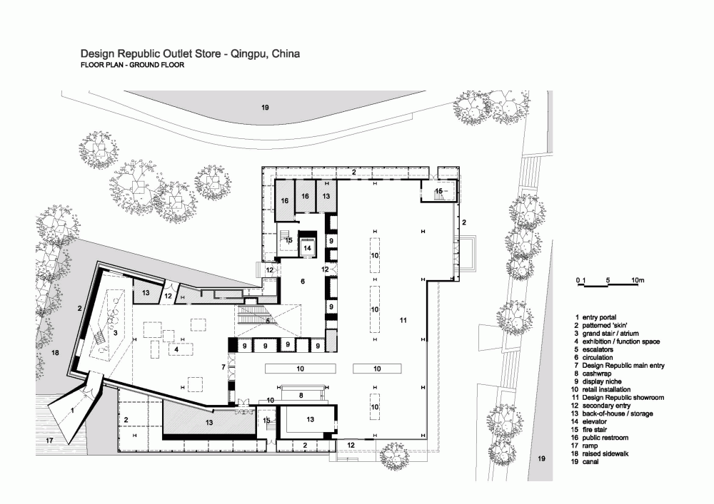
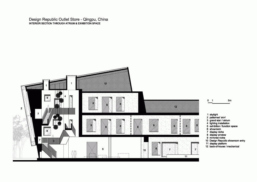
Design Collective, Neri & Hu
Design Collective by Neri & Hu architects is located on the outskirts of Shanghai. The existing building which was inherited by the architects Neri & Hu whom were given the task to completely redevelop and redesign the existing interior and exterior without having to demolish any aspect of the existing structure. The concept developed by the architects was to give the building a new design identity which would create the Design Collective - a new retail initiative within the city. The entrance to the building is within a large steel funnel which in turn acts as a transition space between the urban aspect of the building to the exhibition space within the building. The idea of using a tube to create an entrance works to emphasise the entrance into the building more specifically the exhibition space which stands at 3 storeys and also where the journey around the Design Collective building begins.
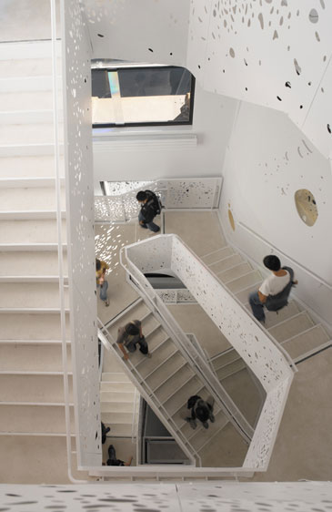
The reason for selecting the Design Collective as a design precedent is the staircase. Within the building the staircase wraps around the building interior and of the main exhibition space which is apparent when entering the building. The staircase takes the user around the space and up and down through many different levels where different displays of furniture can be experienced. The staircase creates varying spacial levels and allows for aspects of the building to be viewed from varying vantage points within the building allowing for different spaces to be seen from the stairs giving hints of displays and space functions.
The staircase acts as the focal point within this design allowing the visitor to view the building in different ways from different angles. This is a technique that would like to replicated within the design of the restaurant building. Due to the nature of the design concept containing several different spaces this will allow the visitor to see all around the building. The staircase in the Design Collective works around the building using angles and levels to create the structure. This also works creating light and shadows a method that due to the nature of the existing structure at Short Hill would allow for.
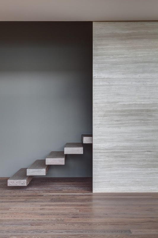
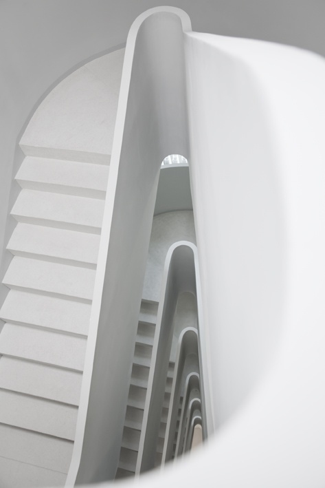
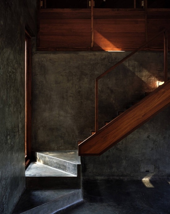
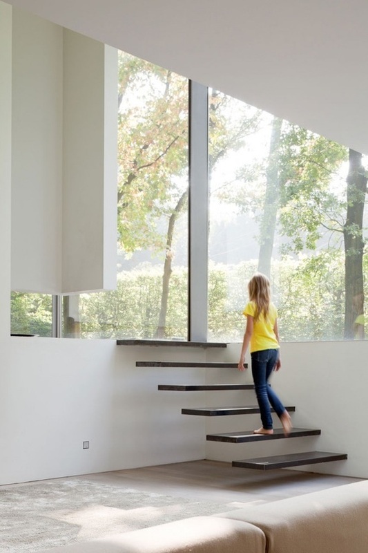
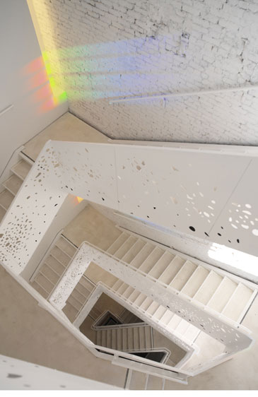
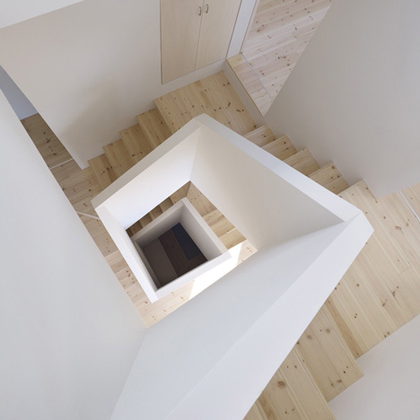
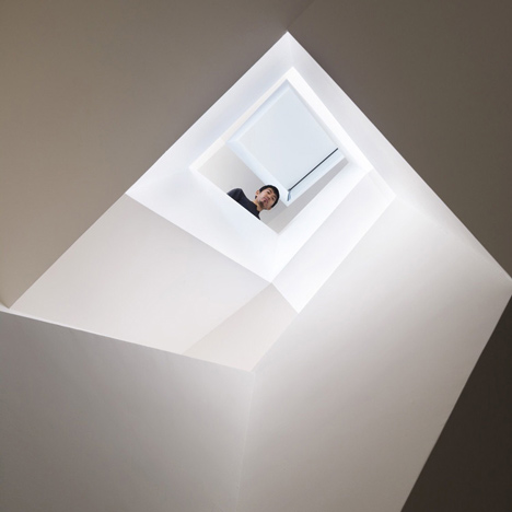
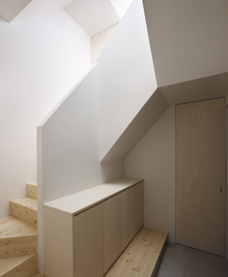
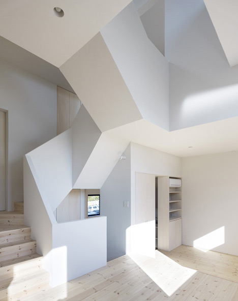
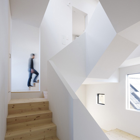
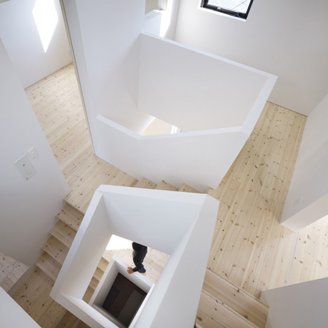
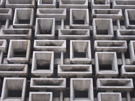
House in Aoto, High Land Design
The House in Aoto has been created by a Japanese architect from High Land Design - Masayoshi Takahashi. The house in Tokyo has been developed with a squared spiral staircase at the heart of the building. The building itself has been constructed using concrete. The house in Aoto is a three-storey building the shelters a roof terrance on the houses roof. A quote from the architect describes the staircase shaft that we developed. "We placed each space like spiral around the stairs. So that it is possible to move around each space without feeling the difficulty moving up and down."
Looking at the House in Aoto as a design precedent with relevance to the staircase looks at how a staircase the takes you from space to space has been developed in a squared pattern around the building in what appears to be a small space. It is the idea of being able to look down at the space as an entirety from the top that is key within the design example. Using this technique within the development of the Short Hill building would allow for building users to look around the space from above and allow them from this point to understand where they are within the building removing this element of loss of orientation at certain parts within the building that will then be reinstated in others.
Looking at the House in Aoto as a design precedent with relevance to the staircase looks at how a staircase the takes you from space to space has been developed in a squared pattern around the building in what appears to be a small space. It is the idea of being able to look down at the space as an entirety from the top that is key within the design example. Using this technique within the development of the Short Hill building would allow for building users to look around the space from above and allow them from this point to understand where they are within the building removing this element of loss of orientation at certain parts within the building that will then be reinstated in others.
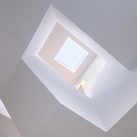
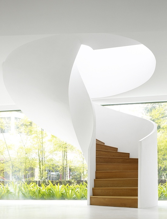
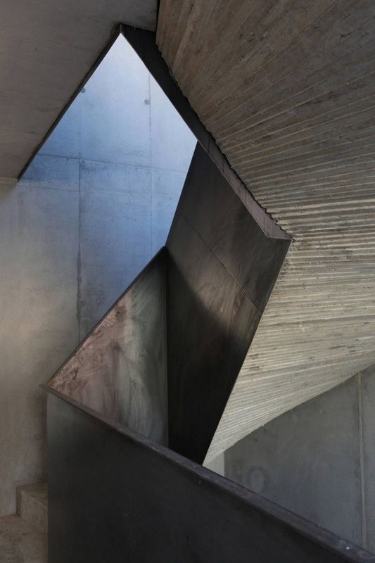
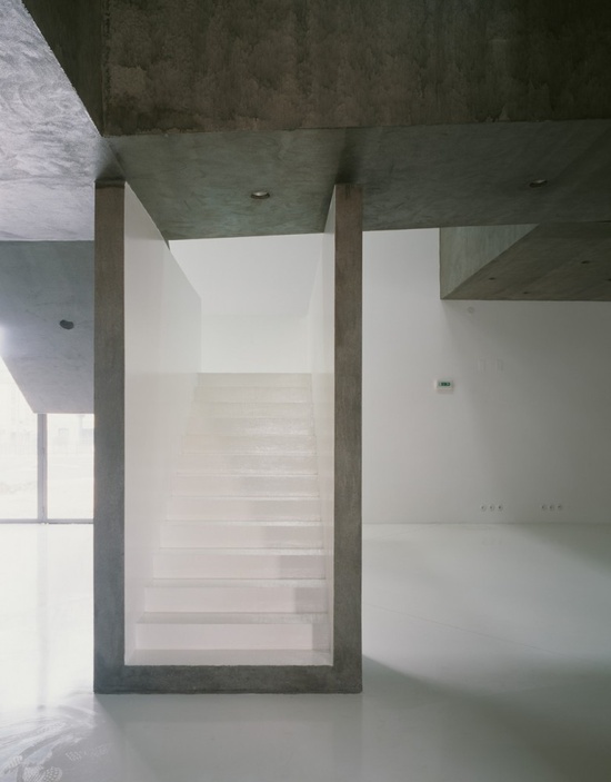
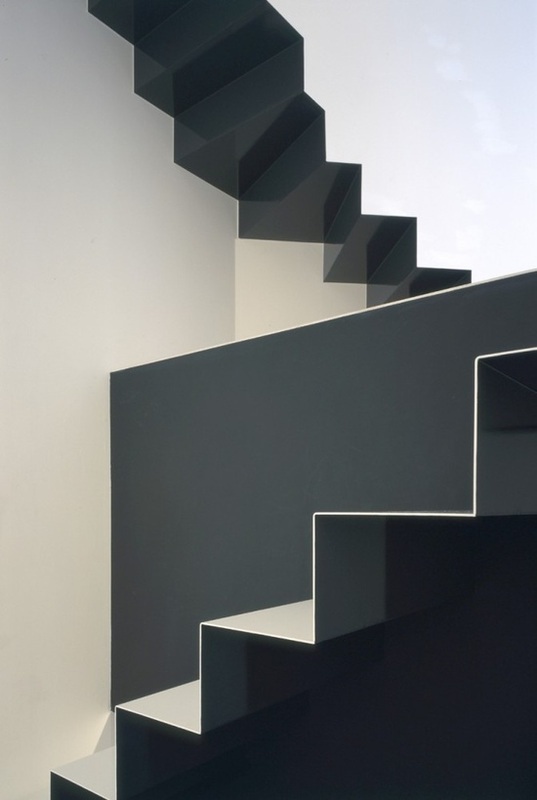
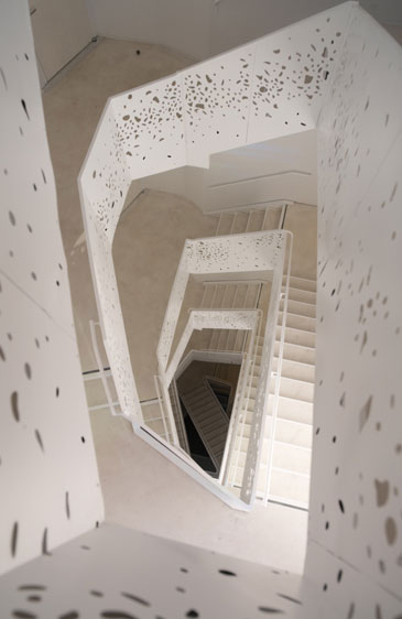
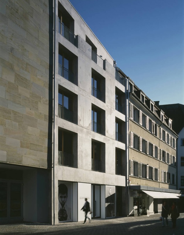
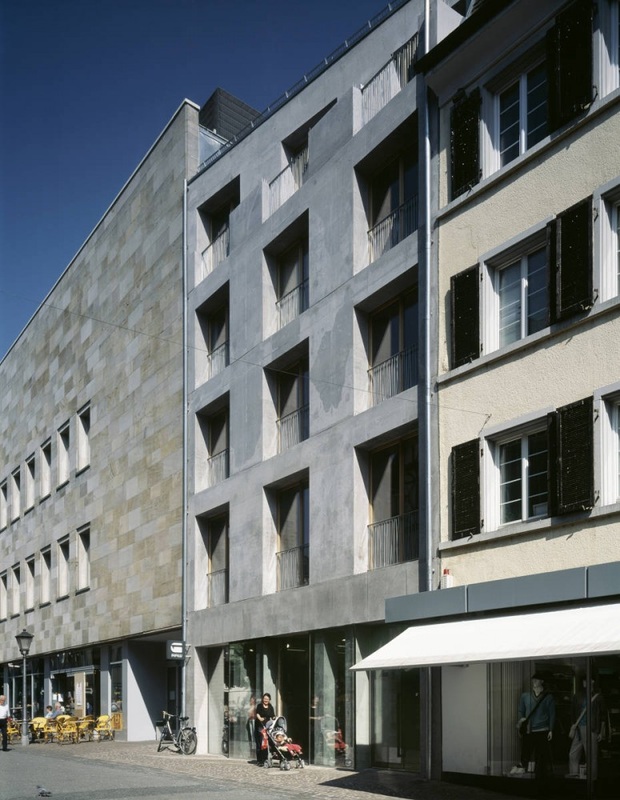
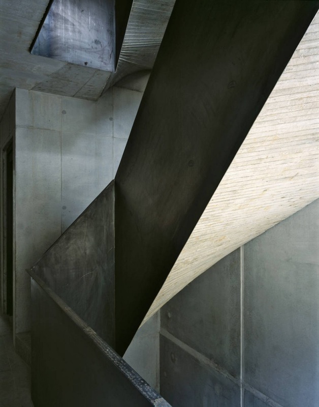
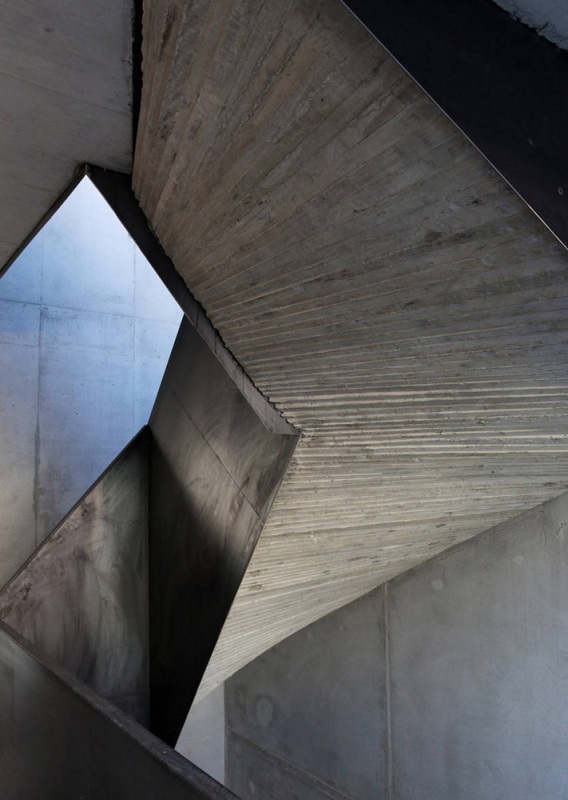
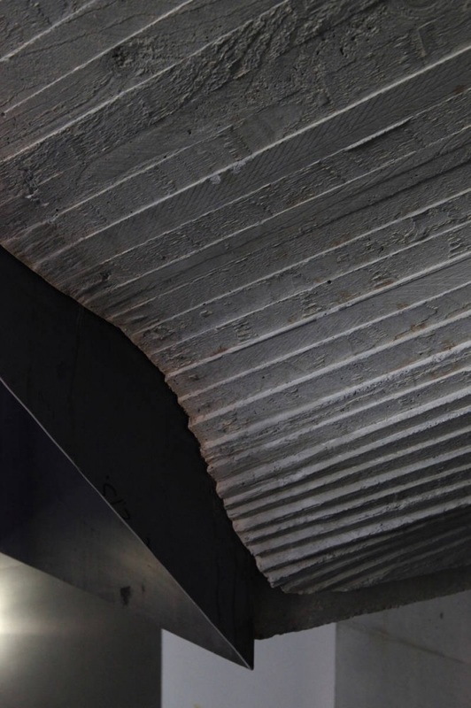
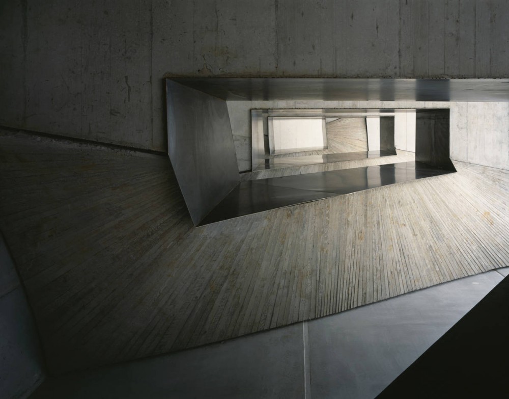
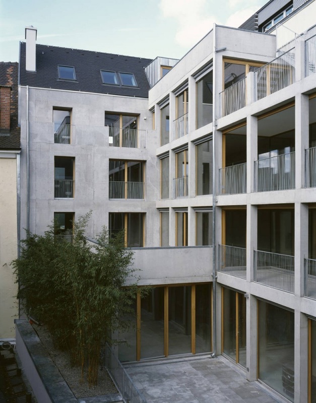
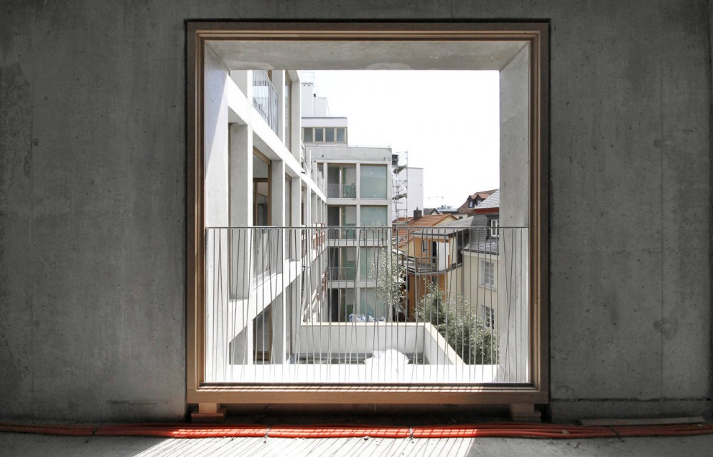
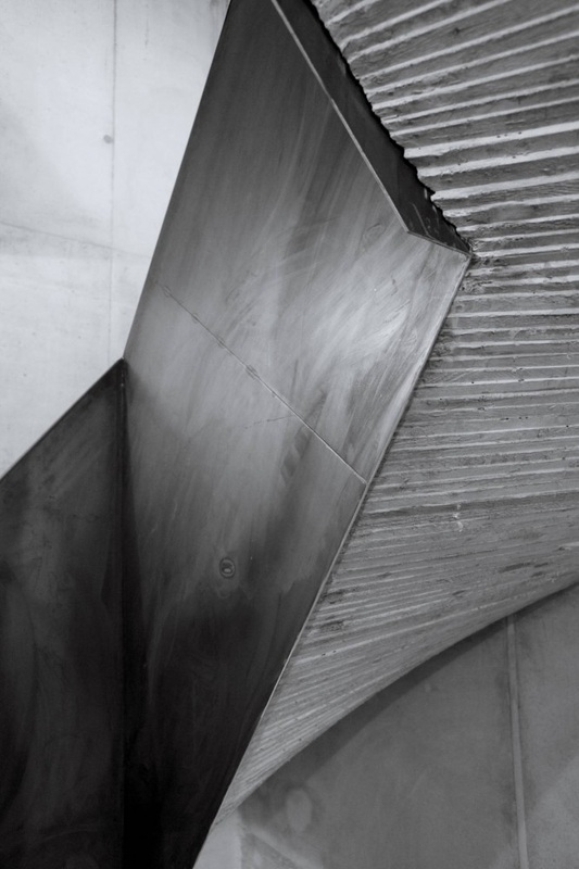
H27D, Kraus Schoenberg Architects
H27D by Kraus Schoenberg Architects can be found in Constance, Germany. This building again uses a staircase of relevance to the development of the concept of my project and using this as an example shows the effects of the twisting staircase.
Mazes
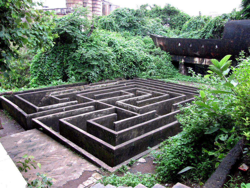
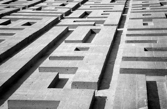
The idea of looking at mazes for a design precedent came from the investigation of staircases. The combination of lines and shapes created within the structure of the mazes can be used to create a structure of the stairs. The concept of looking at the maze also came from the concept of creating confusion. Wanting to create this feeling within the building that users do not know their orientation within the building could be create through the changing levels and the changing directions of the staircase. This concept its the same within a maze. When you enter you know you are at the beginning with the aim of finding a route to the centre.
Maze
1. a confusing network of intercommunicating paths or passages; labyrinth.
2. any complex system or arrangement that causes bewilderment, confusion, or perplexity: Her petition was lost in a maze of bureaucratic red tape.
3. a state of bewilderment or confusion.
4. a winding movement, as in dancing.
Taking this principle this can be applied to the concept design of the staircase within the restaurant building. Using the theory behind the development of mazes and using design precedents looked at with regards to staircase will also for the development of a staircase that it not only functional but also meets the concepts set out within the project to create this element of a loss of orientation within the building that can play with the senses and create this interesting a unique experience for each user within the building.
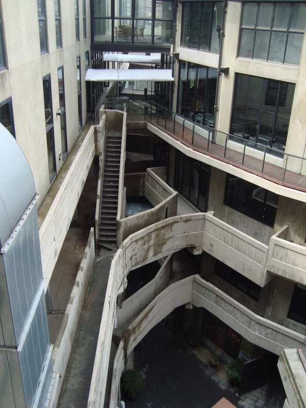
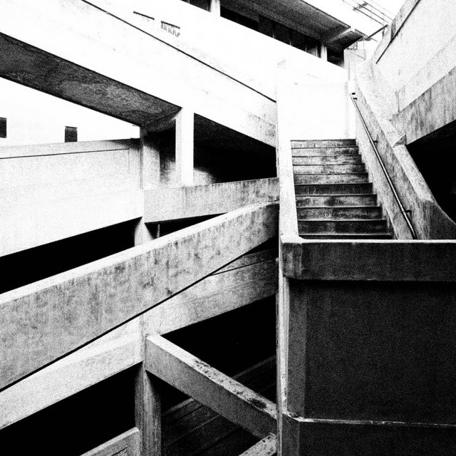
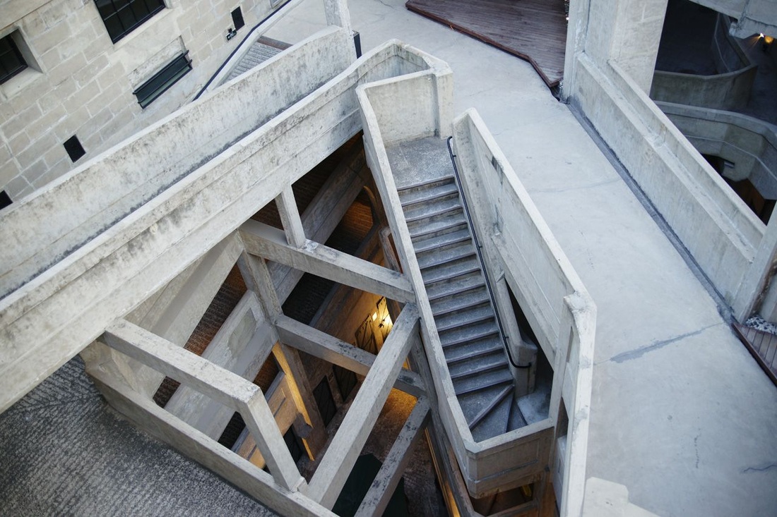
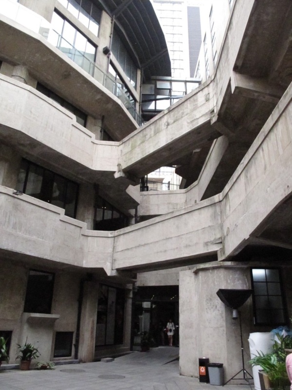
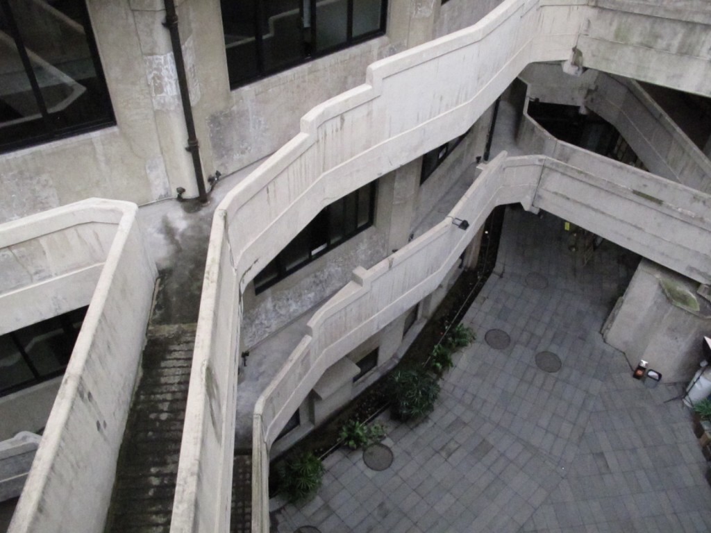
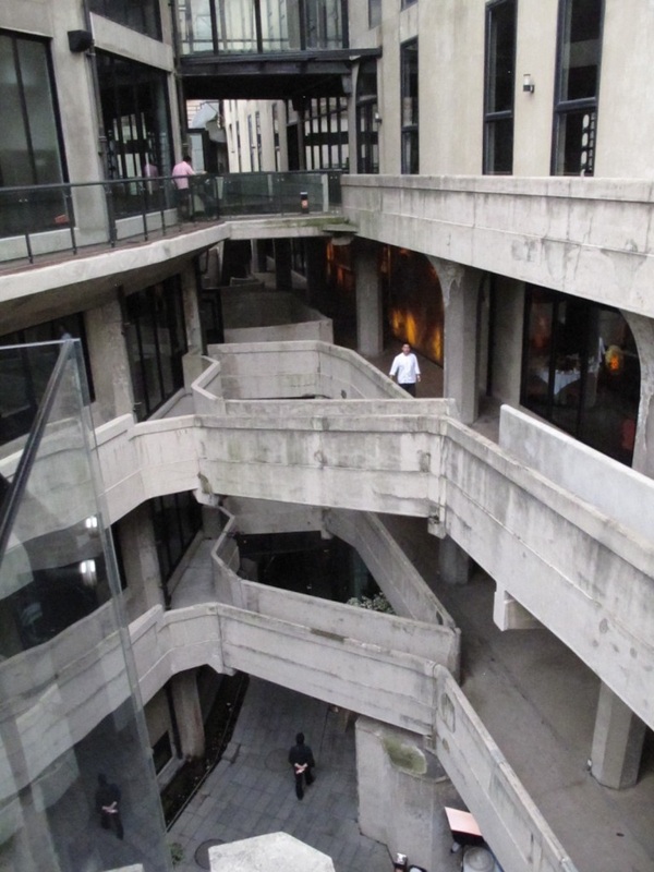
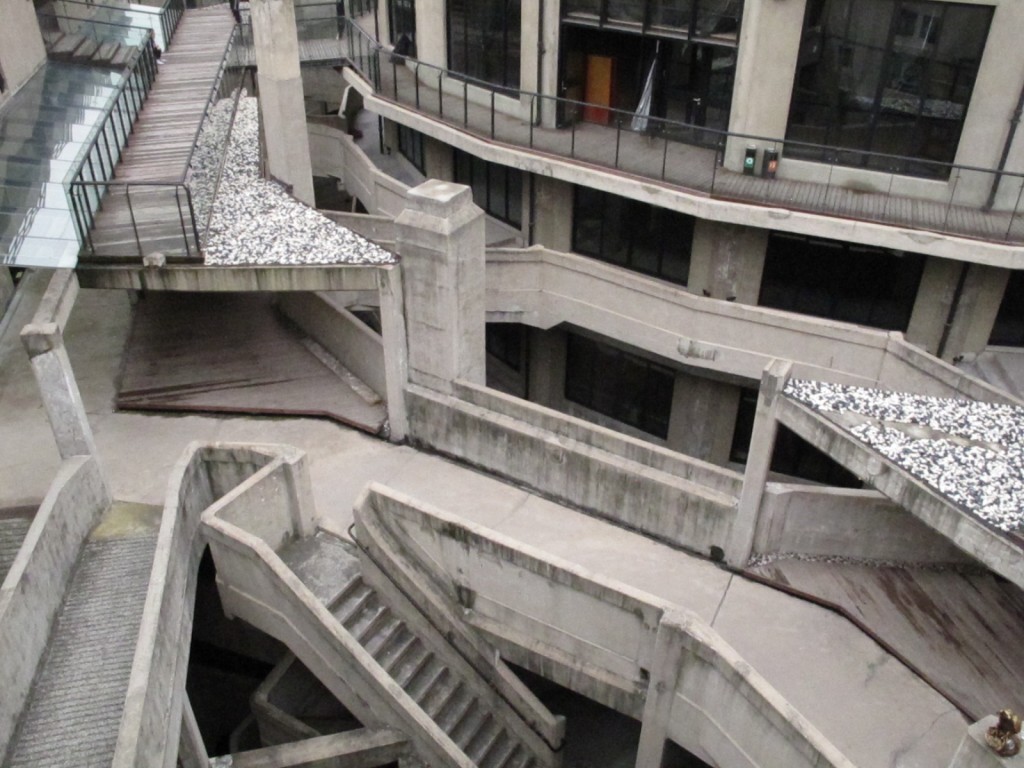
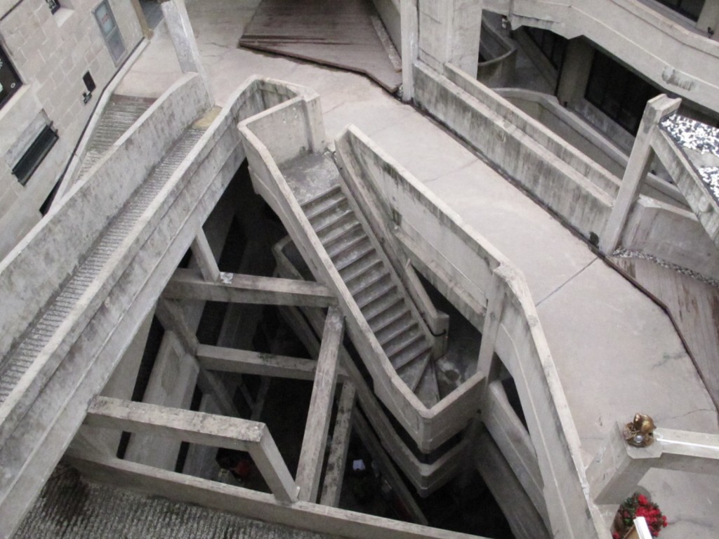
Slaughterhouse Shanghi 1933
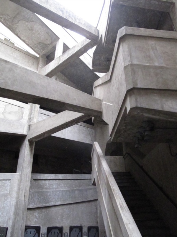
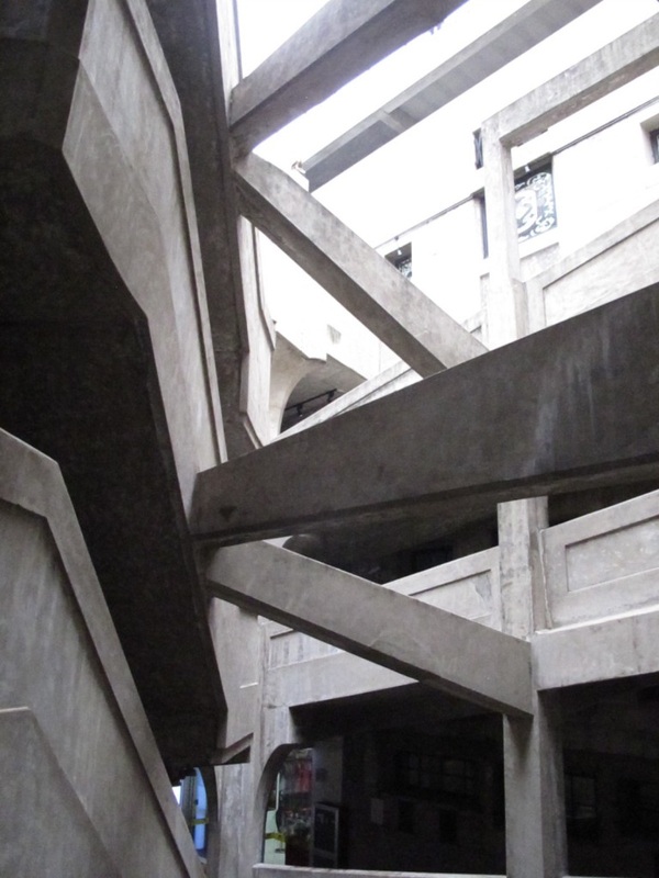
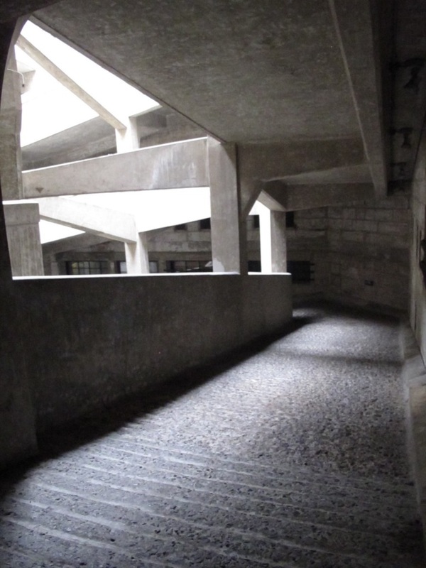
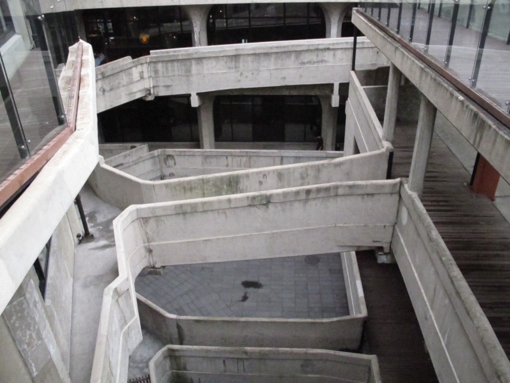
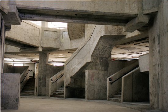
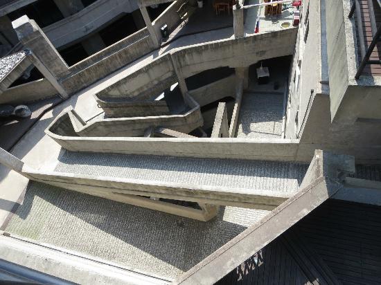
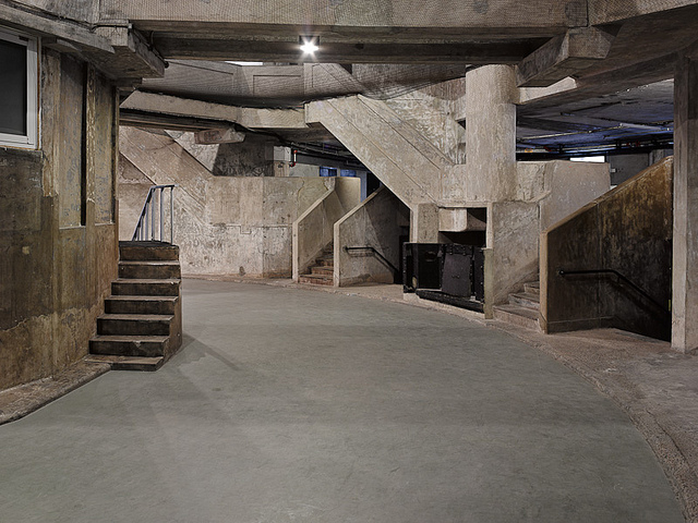
From looking at mazes, particularly those created in a rigid concrete structure, The Slaughterhouse Shanghai 1933 was discovered. Looking through blogs and images of concrete mazes I came across the slaughterhouse and its structure that resembles a concrete maze. The Slaughterhouse 1933 is believed to have been designed by British architects for the purpose of killing animals for consumption has since be redeveloped into the 'Creative Hub" - a large space for arts, music and restaurants. The building is located in the historic Hongkou District. The slaughterhouse is built during the vibrant and urban landscape during pre-communist Shanghai. The four storey concrete maze was built in 1933 by Chinese developers the building has had many purposes over the years including a medicine factory, cold storage facility and not to the creative hub. The Slaughterhouse is the last building left of the three that were built. The other two buildings of its kind were in London, UK and one in the USA which have both been demolished by now.
The Slaughterhouse was commissioned for construction by the Shanghai Municipal Council. To construct the slaughterhouse a cement aggregate was imported from the UK to create the support required within the building to create the load-bearing structure. When the building was abandoned and became into disrepair it was not until 2008 when extensive restoration brought the building back to life as a creative hub for Shanghai. Within the slaughterhouse everything revolves around the central core of the building, which once was the abattoirs workshops - a space that could be accessed through the use of a series of bridges and staircases that cross back and forth at various points through out the building. This method was created to control the flow around the building of both people and cattle that were within the building. There is a space which has been left between the edge and the core of the building which is open air - creating light tunnels. From research it is clear that this is building developed in the communist era with a mix of Art Deco styling.
The reason for looking at the Slaughterhouse Shanghai 1933 is due to its structure and organisation of space and the connection between those spaces. The idea of movement around the space in this way allows the use to see all aspects around the building. The slaughterhouse - the concrete maze allows for people to be moved around in what is appears to be an unorganised collection a paths when in fact the system used and the lines taken throughout the building design create an organised and well planned way of moving people around the building to create visual impact and a systematic approach. The idea of leaving gaps to allow light to filter through is a technique which could be taken to use within the Shot Hill building to create interesting shadows and areas of light.